There are many technicians and market seers who are comparing today’s price action as well as market sentiment to the 2011 period. I will admit that the price action is remarkably similar and that sentiment has reached the same bearish extremes, with some actually worse than 2011. I will also note that so far, the S&P 500 correction in 2015 has yet to take out major chart support at 1820, which is similar to the price action in 2011, as that market correction failed to take out the key 2010 low.
So let’s do a comparison of S&P 500 corrections – 2015 vs 2011.
First off, the peak in May 2011 was only a little more than 2 years after one of the worst bear markets in history. The May 2015 peak is more than 6 years (historically a long bull market) after the 2009 low.
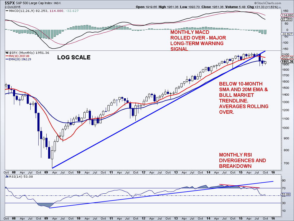
Secondly, and I will lump a lot of things together here. In 2011, the 10-month and 20-month EMA’s never rolled over, but just flattened. In 2015, the 10-month SMA has already rolled over and the 20-month EMA has flattened and may be starting to roll. The monthly MACD did see a bearish cross in 2011, but it was extremely minor. In 2015, the monthly MACD is well below its signal line in a clear downtrend. The 14-week RSI saw one bearish divergence in 2011, while we have seen 5 bearish divergences this time. In 2011, the 14-month RSI never reached overbought territory and never traced out a bearish divergence. This time, the monthly RSI cycled into overbought territory and put in a series of bearish divergences.
Third, corrections in bull markets generally don’t play out the same. Yes, patterns tend to appear, year after year, decade after decade — just not in the same bull market when it comes to major formations or waves. This may be the most important distinction of all that I have listed. Look at any bull market over time, and one rarely sees the same price action in major market corrections from year 1 to the end of the bull.
So what I’m saying is this comparison of 2015 to 2011 will work until it doesn’t. I think it will eventually fail and those trading it will be left with their shorts down.
I still “prefer” the setup that has the S&P 500 eclipsing its August lows, potentially later in October, followed by a pretty good rally that eventually fails, and is then followed by new lows. One must be very careful if and when the August lows get taken out because there is little support until 1,820, and that was a “V” bottom. So thinking about that, there could be less buying demand (support) at last October’s correction lows then people think as there is little price structure to it.
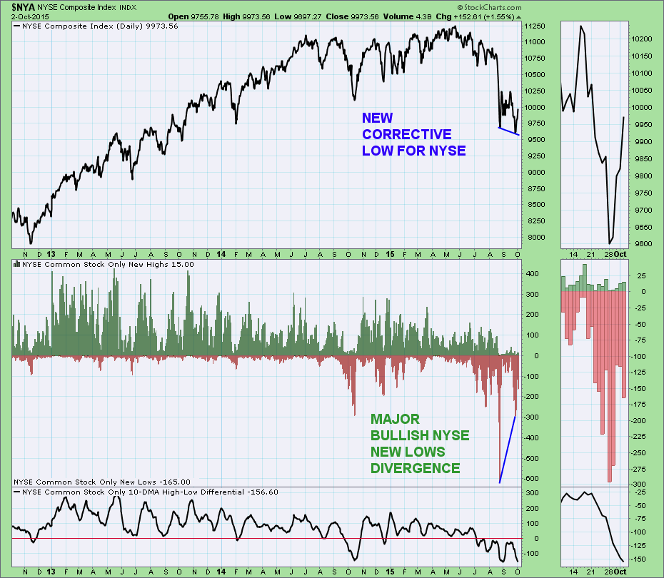
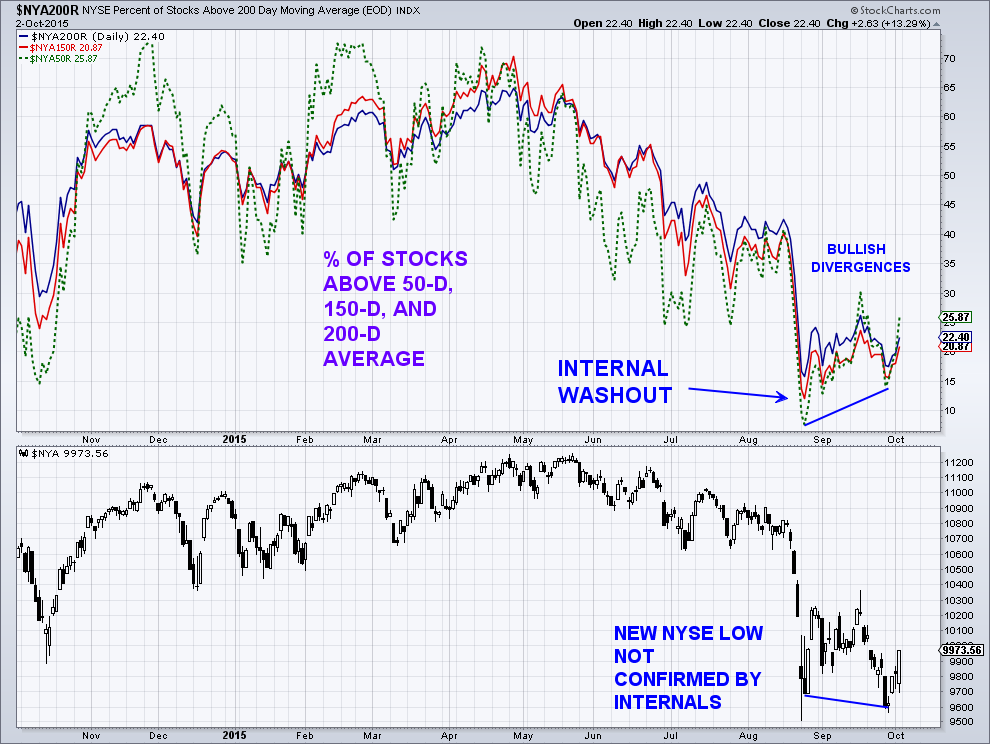
And of course, with the panic buying Friday, it is possible that the lows this week were a successful test of the August lows, and the rally that many are looking for is just getting started. In my email update to subscribers on Wednesday, I did show some potentially bullish divergences with respect to the NYSE Composite internals and the Russell 2000 daily momentum. Both these indexes did go to new corrective lows, and yes, like 2011.
continue reading on the next page…


")
 Rolling Over At Key Fibonacci Level?")

