The following five charts look at mostly global markets and indicators.
Further below is an investment summary and final thoughts.
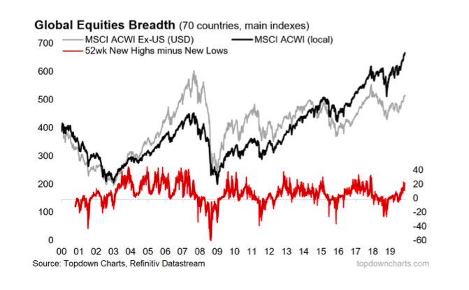
6. Global Equities
It looks like we’re in a new cyclical bull market (based on a fairly familiar and reliable global equity market breadth signal).
This chart and a few other global equity market breadth indicators helped pick the big breakout late last year.
It’s quite likely that if the new cyclical bull market does get derailed somehow, that we see early warning signs show up in this chart. So this will be a key one to watch for risk asset allocations.
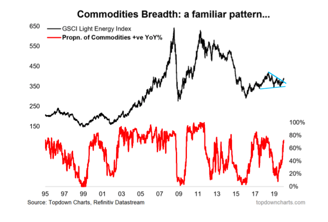
7. Commodities
Commodities (at an asset class level) have also seen a familiar market breadth pattern emerge, which points to a cyclical bull market (lines up with relatively light positioning, cheap valuations, and a prospective better macro backdrop). The outlook across the individual commodities that make up this index is a bit more nuanced, but the aggregate/asset class view looks fairly straightforward based on the sum of evidence from our indicator set.
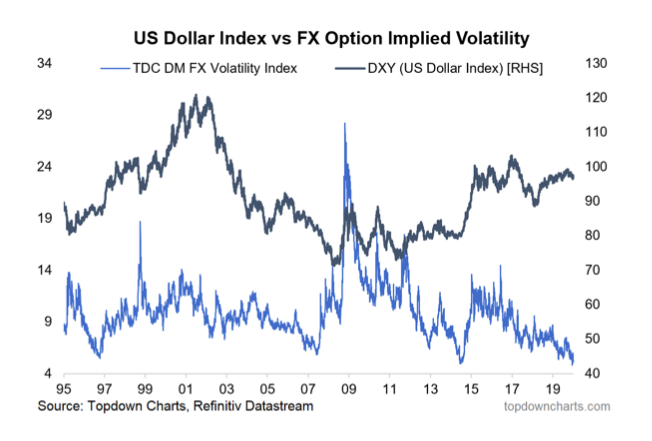
8. FX Volatility
One key piece of the puzzle for commodities is the US dollar, and while I continue to maintain a bearish bias there, one thing I am very mindful of is the crunch in FX volatility. Typically crunches in volatility like this tend to be resolved in a violent fashion: that is, it could be a harbinger of a large/rapid move (agnostic of direction). So, will 2020 bring a return of volatility for the US dollar?
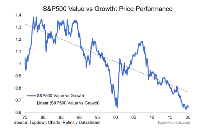
9. Value vs Growth
The investment strategy graveyard is littered with failed calls for a turnaround in the performance of value vs growth stocks. But I think we could be close to the much-awaited and much-forecast turning point. Relative value between the two cohorts is at the lowest point in 20 years, and in terms of macro catalysts, my expectations for higher bond yields, better growth, and higher commodity prices will help the sectors that are slightly over-represented in value vs growth. So don’t forget about value.
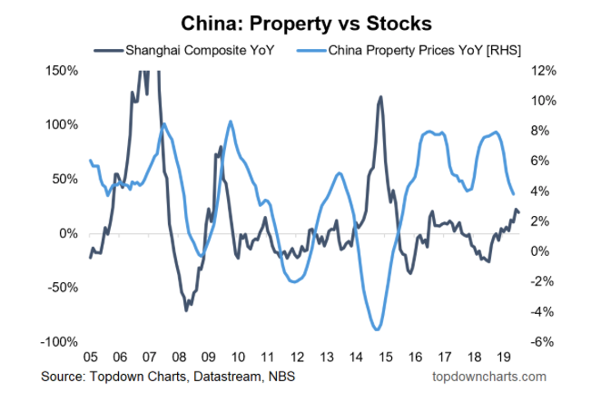
10. China
Last but not least, this chart shows Chinese property price growth vs China A-shares. It’s a useful chart for China watchers and global investors in general, but it’s of particular interest now because property price growth is rolling over, and that could be good news for China A-shares.
Because the marginal speculative investment dollar in China is basically trapped in the country, you tend to see this succession of chasing one hot asset after another. Thus, we could start to see a rotation effect between property and stocks in China, and that (along with cheap valuations, easier monetary policy, better global growth, and a trade deal/truce) could drive a potentially explosive new bull market in China A-shares.
Summary:
-Expect a rebound in the global economy, led by emerging markets.
-Defensive assets are extremely expensive, making them possibly sources of risk rather than hedges of risk.
-Commodities and inflation expectations are set to do well as the late-cycle extension thesis will provide a supportive macro backdrop.
-Bearish US dollar, but bullish on the prospects for higher FX volatility.
-Stay bullish global equities. Wary of high absolute valuations in the USA (but for now the ERP is still cheap).
Final Thoughts and Bottom Line
Last year was an interesting one in multi-asset strategy, for a while there both bonds and equities did well… in fact probably the only way to get it wrong last year was to be overweight cash! Looking forward I think 2020 is going to be more binary. It’s going to be either bonds do well or equities do well, and as you might gather from the charts in this post, my view is this will be a year that favors risk/growth assets and not defensive assets.
Given some of the key market breadth developments late last year, the lay of the land in valuations, and the economic leading indicators, to me it seems rational to continue to favor risk assets over the medium-term (particularly commodities and emerging markets), and remain underweight defensive assets. The tactical outlook of course will be a moving target, as (geo)politics will no doubt drive bouts of volatility and swings in sentiment provide opportunities.
Finally, as regular readers will know, I will be updating this blog post on a quarterly basis, and again at the end of the year just like I did with my 2019 Charts. So be sure to follow and keep in touch through the year.
Twitter: @Callum_Thomas
Any opinions expressed herein are solely those of the author, and do not in any way represent the views or opinions of any other person or entity.


