I spent a lot of time in the 2019 End of Year Special Edition looking back and reflecting across the year just been, covering some of my best (and worst) charts and calls.
But this article provides a look at the most important part of that report.
As interesting and sometimes amusing as it is to look back, as investors we get paid for looking forward, and there’s a few existing trends and themes that will remain front of mind and be key to keep on the radar in 2020.
The following is a selection of the key charts and indicators I will be watching closely this year.
1. Global Economy
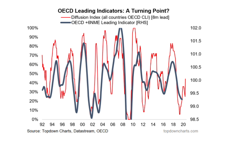
A turning point in the global economic cycle: 2019 basically saw a global manufacturing and export recession. Yes Recession. But looking forward, I have a growing list of leading indicators pointing to a recovery in 2020, and the below is one of them.
The diffusion index of OECD leading indicators has made a clear turnaround after reaching a decade low. I will be watching for a turn up in the main global indicator (and for the diffusion index to continue to edge higher/stay higher).
2. Emerging Markets
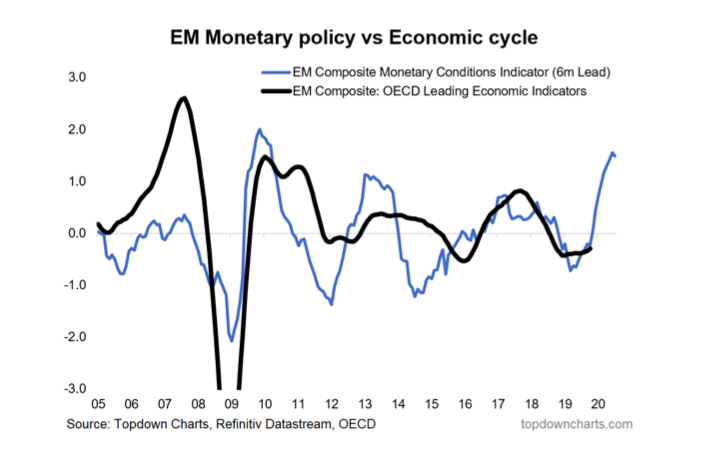
A big part of the 2020 recovery thesis is the global monetary policy pivot. Not many have noticed, but EM central banks have been particularly aggressive in easing policy (and by the way, they have the most traditional policy ammunition available). Given some of the cycle indicators have already begun to stabilize for EM I have a strong degree of confidence that we will see a cyclical upturn across emerging economies in the coming months and quarters.
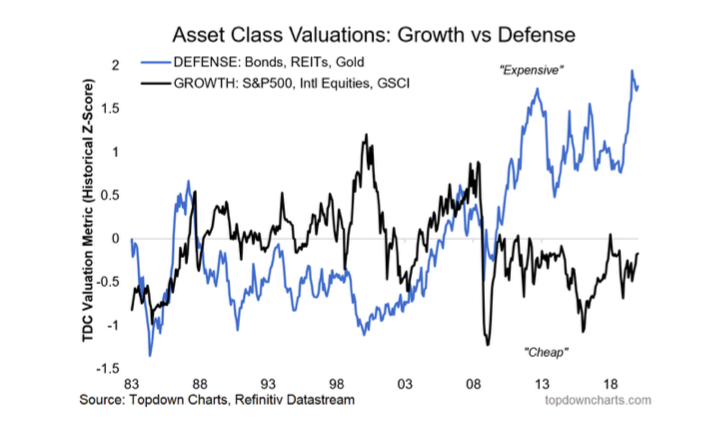
3. Growth Assets vs Defensive Assets
This chart says it all in terms of where investors have been positioned, and it tells you that defensive assets may not necessarily be “safe” given such expensive valuations. Indeed, a global economic rebound could well make defensive assets a source of risk, rather than a hedge of risk.
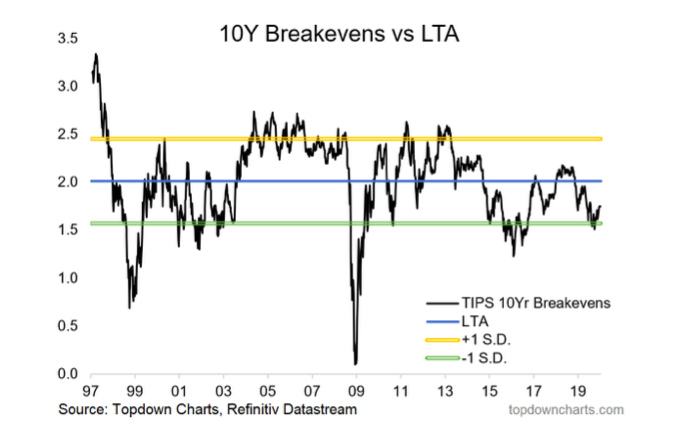
4. TIPS breakevens
They look cheap, and should rebound if we get better growth. This will also tend to put upward pressure on bond yields (i.e. nominal yield = real yield + inflation expectations). This is closely tied in with the commodities picture [chart 7].
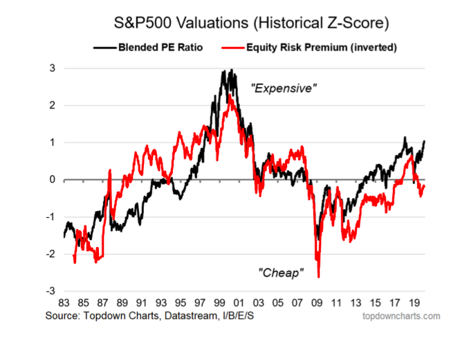
5. US Equity Valuations
The downside of likely higher bond yields is that all else equal it will squeeze the ERP (equity risk premium), which in contrast to absolute valuations, still looks cheap/attractive. Indeed, you can argue it’s quite rational to be bullish equities even as absolute valuations are historically high if the equity risk premium provides enough of a cushion.
The next five charts for 2020 take a broader view of the global markets…
continue reading on the next page


 Flirting With Critical Support… Again")

