Part One: The Squeeze
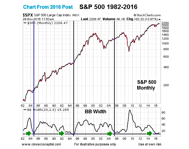
A November 30, 2016 analysis highlighted a very rare long-term occurrence on the monthly S&P 500 Index (INDEXSP:.INX) chart below (1982-2016). Notice how the Bollinger Band Width only reached 2016 levels on three other occasions (1984, 1995, and 2005). In each case, the S&P 500 consolidated (low volatility) and then broke out of the consolidation box (higher volatility).
The potential impact on the present day markets can be better understood using the generic description of a “Bollinger Band squeeze” via stockcharts.com:
Bollinger BandWidth is best known for identifying The Squeeze. This occurs when volatility falls to a very low level, as evidenced by the narrowing bands. The upper and lower bands are based on the standard deviation, which is a measure of volatility. The bands narrow as price flattens or moves within a relatively narrow range. The theory is that periods of low volatility are followed by periods of high volatility. Relatively narrow BB Width (a.k.a. the Squeeze) can foreshadow a significant advance or decline.
The squeeze periods occur when the Bollinger Band Width indicator reaches very low levels.
Part Two: A Price Surge
Similar to using price during a period of consolidation, we do not know if the squeeze odds lean bullish or bearish until a “price surge” or breakout occurs. From stockcharts.com:
After a Squeeze, a price surge and subsequent band break signal the start of a new move. A new advance starts with a Squeeze and subsequent break above the upper band. A new decline starts with a Squeeze and subsequent break below the lower band.
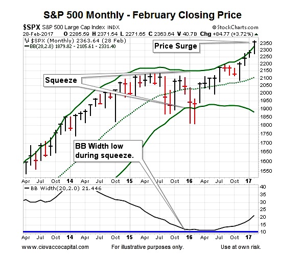
Since we are using monthly charts, a price surge cannot go into the books until the last trading day of the month. As you can see in the chart above, the S&P 500 closed above the upper Bollinger Band at the end of February (”a break above the upper band”).
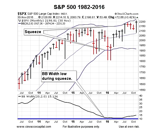
Historical Squeeze And Surge
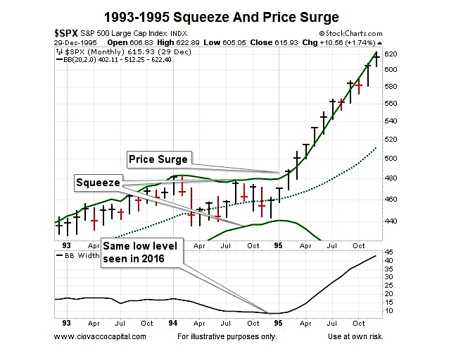
When the squeeze and price surge occurred in early 1995 (see chart below), it told investors the odds of good things happening were improving relative to the odds of bad things happening; the same is true in 2017. The charts help us with probabilities, which are quite a bit different from certainties.
Charts Cannot Predict The Future
Since no indicator can predict an uncertain future, the Bollinger Band set-up that recently occurred helps us with odds over the coming months and years. Signals on monthly charts tell us little about the next few hours, days, and weeks. The set-up described above aligns with other hard data/charts covered in recent months on See It Market, including:
- Signal Has Occcurred Only 10 Other Times In Last 35 Years – August 2016
- Radical Shift Brings New Investment Landscape – November 2016
- History Says Bull Market May Have Room To Run – December 2016
- Will 2017 Turn Into Another 1982 Bull Market Breakout? – January 2017
- Rare Stock Market Indicator Flashes Bullish Signal – February 2017
Taking It Day By Day
As of this writing, the longer-term outlook remains favorable. As always, we will remain open to all outcomes. The charts and hard data will help guide us if we remain flexible and unbiased.
Thanks for reading.
Twitter: @CiovaccoCapital
The author or his clients may hold positions in mentioned securities at the time of publication. Any opinions expressed herein are solely those of the author, and do not in any way represent the views or opinions of any other person or entity.


