The past seven years has seen extraordinary monetary policy employed by the Federal Reserve to satisfy its dual mandate of price stability and full employment. The unemployment rate has declined from 10.0% in October 2009 to 4.9% in January 2016. The number of employed persons has increased from 129.974 million to 143.288 million over the same period. Recognizing the qualitative arguments, quantitative improvement has been achieved in the labor market.
Inflation, as measured by the Consumer Price Index (CPI), has continued to rise during the same period.
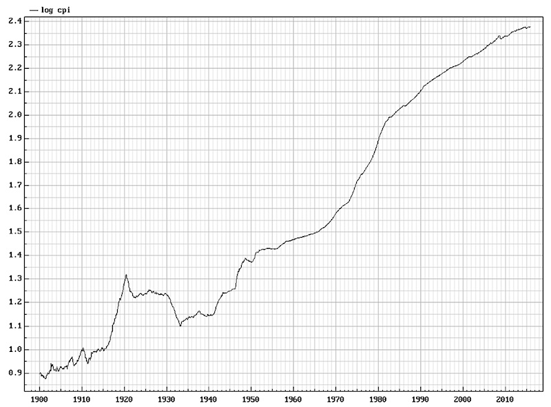
The CPI index has risen from 216.509 in October 2009 to 237.847 in December 2015. The rate of change, as expressed in year-over-year terms, has been erratic. Additionally, the rate of change has been lower than the desired level of 2%, also referred to as price stability.
Given the rise in the U.S. Dollar, the decline in commodity prices, and subdued wage growth, market participants are extrapolating low inflation well into the future.
Setting aside fundamental analysis, what can history can tell us about inflation? The following graph is the log of monthly CPI Index covering the period January 1900 to December 2015.
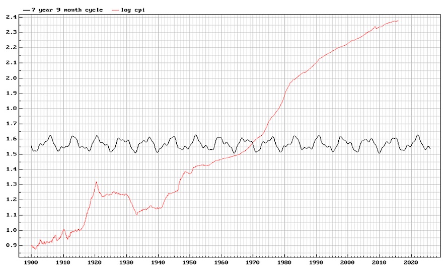
A spectrum analysis of the data identified every possible cycle period. We chose 3 cycles that were identified as being very reliable as measured by the Bartels test; 19.6 months, 42.2 months, and 93.0 months. (The Bartels test measures the likelihood of the cycle being the result of pure chance. A Bartels test with p<0.05 is considered significant, while p<0.001 is considered to be very reliable.)
We then created a composite cycle which has a length of 7 years and 9 months with p=0.00000012. The following graph overlays the composite cycle, extrapolated to January 2026, on the log of monthly CPI Index covering the period January 1900 to December 2015.
In order to improve clarity, the following graph overlays the composite cycle, extrapolated to January 2026, on the log of monthly CPI Index covering the period January 2008 to December 2015.
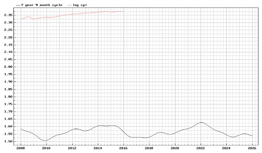
The cycle suggests that the Consumer Price Index will trough in approximately September 2016, move sideways until September of 2017, and then start to move appreciably upward. The next peak is projected to occur in January 2022.
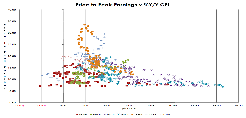
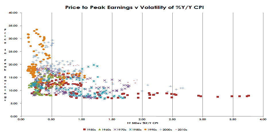
This analysis has significant implications for risk positioning going forward in the equity asset class (i.e. S&P 500 Index). Specifically, history demonstrates that P/E ratios are adversely affected by a high absolute level of inflation (Graph 1) and high volatility of inflation (Graph 2).
As for the fixed-income asset class, current yields across the U.S. Treasury curve offer razor-thin margin(s) of safety; defined as the adverse move in basis points required to eliminate 1 year of yield.
Thank you for reading.
Further reading from Brett: Japanese Yen Futures: A Historical Trend Perspective
Twitter: @Techs_Global
The author has a position in the mentioned security at the time of publication. Any opinions expressed herein are solely those of the author, and do not in any way represent the views or opinions of any other person or entity.


