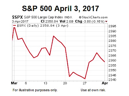
Charts Were Helpful When The S&P 500 (INDEXSP:.INX) Was Struggling On April 3
Since an April 3 article, Why Odds Still Favor New Record Highs In Stocks, proved to be helpful after the S&P 500 had dropped 78 points below the March 1 high, it may be constructive to revisit the same concepts now that the S&P 500 has printed several new closing highs.
This Is What Increasing Fear Looks Like
The chart below shows the S&P 500’s 100-day moving average (blue), 200-day (red), and 300-day (green) during the transition from a favorable period to an unfavorable period (2005-2008). Moving averages allow us to focus on longer-term trends rather than inevitable day to day volatility.
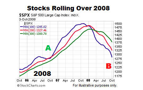
Charts cannot predict the future; they simply help us better understand the odds of good things happening relative to the odds of bad things happening. The left side of the chart above shows a more favorable look with blue, the fastest moving average, on top and the slopes of all three moving averages are positive (bullish trends). The right side shows a lower probability look with blue, the fastest moving average, on the bottom and the slopes of all three moving averages are negative (bearish trends).
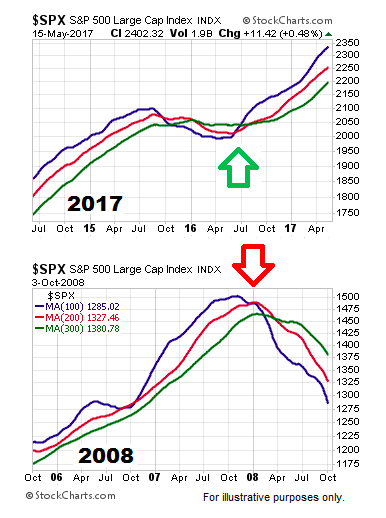
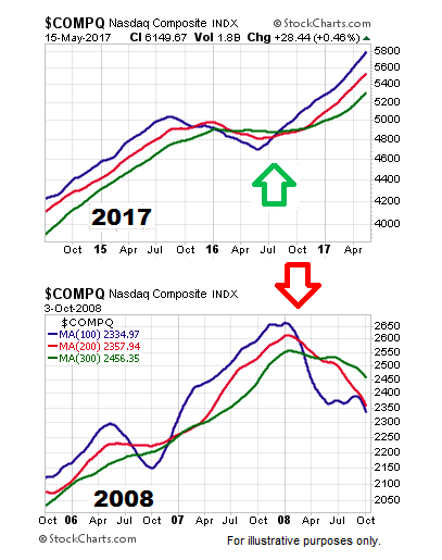
How Does 2017 Compare To The 2007-2008 Peak?
The charts below allow us to look at markets through an unbiased lens. Reviewing the trends below requires no discussion of politics, the Fed, or our personal views on any topic. Do trends in 2017 look more like a favorable period (point A in first chart) or an unfavorable period (point B in first chart)?
ALSO READ: Should Investors Be Concerned By Latest Bond Binge?
History Says Markets Could Surprise On The Upside (2017-2022)
This week’s video covers numerous similarities and differences between the early stages of the powerful 1995-2000 rally in stocks and 2017. Like the charts above, the charts in this week’s video speak for themselves (click link in prior sentence to view video).
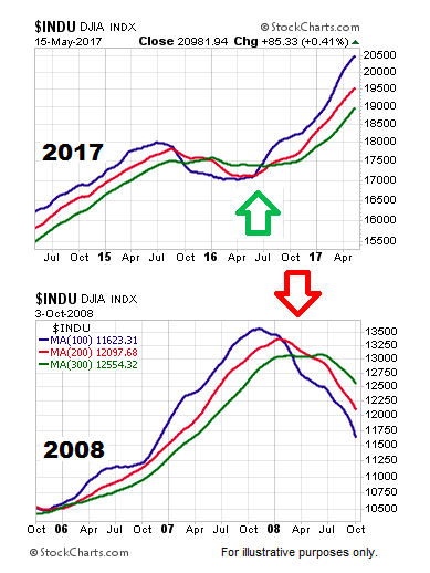
The Dow Jones Industrials (INDEXDJX:.DJI)
Does the Dow look more like a favorable period or unfavorable period? You can decide using the charts below.
The NASDAQ Composite (INDEXNASDAQ:.IXIC)
The same concepts apply to the May 2017 version of the NASDAQ’s daily chart.
continue reading this article on the next page…

: Showing Some Signs of Emerging Strength")
