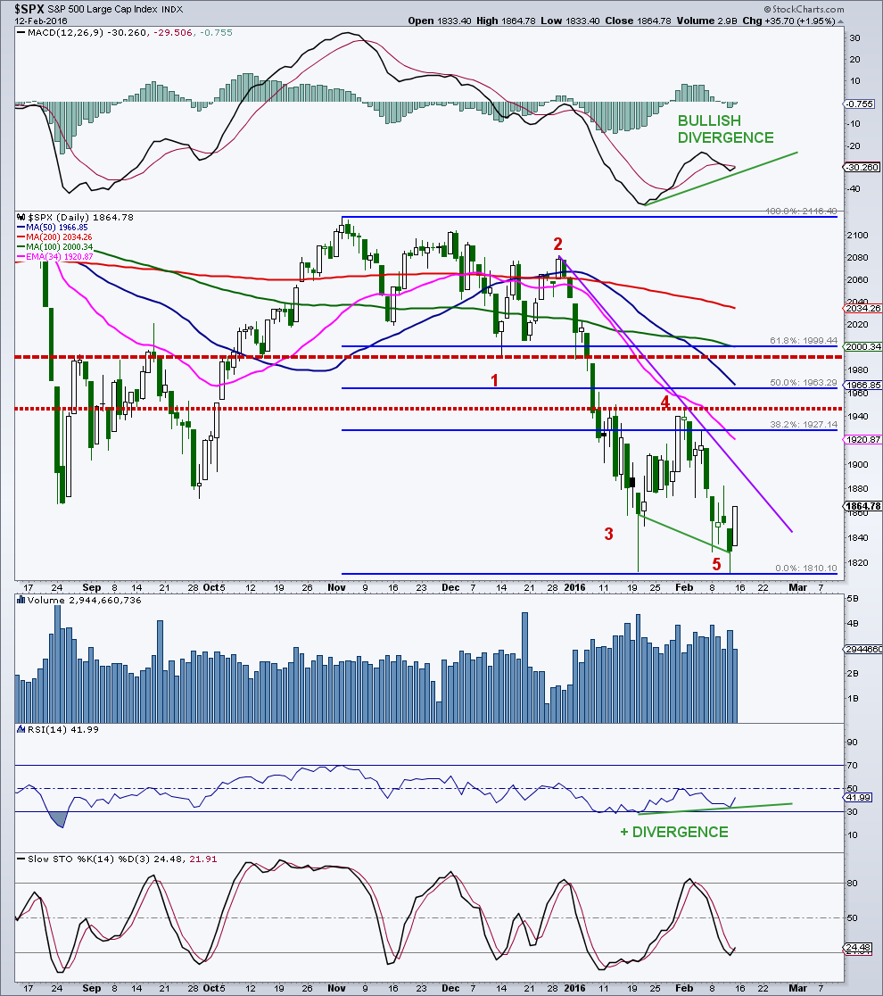
The S&P 500 bounced hard off the 1,812 chart support area and bears have yet to seal the deal.
Based on the current S&P futures activity (+27 at the time of my writing) the “500” is approaching trendline resistance in the 1,895 zone. There are many potential areas of interest on the daily chart for both the bulls and the bears.
- Initial chart resistance, from the February 1st high sits at 1,947.
- Key Fibonacci retracement targets of 50% and 61.8% lie at 1,963 and 1,999 respectively. Chart resistance is also heavy in the 2,000 region.
I believe that the initial bear market decline (5 waves) just completed and that we are now in the midst of a bear market rally. In a bear market, rallies should be three waves, not five waves. So depending on how this rally shakes out, it should be a great tell going forward. The real potential danger, assuming this is a major bear market, will be after this rally ends according to one of the Elliott Wave counts. The next decline would be a wave 3 of 3 and the most dynamic of the bear market. To break that specific bearish count, the recent high at 1,947 needs to be taken out (there are other potential bearish counts) and to really turn the daily chart more constructive, the 2,000 region needs to be retaken. In other words, a lot of technical damage needs to be repaired for the bull market to continue.
On the daily, I have marked some key chart resistance levels (red dashed lines) as well as trendline resistance. There are certainly some nice bullish momentum divergences and would like to see the daily MACD recross its signal (red) line. I will note that in bear markets, bullish divergences do not work out as well as they do during bull markets. They tend to fail.
Also note all the declining moving averages sitting on top of price. Certainly bearish from a longer-term standpoint, if not long-term perspective.
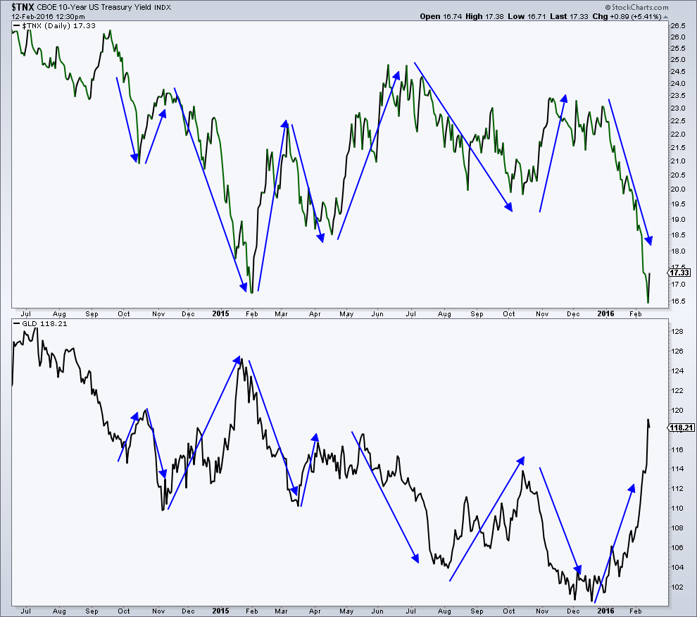
As I said last week , the gold and treasury trade was getting a bit ridiculous and should unwind some here. This chart shows the relationship between the yield on the 10-year treasury and the ETF GLD. It’s pretty convincing that lower yields are gold friendly.
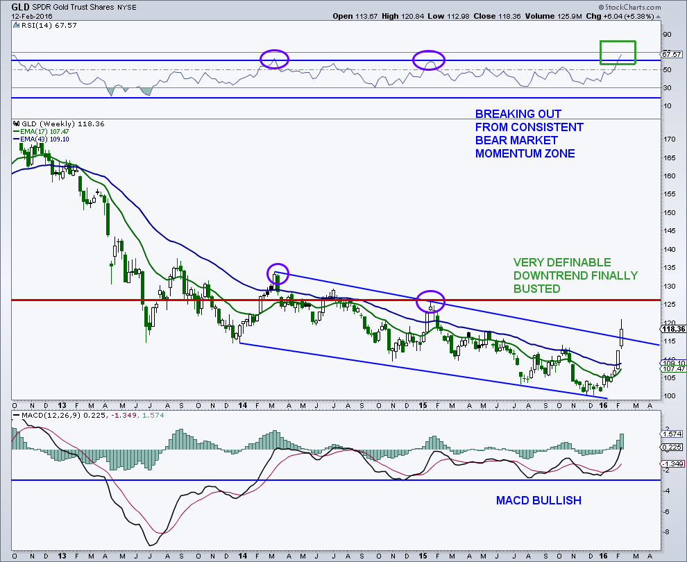
On the weekly GLD chart, price has busted through a bearish channel that has been in place since early 2014, certainly a bullish sign, and something I did not think would happen this fast. The 14-week RSI also broke out from its bear market momentum zone for the first time in years. Commercial hedgers (smart money) had been positioned for a rally, no surprise there, as I have been writing about for months. However, they have reduced their net futures position in gold fairly quickly of late, so I think price does some much needed backing and filling before the next leg higher begins. It’s quite possible that this is a bear market rally that extends well into 2016 before the next leg to new lows.
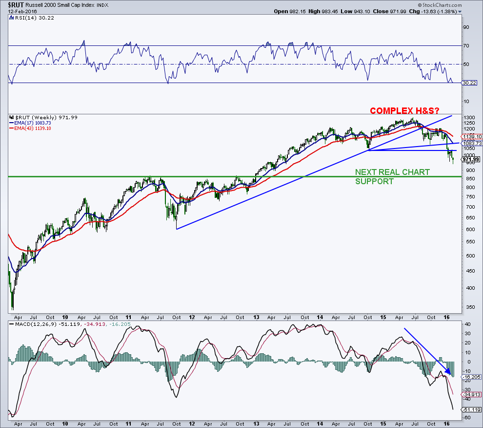
The weekly of the Russell 2000 looks horrible. The next real area of chart support is way down in the 850 region and this also corresponds to a measured move based on the size of the complex and completed head-and-shoulders formation.
You can contact me at arbetermark@gmail.com for premium newsletter inquiries. Thanks for reading.
Read more from Mark: “Market Bears Driving Deep Into Bulls Territory“
Twitter: @MarkArbeter
The author has a position in the mentioned securities at the time of publication. Any opinions expressed herein are solely those of the author, and do not in any way represent the views or opinions of any other person or entity.


: Showing Some Signs of Emerging Strength")
