The reflation trade is also known as the weak-dollar trade; both refer to leadership from assets that tend to perform well during periods of rising inflation expectations and/or a weakening U.S. dollar. Reflation is also used to categorize the early stages of economic improvement after a period of weakness or contraction.
There is no question the market has become interested in weak-dollar/reflation assets in recent weeks. However, the million dollar question is:
Does the current reflation rally have legs to morph into a lasting turn or is this more likely to be another flash in the countertrend pan?
2008-2009: A Reflation Reference Point
While there are countless differences between 2008-2009 and 2016, both periods were preceded by fairly lengthy stretches in which the reflation trade was out of favor, especially from a market leadership perspective. Therefore, if the reflation trade is back to stay, we would expect to see some similarities between the bullish turn in 2008-2009 and the recent turn in 2016.
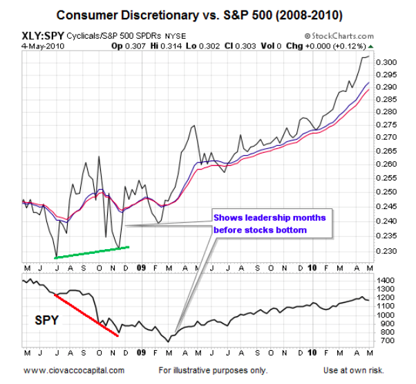
2008-2009: Consumer Discretionary Stocks Flip From Laggard To Leader
If market participants believe reflation will assist with or coincide with better economic outcomes, it stands to reason that consumer discretionary stocks would begin to pick up a stronger bid, which is exactly what happened in late 2008. In the chart below, notice how the XLY:SPY ratio bottoms months before the S&P 500 Index, which hinted at improving odds relative to the economy and markets.
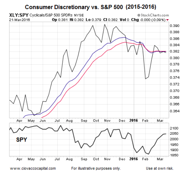
If we examine the same ratio on the same weekly chart, what can we learn about 2016? Unlike 2008, which featured an improving XLY:SPY ratio, the trend over the past few months has been weaker (lower highs and lower lows). While it is quite possible the ratio will go on to complete a bullish turn in the coming weeks and months, from an “evidence in hand” perspective, it has not occurred yet.
2008: Emerging Markets Were In Better Shape
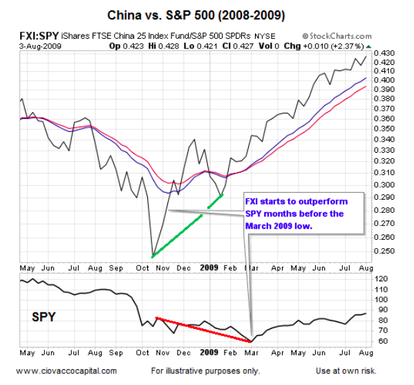
During the Financial Crisis emerging market economies were not carrying the same debt burdens as the U.S. economy, which allowed emerging markets to provide some leadership as fear started to wane in late 2008 and early 2009. The China ETF (FXI) bottomed relative to the S&P 500 in October 2008 or well before U.S. markets turned in early March 2009. Notice the steep slope of the FXI:SPY ratio in early 2009.
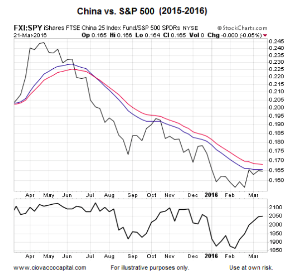
Fast forward to 2016 and China has joined the debt-burden club. The FXI:SPY ratio in 2016 does not inspire confidence about China’s prospects relative to those in the United States. FXI has gained some traction relative to the S&P 500 (SPY) in recent weeks, but so far it looks nothing like the steep slope in early 2009.
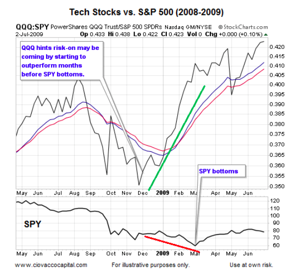
2008-2009: Tech Stocks Take The Lead
The NASDAQ tends to feature newer high-tech companies relative to the S&P 500’s more seasoned mix of large caps stocks. Therefore, typically, demand for popular Nasdaq 100 ETF (QQQ) picks up when market participants become more confident about future economic outcomes. Similar to FXI, QQQ started to run relative to SPY months before the March 2009 bear market low. Notice the strength of the QQQ:SPY trend in early 2009 (before SPY bottoms).
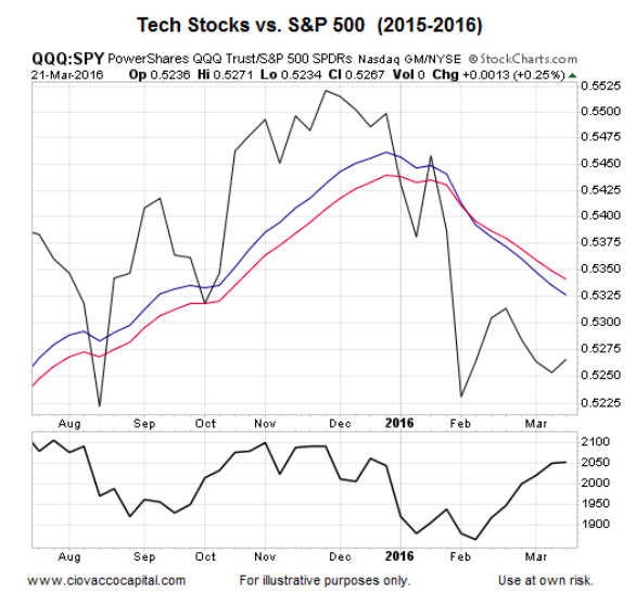
The current trend in QQQ:SPY is a stark contrast to the confident look in early 2009. QQQ has shown some relative improvement in recent weeks, but it still has work to do from a trend perspective.
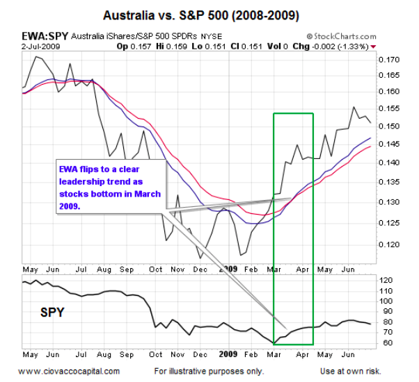
Australia Assists With Keeping An Open Mind
Australia is a commodity-rich nation. Commodities prices tend to rise as economies improve and/or central banks flood the financial system with liquidity. While the EWA:SPY ratio did not bottom before the major U.S. stock market indexes, it did provide leadership after the March 2009 turn.
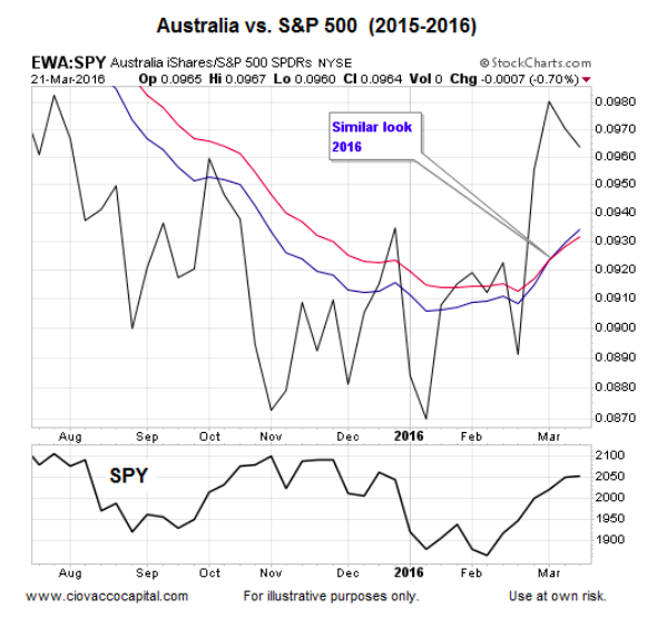
The 2016 version of the ratio looks much improved and similar to the bullish turn in 2009, helping us remain open to better than expected outcomes for stocks and reflation-friendly assets in the weeks and months ahead. If the EWA:SPY ratio begins to weaken, especially if it reverts back to a weekly downtrend, the odds of a sustained reflation rally will drop.
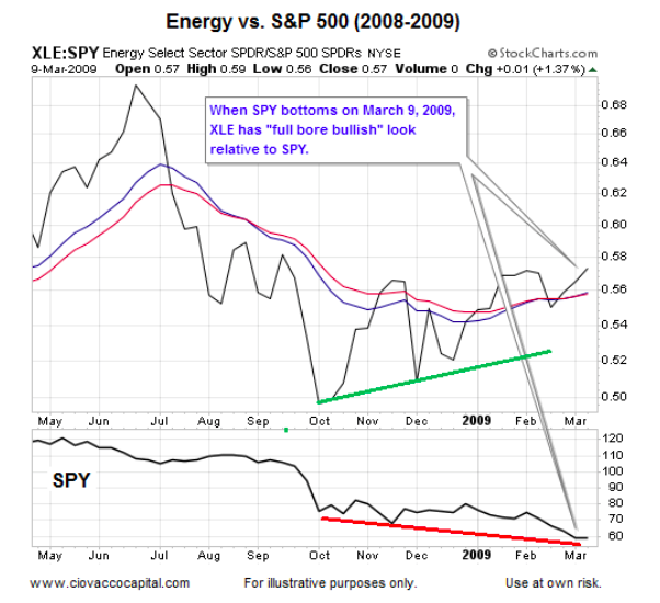
Energy Started To Lead In Late 2008
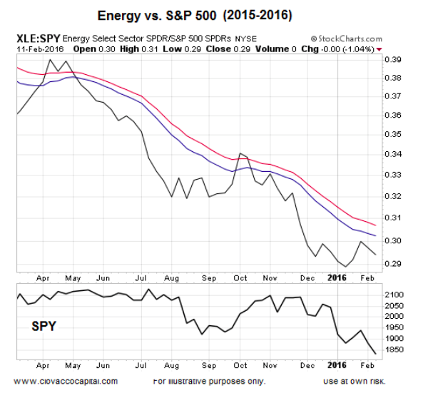
Energy needs a “supply glut in 2016″ caveat, but we can still learn something about economic conviction and the reflation trade by comparing the two periods. The energy sector ETF (XLE) started to outpace SPY months before SPY found a bottom in March 2009. The chart below shows the ratio on the day the SPY bottomed (end of the bear market).
The chart below is as of February 11, 2016, the day the stock market bottomed. The 2016 XLE:SPY ratio looks nothing like the 2008-2009 reflation turn.
continue reading on the next page…


: Showing Some Signs of Emerging Strength")
