In professional baseball, there is a performance standard called the Mendoza Line, a term coined in 1979 and named after Mario Mendoza, a player that struggled to hit consistently throughout his career. The standard or threshold is a batting average of .200. If a player, other than a pitcher, is batting less than .200, they are not considered to be of professional grade.
Investors’ also have a Mendoza Line of sorts.
This one, the yield curve, serves as an indicator of future recessions.
Since at least 1975, an inverted yield curve, which occurs when the 2yr U.S. Treasury note (UST 2) has a higher yield than the 10yr U.S. Treasury Note (UST 10), has preceded recessions. Currently, the 2s/10s yield curve spread has been flattening at a rapid pace and, at only 0.33% from inversion, raises concerns that a recession might be on the horizon.
Interestingly, the Federal Reserve (Fed) recently introduced the merits of a new yield curve formula to supplement the traditional curve and better help forecast recession risks. Might it be possible the Fed has brought this new curve to the market’s attention as it does not like the message the traditional curve is sending?Given that the Fed Funds rate remains very low despite recent increases, is it possible the Fed is desperately attempting to increase the monetary ammo available for the next recession?
Regardless of the Fed’s intentions and whether the market takes the Fed’s bait and buys into a new recession warning standard, understanding the differences between the traditional curve and the new curve provides valuable insight into what the Fed’s reaction function might be regarding enacting monetary policy going forward.
Traditional 2s/10s Curve
*In this article we solely refer to traditional yield curve represented by UST 2 and UST 10. There are other curves that use different maturities and credits which provide value as well.
The yield on the UST 10 not only reflects the supply and demand for ten-year government debt securities but importantly embedded in its yield are investors’ expectations for inflation and growth. These expectations are influenced to some degree by the Fed’s monetary policy stance.
The UST 2, on the other hand, is much more heavily influenced by the Fed Funds rate set by policy-makers and less so by long-term growth and inflation expectations.
Therefore, the UST 10 provides information about how borrowers and lenders view future economic activity and inflation, while the UST 2 affords us insight into how the Fed might change interest rates in the future. It is this intersection of the Fed’s interest rate policy and the heavy reliance on debt to fuel economic activity that makes the 2s/10s yield curve an especially compelling indicator today.
The graph below charts the correlation between Fed Funds rate expectations, as quantified by the rolling 8thFed Funds futures contract, and benchmark maturity Treasury securities. The 8thFed Funds contract denotes market expectations for eight months forward. It is the longest contract available without compromising price consistency due to illiquidity.
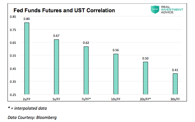
From 2000 to the present, the correlation of UST 2 and Fed funds futures is a positive 0.80. In other words, 80% of the price change of the UST 2 is explained by expectations for future rates of the fed funds rate. As shown, correlation declines as the time to maturity increases. The relationship between the UST 10 and Fed funds future is .56, which is significant but less dependent on Fed Fund expectations than the UST 2.
continue reading on the next page…


