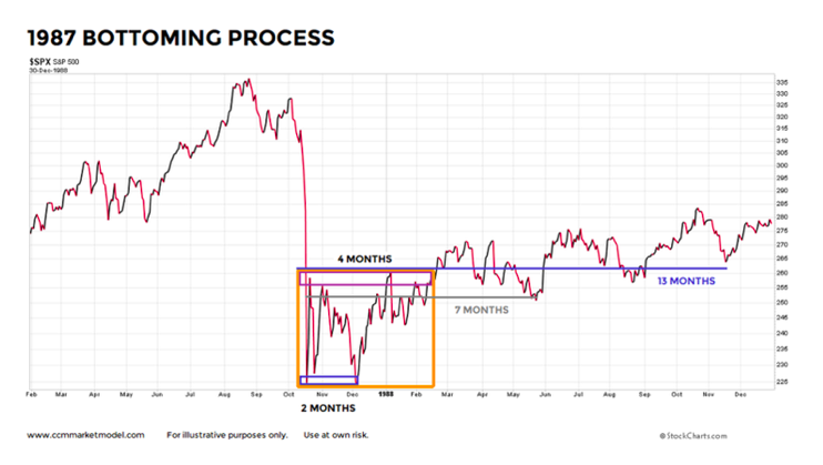
A February 13 investing article reviewed several post-plunge market profiles that featured a period of consolidation, including the 1987 case below.
WE NEED A HEALTHY CORRECTION
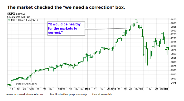
In 2018, prior to the recent volatility, the S&P 500 was rising in a manner that caused many to say, “we are in desperate need of a healthy correction”.
MILLION DOLLAR QUESTION
In the markets, simple tends to be more effective versus complex. Therefore, in the wake of the long-awaited “healthy 10% correction”, it is prudent to ask does the present day look like:
(1) A correction within the context of an ongoing bull market, or
(2) The early stages of a new bear market?
Why are these simple questions so important? If the answer is “a correction within a bull market”, it implies patient investors will be rewarded with higher highs (and higher profits) in the coming weeks/months. If the answer is “a new bear market”, lower lows are on the way.
THE PRIMARY TREND
Ultimately, we are asking if the primary bullish trend is still in place or is it looking vulnerable to rolling over into a primary downtrend. If we take the chart above and add in a simple trend reference point, the 200-day moving average, we have to lean toward the “this looks like a correction within a bull market” answer.
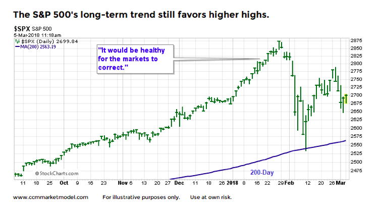
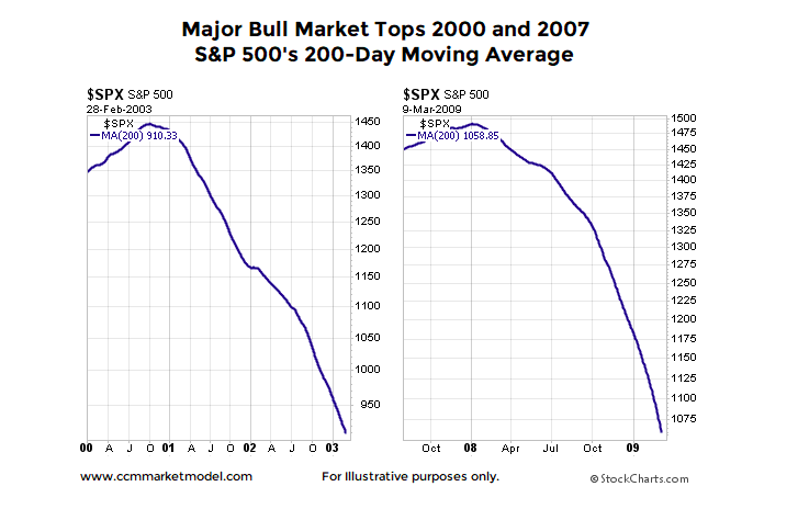
If the primary trend rolls over and morphs into a long-term bear market, we would expect to see price drop below the 200-day moving average – today it remains above the 200-day. More importantly, when the primary trend rolls over into a long-term downtrend, the slope of the 200-day moving average flips from positive to negative as it did near the major market tops in 2000 and 2007.
WILL A TRADE WAR BRING DOWN THE BULL?
A fair counter to the 200-day charts above is “that is one data point”. This week’s video looks at numerous data points on numerous timeframes to help us better understand the market’s vulnerability to a bear market in light of recent developments regarding tariffs. The primary focus of the video is monthly Bollinger Band signals for the S&P 500. As shown in the video, Bollinger Bands were very helpful prior to and during the stock market’s major peak in the year 2000. The video compares and contrasts 2018 with the hard data in 2000.
ALL TRENDS PAUSE FROM TIME TO TIME
The expression “the market needs to consolidate its gains” speaks to the need for a healthy pause/pullback/correction within the context of an ongoing bullish trend. As of this writing, the facts we have in hand tell us the odds favor higher highs in stocks in the weeks/months ahead.
As always, we will continue to take it day by day, remaining open to a shift in the observable evidence and bull/bear probabilities. As noted in early January, assessing the odds via charts/hard evidence was extremely helpful in terms of remaining invested with the primary bullish trend in calendar year 2017.
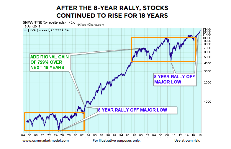
HISTORY SAYS STOCKS CAN KEEP GOING UP
While it may seem implausible for stocks to continue to rally for many years, history says stocks can keep going up. Check out our article from earlier this year on this subject.
Twitter: @CiovaccoCapital
The author or his clients may hold positions in mentioned securities at the time of publication. Any opinions expressed herein are solely those of the author, and do not in any way represent the views or opinions of any other person or entity.


