THIS IS WHAT A MAJOR TREND REVERSAL LOOKS LIKE
The three periods shown below produced an average peak-to-trough loss of over 50% on the S&P 500 Index (broad stock market gauge).
Thus, it is prudent to understand some of the common characteristics found in all three cases.
We can then look for similar characteristics in the present day stock market.
Imagine if you were a few years away from retirement when the 1973-1974 bear market hit. The S&P 500 dropped 48.2% causing many sleepless nights.
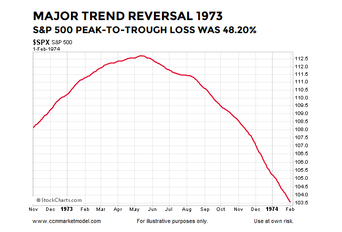
The chart above shows the S&P 500’s 200-day moving average during the earlier stages of the 1973-1974 bear market that came to an end on October 3, 1974. The chart seems fairly simple, but contains a ton of valuable information about a major shift in investor expectations regarding future economic and market outcomes.
While the combination of fundamental factors, including valuations, interest rates, inflation, economic issues, and geopolitical events are significantly different in all three major bear markets, there are also important and consistent lessons for investors.
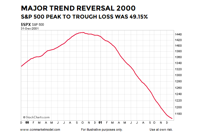
On the left side of the 1999-2001 chart below, the net aggregate opinion of all market participants regarding all subjects on all timeframes was bullish. Consequently, the bias was for the market to move higher based on positive expectations about future economic and market outcomes.
In the early stages of the bear market, more and more market participants begin to respect the problems of the day, resulting in a major and sustained shift in the net aggregate opinion of all market participants regarding all subjects on all timeframes. Consequently, the odds shift to favoring a series of lower lows rather than a series of higher highs.
These examples provide a fact-based response to a common objection to historical studies:
“But today is significantly different from the periods shown in numerous ways.”
“Today is different” is always true. No two periods in human history have the exact same combination of fundamental, geopolitical, economic, psychological, and technical factors.
The three painful bearish periods shown here (1973-1974, 2000-2002, and 2007-2009) are all unique in significant ways, but the process of a major shift in the net aggregate opinion of all market participants looks very similar in all three cases. Stated more simply, the whys differ in each case, but the major trend reversals are very similar.
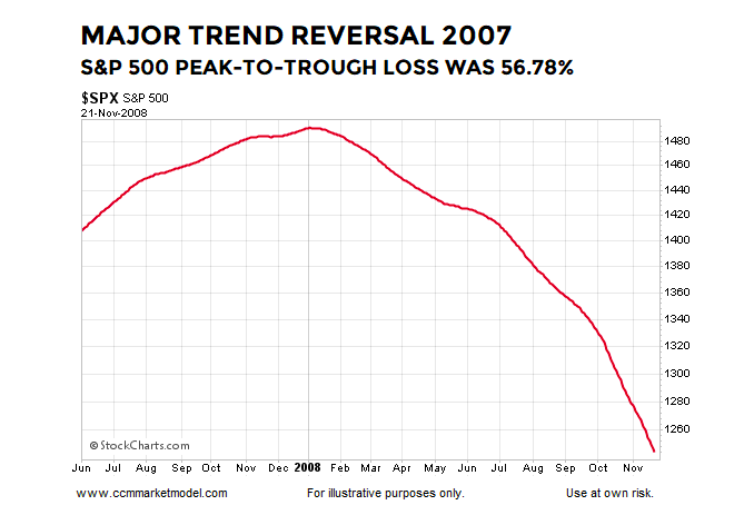
The early stages of the financial crisis bear market occurred in a significantly different fundamental environment relative to the oil embargo 1970s and dot-com-hyped early 2000s, but the process of a major shift in market sentiment is similar in many important ways. There is nothing magical about the 200-day moving average; this is an exercise in pattern recognition. Chart patterns reflect patterns of human thought. People think and behave in similar ways near a major market peak because human greed and fear are constants. The same is true for all patterns in the stock market (bullish, neutral, and bearish).
HOW DOES THE SAME CHART LOOK TODAY?
If we look at the question above, it can be rephrased in this manner:
“Are we seeing a similar bearish shift in the net aggregate opinion of all market participants regarding all relevant subjects on all timeframes?”
The answer is no. The present day chart also represents a discernible pattern in human behavior.
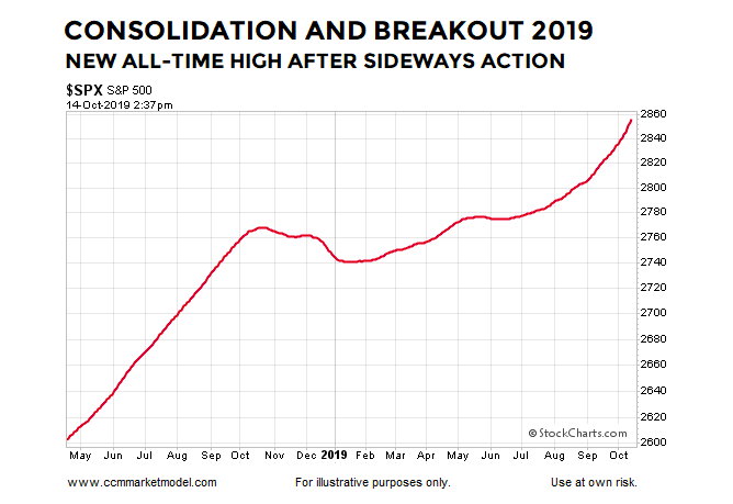
From a traditional charting perspective, the 2019 chart below appears to be a continuation pattern.
The trend on the left side of the chart below is bullish. We are all familiar with the expression the market needs to consolidate its gains, which is exactly what took place in the center of the chart below.
Given what we know today, we have a bullish trend, a period of consolidation, and what appears to be a resumption of the bullish trend.
Does the chart above look anything like the 1973-1974, 1999-2001, or 2007-2008 major-bear-market-reversal charts above?
continue reading on the next page…


: Showing Some Signs of Emerging Strength")
