Predicting the future direction of the markets is 1) really difficult, 2) never about certainties, and 3) all about probabilities.
Because of those three truths, I like to focus on price itself.
As legendary technical analyst and mentor Ralph Acampora once said, “The only thing you can’t restate is price.”
I also like to surround myself with guideposts that help me see when the weight of the evidence is changing from bullish to bearish, or vice versa.
Three charts in my daily routine have started to turn from bullish to bearish, suggesting caution in the coming weeks and months.
First, we have the non-confirmation in the widely-followed FAANG stocks (vs the S&P 500).
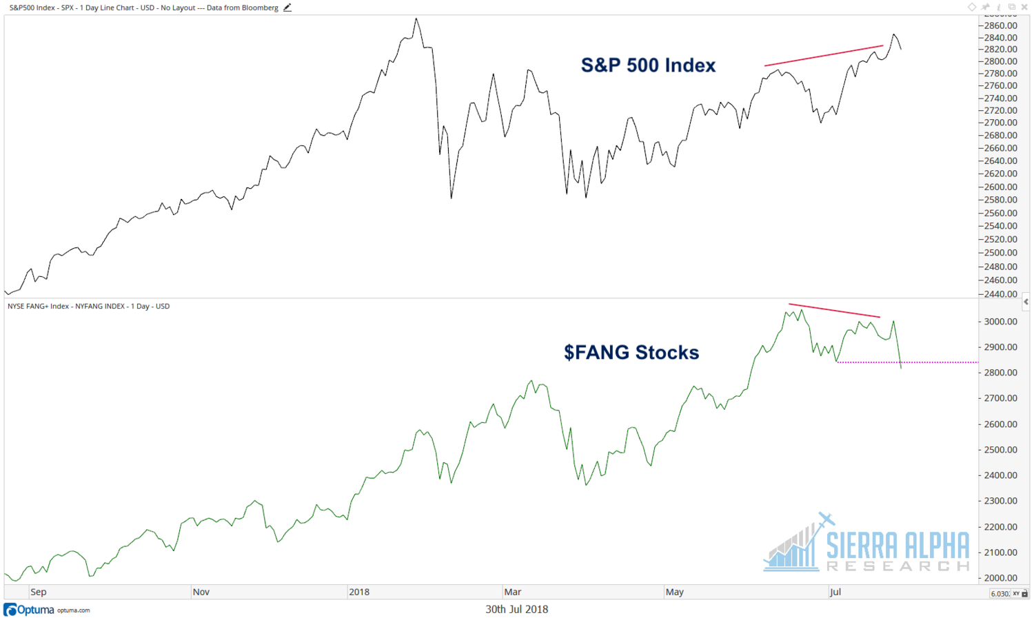
As the S&P 500 (NYSEARCA: SPY) moved to new highs through the month of June, the NYSE FANG+ index (which includes a number of non-FAANG but FAANG-y stocks like TWTR and TSLA) failed to reach a new high. This sort of “non-confirmation” comes from Dow Theory, where Charles Dow looked at the Industrials and Rails to see if they confirmed each other’s patterns.
After failing to reach a new high, the FANG+ index broke to new lows last week on the weakness in Facebook (NASDAQ:FB) and Twitter (NASDAQ:TWTR). What’s very interesting is that even with these leadership names breaking down, the S&P 500 as a whole is still in fairly positive shape. This speaks to how leadership is not as narrow as many (including me) have feared!
Second, the Consumer Discretionary to Consumer Staples ratio has finally broken down after years of Discretionary outperformance.
This ratio is more than just a read on the consumer space. It also speaks to general risk appetite and whether investors are leaning more toward offense or defense.
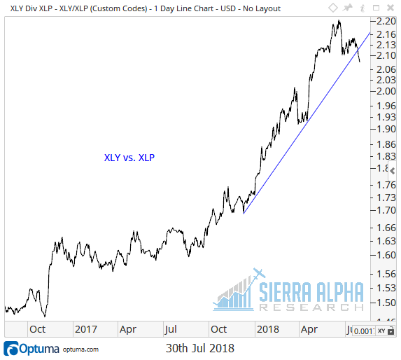
This ratio has been in an uptrend for years, and has rarely put in a lower low, even during pullbacks. While it’s still early days, this potential change in trend could signal a further rotation in leadership. This also speaks to the fact that there are many opportunities outside of the FAANG names. This ratio only turns down if there are stocks in Consumer Staples that are worth considering here.
Finally, we have the potential breakdown in the momentum factor.
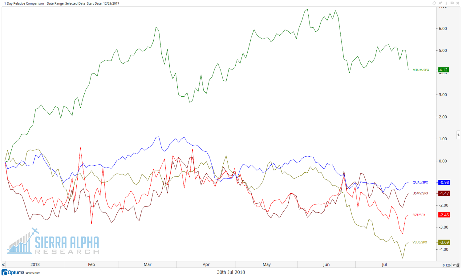
Momentum has dwarfed all other factors in 2018. In fact, it’s the only main factor I follow that has outperformed the S&P year-to-date. Here we see the MTUM ETF up 4% relative to the SPX in 2018, while the other factors are down 1% to 4% relative YTD.
The chart that concerns me is the one below, which shows the momentum ETF relative to the S&P 500. This ratio has shown a similar pattern to the Consumer Discretionary to Consumer Staples ratio, and has not put in a lower high since 2016.
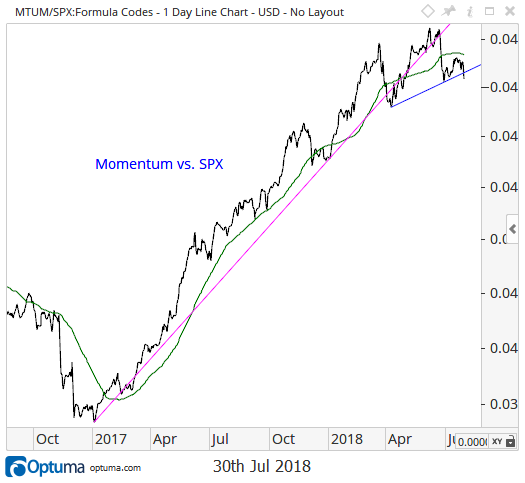
What this chart tells me is that the underlying dynamics of the US equity markets are shifting from a pro-momentum market to a something else market. Notice how in the earlier chart all of the other factors are popping up while momentum is dropping lower.
This is certainly not a “the sky is falling” chart, as there are plenty of stocks that are holding up just fine. But it does mean that if you’ve been blindly following the pro-momentum trade in 2018, it may be time to diversify your thinking a bit.
While none of these three charts are terribly negative, they’re certainly not terribly positive. They speak to a rotation in leadership, and perhaps suggest that the days of sitting back and watching the FAANG stocks fall upwards may be behind us.
Twitter: @DKellerCMT
Any opinions expressed herein are solely those of the author, and do not in any way represent the views or opinions of any other person or entity.

: Showing Some Signs of Emerging Strength")
