Two themes stand out as I review stock market charts this week.
First, the leadership of the supersized MANIA names that seem to dwarf everything else. Second, charts in the Financials sector (NYSEARCA:XLF) that have been notable underperformers over the last six weeks.
Let’s review both themes and let the charts tell the story.
The MANIA or FAANG theme is one of narrow leadership.
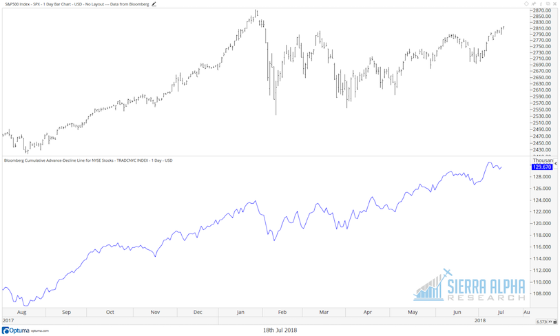
While many have pointed out that breadth remains positive (which is true- see the chart below showing the consistent uptrend in the NYSE cumulative advance-decline line), I would say there is no denying that a relatively small number of stocks have contributed a relatively large percentage of gains for the S&P 500.
As the quant team at Bank of America Merrill Lynch recently pointed out, “Excluding FAANG stocks, index returns [YTD] would have been negative.” As a matter of fact, only three sectors have outperformed the S&P in the first half of 2018, with Health Care just barely eeking out a positive number.
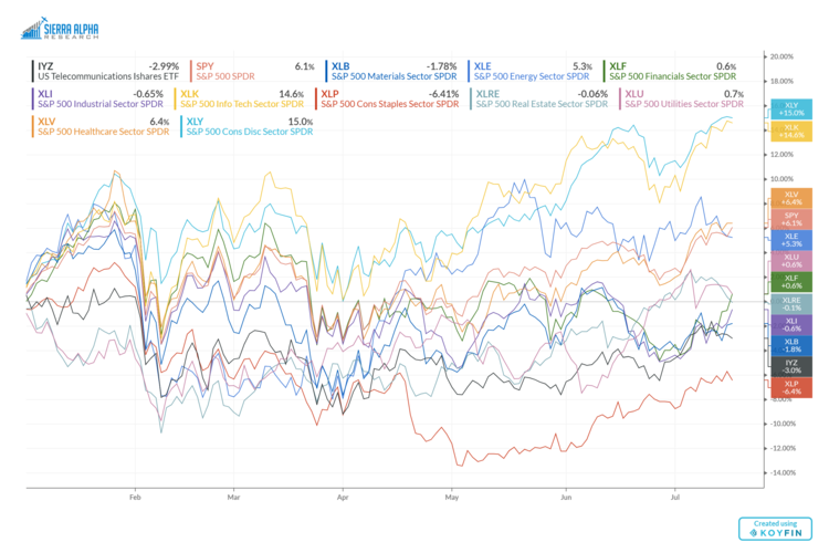 Now to be honest, you can ignore the fact that the four largest sectors have the four best returns YTD. And with Technology and Consumer Discretionary putting up outsized gains, it’s easy to make a bull case.
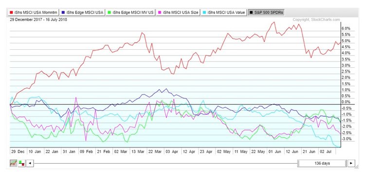
Another way to measure this sort of narrow leadership is using the momentum factor. The “mo” trade has just worked and has handily beaten pretty much every other factor out there.
I would say that the combined market cap of the megacap tech/consumer stocks means that their uptrends are having an oversized effect on the chart of the SPX. If and when the MANIA names break (NFLX’s selloff this week could be the beginning of that, but I’ll believe it when I see it on the chart!), the SPX will reflect that weakness just as much as it has reflected their strength all this time.
Now, more than ever, it is important to review what’s happening elsewhere in the equity markets, as I could see a situation where the MANIA names struggle and other sectors and groups start to outperform.
In a Bloomberg Television interview last week, I suggested that Financials had the most to prove heading into earnings season. I followed that up with an article reviewing the charts of large banks and asset managers to illustrate the short-term downtrends.
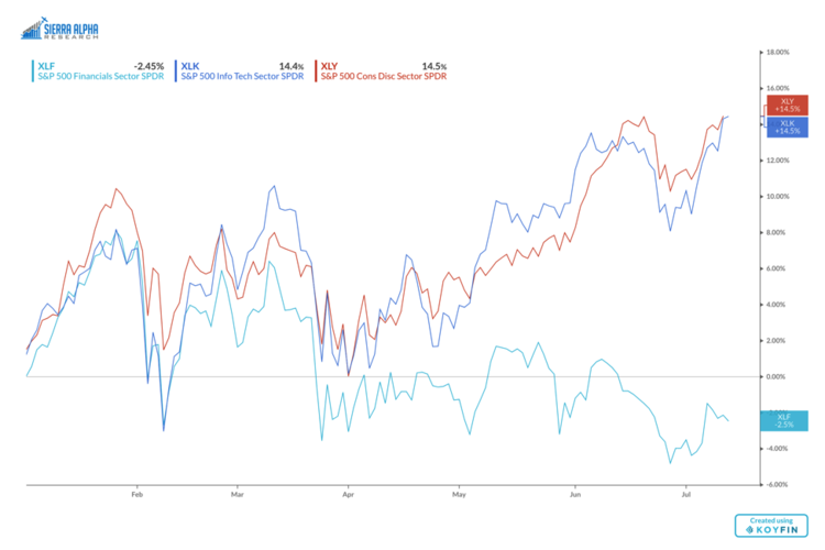
So far, earnings have been fairly positive and the banks have rallied this week. It’s interesting to note that stocks like JPM and GS have now recovered to a trendline using the 2018 highs.
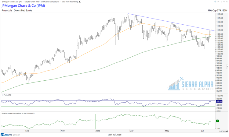
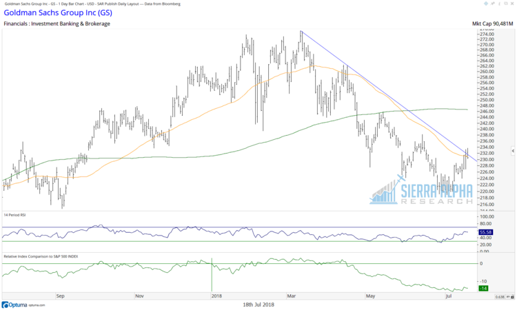
So far, earnings have been fairly positive and the banks have rallied this week. It’s interesting to note that stocks like JPM and GS have now recovered to a trendline using the 2018 highs.
Twitter: @DKellerCMT
Any opinions expressed herein are solely those of the author, and do not in any way represent the views or opinions of any other person or entity.


: Showing Some Signs of Emerging Strength")
