 Charts allow us to monitor the never-ending battle between bullish economic conviction and bearish economic conviction. Experienced traders know higher beta and more economically sensitive ETFs tend to outperform when bullish confidence is greater than bearish concerns… reflecting a bullish stock market. So where are we now?
With the ongoing political posturing in Washington and a fast approaching debt ceiling deadline, many believe we are headed for a sharp drop in stocks similar to 2011. In most cases, economically sensitive ETFs were waving yellow flags several months before the August 2011 waterfall plunge in stocks. What are those same ETFs telling us today?
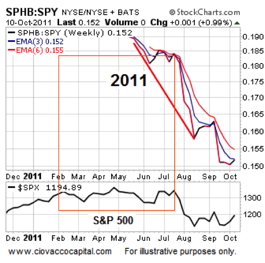
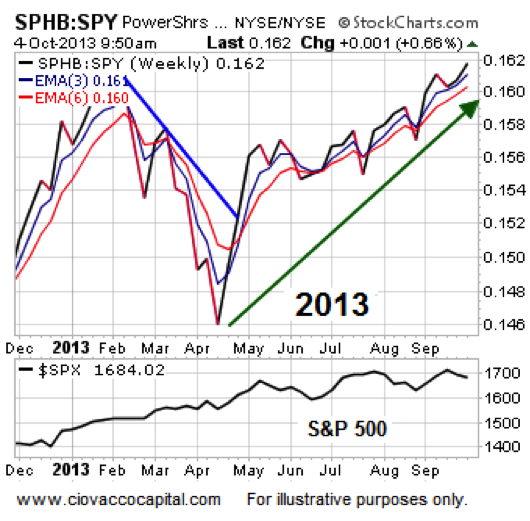
2011 vs. 2013: Relative Strength
The SPHB ETF tracks higher beta market sectors, such as financials, energy, technology, consumer cyclical, and basic materials. The chart below shows traders were avoiding these sectors several months before the “surprise” downgrade of U.S. debt. The bottom of the chart shows when the August 2011 waterfall plunge in the S&P 500 occurred.
Open To Bullish Stock Market Outcomes Post Debt Ceiling
The same chart paints a much different picture in 2013. Instead of avoiding higher beta and economically sensitive sectors, traders are favoring those assets over the broader market. The chart below does not discount the possibility of short-term volatility and weakness as politicians follow their “I am fighting for my constituents and want to get re-elected” script, but it does tell us to keep an open mind about bullish stock market outcomes once things calm down.
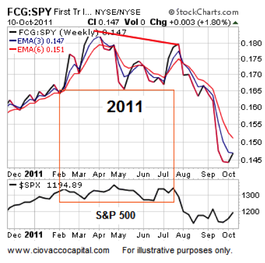
Still Skeptical?
Since SPHB is thinly traded, you may discount the charts above. The tour de force presented via the charts below is difficult to brush aside. The high beta natural gas ETF (FCG) was underperforming SPY for four months before the August 2011 downgrade of U.S. debt.
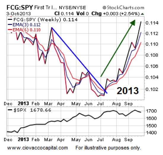
Instead of waving yellow flags in 2013, FCG is telling us to keep an open mind about higher highs in stocks once the debt ceiling issue is put to rest.
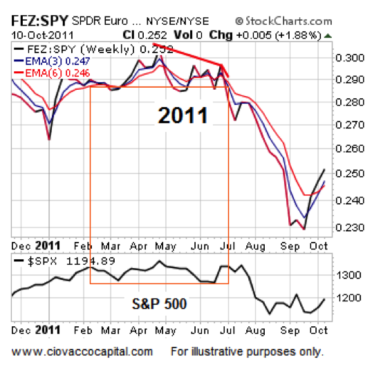
The problems in Europe related to excessive debt have not been solved; the ECB kicked the can down the road via the unlimited 3-years loans for banks. The EURO STOXX 50 ETF (FEZ) made a lower high relative to SPY in early July 2011, which helped foreshadow the pain that was right around the corner.
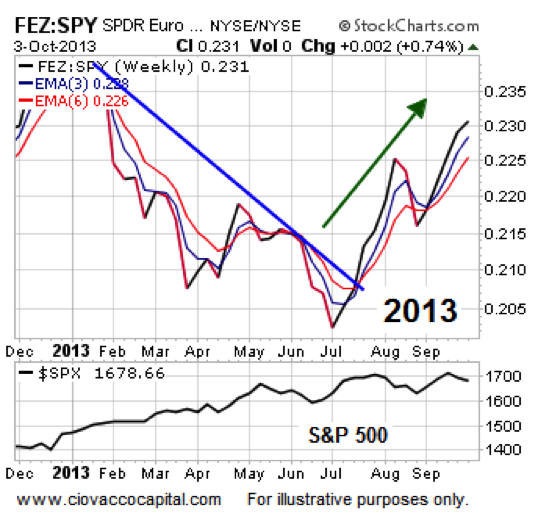
In the past, we have covered the three steps required for a bullish trend change. The 2013 chart of FEZ vs. SPY is a textbook example of a bullish turn and looks nothing like the 2011 chart above.
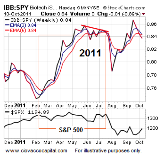
If you think innovation and high-risk/high-reward, biotech comes to mind. IBB vs. SPY made a lower high prior to the difficult period in 2011.
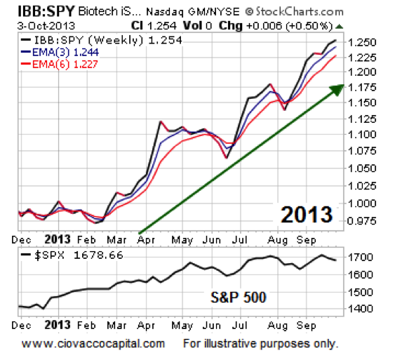
The 2013 chart of IBB vs. SPY looks nothing like the 2011 version. It looks much more like a market that is willing to accept risk in search of higher rewards.
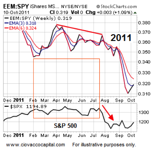
Emerging markets were weak on a relative basis four months before traders ran for the exits in late July/early August 2011.
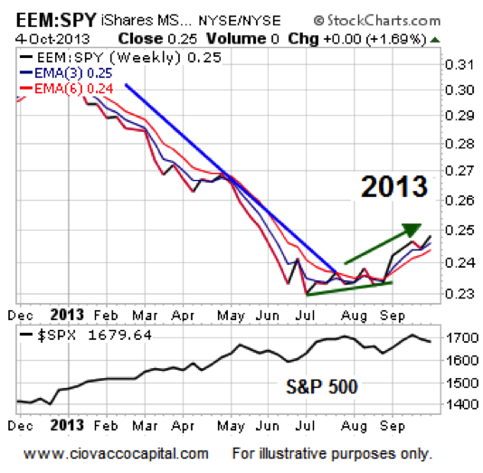
As shown in the 2013 chart below, emerging markets have been outperforming in recent weeks and they were ahead of SPY this week as of Thursday’s close.
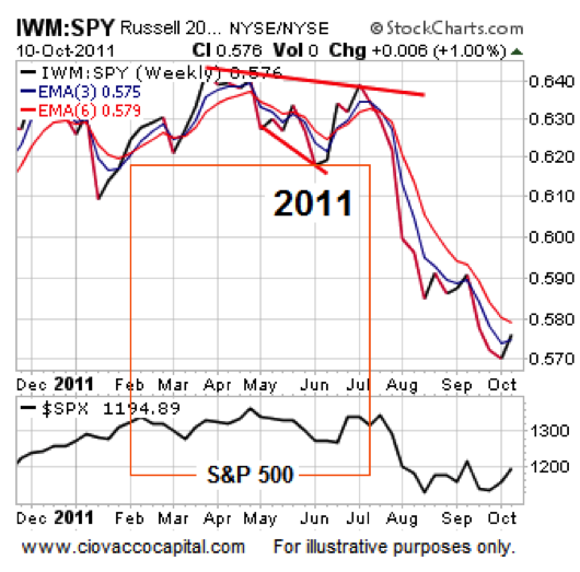
On a relative basis, small caps peaked in late March 2011, which added to the risk-off pile of evidence that was clearly evident.
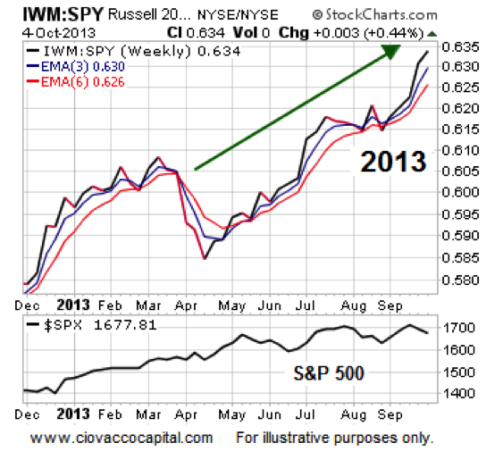
Small caps tend to perform better when traders and investors are confident about future economic outcomes; and this is reflected in a bullish stock market. Compare and contrast the 2011 chart above and the 2013 chart below; 2013 looks better.
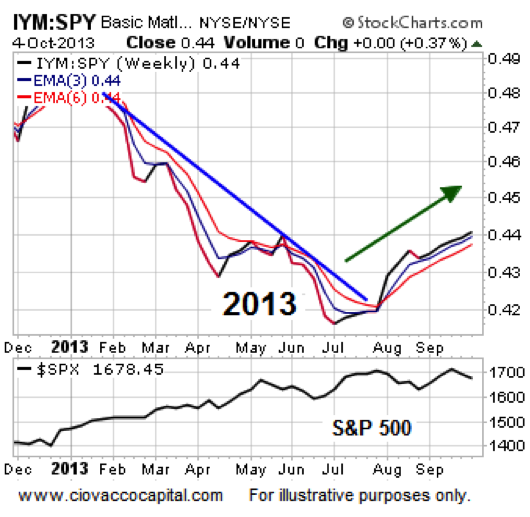
When the economy is weak the demand for raw materials begins to wane. IYM was in an established downtrend vs. the S&P 500 when our friends in Washington caused all kinds of stock market unrest in 2011.
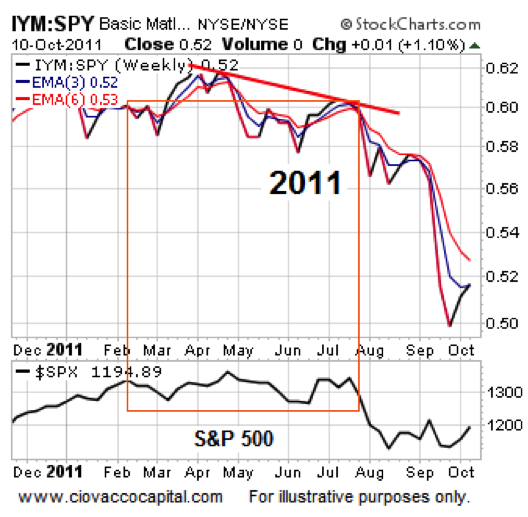
In the present day, materials have seen positive demand since hitting a low relative to SPY in late June.
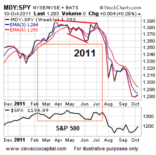
Midcaps peaked in late March 2011, which aligns with a cautious market. In early July 2011, MDY began to tank relative to SPY, which equates to a rapidly waving yellow flag.
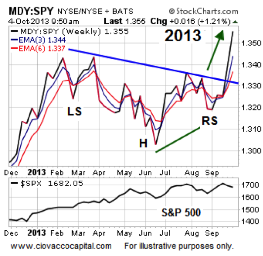
In 2013, you can make an argument that MDY recently broke out of a bullish inverted head-and-shoulders pattern vs. SPY.
Tech stocks underperformed for the first five months of 2011, which aligned with the “we are being careful” case.
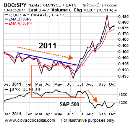
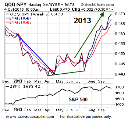
In stark contrast to the 2011 chart above, the QQQs have been beating SPY since early April 2013, which aligns with the “risk-on” case.
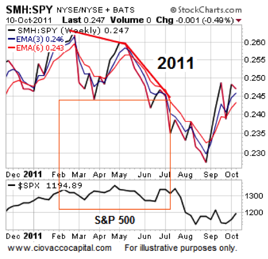
Similarly, semiconductors were seeing little in the way of support from investors for the first six months of 2011.
In 2013, SMH made a low relative to SPY in early April and has not revisited that low since. The most recent relative low was made almost eight weeks ago.
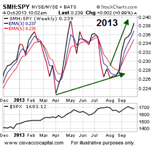
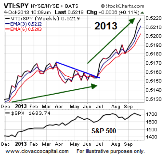
The last two charts speak to market breadth. Healthy markets have broad bullish stock market participation, which is not what was present in 2011.
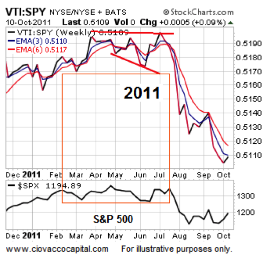
The broader VTI is outperforming SPY in 2013, which tells us to be open to bullish outcomes in the weeks ahead.
Argument Valid As Long As Charts Support It
One of the most important things in trading and investing is the concept of paying attention to the tape vs. trying to forecast the tape. This video segment makes an argument for paying attention rather than forecasting. In its present form, the tape looks almost nothing like the pre-2011 plunge period, which reflects a market that may be ready to push higher once the dust settles on the debt ceiling. If the tape and charts above deteriorate, we must be willing to adjust accordingly. As things unfold, we will provide updated charts via the CCM Twitter Feed: @CiovaccoCapital.
Thanks for reading.
Author holds long positions in SPY, EEM, IWM, QQQ, MDY, VTI, and SCHB at time of publication.
Any opinions expressed herein are solely those of the author, and do not in any way represent the views or opinions of any other person or entity.
: Creating Bullish Divergence?")


 and Semiconductors (SMH): Concerning Price Pattern?")


