Not quite a month ago we posted an article showing ways a decline in treasury bonds could play out.
Since that time, we realized there’s more our readers might like to hear about the treasuries breakdown in the big-picture and its relationship to the more recent post we made about major stock indices.
Long-time readers may remember that bonds adhered pretty closely to the Elliott wave pattern we had been emphasizing since 2011. Because it was also a terminal pattern, the downward reversal of 2016 was expected.
Treasuries and equities waltzing together, but one is likely to misstep
Even with the pattern embarking on a new downward phase, bonds have been recognizing the supports and the chart geometry that we would expect. Going forward, there are two main downward scenarios for bonds – with one more immediately bearish than the other, although both scenarios bearish in the long run.
The scenario that bonds choose may also influence which of two competing scenarios takes place in the U.S. stock indices. For example, an accelerated decline for bonds (our main scenario) could coincide with stock indices holding support for awhile longer (also our main scenario).
Conversely, if bonds find support nearby, that development could coincide with stocks sliding down more forcefully.
Note, even though there is an rough “opposite” relationship between bond prices and stocks, we don’t believe there is a high-probability scenario where either bonds or stock indices put in a new multi-year rally from here. The question during the two to four years will be more about how a decline in one market might influence a decline in the other market.
An intrusive crescendo by interest rates
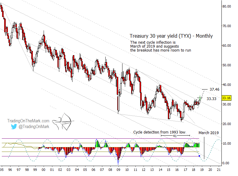
Before we post our updated chart for treasury bonds, let’s look at a related long-term chart of yields – in this case the U.S. Treasury Yield Index for 30-year Bonds (Index CBOE: TYX). A quick look at the channel that had contained the yield rate with support and resistance since 1995 shows how significant the new upward breakout might be viewed in hindsight.
The rise in yields is not unexpected. In fact, the Fed has been advertising it assertively.
The important timing on the yield chart is suggested by the dominant 41-month cycle and also by the Fed’s published intention to raise rates until spring 2019. A temporary cessation in increases may coincide with the cycle inflection and perhaps with the March or May FOMC meeting.
Note, it’s possible the 41-month cycle in TYX and the somewhat similar 43-month cycle in treasury bond futures have inverted, but the next inflections in either or both could still coincide with important turns in yield rates and bond prices. The inflection marked for TYX occurs around March 2019.
With increases looming in rates, the question becomes whether the bond market responds to FOMC announcements by holding during the next five to six months or by declining sharply during that time. Part II of this post shows the two scenarios for bonds side by side.
In volatile conditions, traders of all experience levels can benefit from charts that show the areas where turns are more probable.
Trading On The Mark helps subscribers stay on top of the moves with twice-daily updates for the Dollar Index, Euro futures, the S&P 500, crude oil, treasury bonds, and gold.
Between now and October 31, new subscribers can lock in savings of 15% on all of our services. The coupon code for the special offer is “fractal”.
Twitter: @TradingOnMark
The authors may have a position in the mentioned securities at the time of publication. Any opinions expressed herein are solely those of the author, and do not in any way represent the views or opinions of any other person or entity.

: Showing Some Signs of Emerging Strength")
