When market volatility increases, there’s an incredible temptation to focus on short-term price action.
However, it’s important to take a step back and see how the short-term price movements relate to the long-term trends.
One of the charts I use to keep the proper long-term perspective is a monthly chart of the S&P 500 (NYSEARCA: SPY) and a 120-month (or 10-year) rate-of-change indicator.
I’ve usually used this chart to illustrate the “generational lows”- that is, the major lows of each secular bear market which tend to happen about once per generation.
If you look at when this 10-year ROC has turned negative, you’ll see that they coincide with the 2009 and 1974 market lows. See chart below.
S&P 500 Index Historical Chart w/ 120-Month ROC Indicator
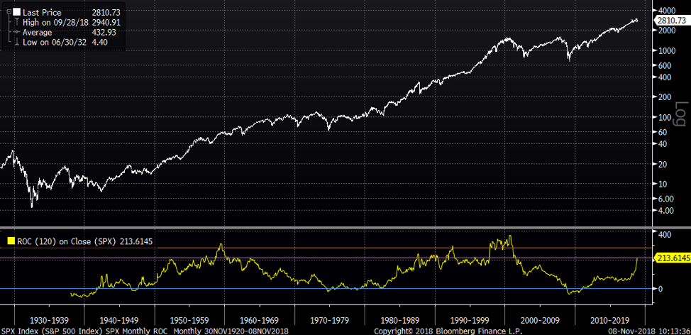
I’ve often shared this chart with clients to show them that even though the market had been in a sustained uptrend in recent years, this rate-of-change often reaches above 300 in extended bull markets.
To put another way, the current market was not as extended as it appeared.
When I brought up the chart this week, I was surprised to see that the indicator had jumped so suddenly, even in face of a choppy market environment.
Digging into the data a bit, I realized that the sudden up move in the ROC indicator was less about the current market movement, but more because ten years ago was the 2008 cyclical bear market. So the ROC will likely appreciate for the next couple months as the starting point to the ROC moves much lower.
The 120-month ROC is currently at about 214% (purple line), meaning the market right now is 214% higher than it was ten years ago.
If the S&P 500 stays where it’s at for the next couple months, that would push the 120-month ROC up to about 280% (orange line), since the starting point to the measurement is moving much lower.
This would put the ROC indicator in line with 1959, 1992, and 1997.
After the 1959 signal, the market corrected about 13% and took about three years to eclipse those highs.
After the 1992 signal, the SPX drifted higher but the market slowed down leading into the 1994 low. So more of a time correction than a price correction.
After the ROC rose above 300% in 1997, it actually remained elevated for a while leading into the 2000 market peak.
In considering the longer time frames, as in multiple years and beyond, I find technical analysis to be more descriptive than predictive. It helps us to put the current move into proper context and understand how different market moves relate to historical environments.
The ten-year rate-of-change on the S&P 500 tells me that the market is starting to display conditions that have lined up with previous price and time corrections. At the very least, it tells me to remain cautious.
Learn more about my research over at Sierra Alpha.
Twitter: @DKellerCMT
Any opinions expressed herein are solely those of the author, and do not in any way represent the views or opinions of any other person or entity.


