The relationship between stock prices and treasury bond yields is an important one.
When the economy is doing well, corporate earnings are good, stocks typically rise, and bond yields (interest rates) move higher.
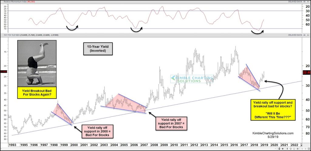
Today’s chart takes a look at treasury bond yields from a different perspective – upside down (or inverted). I’ve found that inverted charts can assist in removing investor bias.
Are treasury bond yields signaling lower prices for the S&P 500?
The chart below is the 10-Year Treasury bond yield inverted. (So support areas are really resistance and rallies are really declines.)
What jumped out to me is that every time yields touched the rising support line in the inverted chart below, they bounced higher. And each of those bounces were bad for stocks.
Note that when it rallied off support in 2000 and 2007, stocks fell hard.
So, will it be different this time around?
10 Year Yield Curve – Inverted
Note that KimbleCharting is offering a 2 week Free trial to See It Market readers. Just send me an email to services@kimblechartingsolutions.com for details to get set up.
Twitter: @KimbleCharting
Any opinions expressed herein are solely those of the author, and do not in any way represent the views or opinions of any other person or entity.


")


