For months now, the U.S. Federal Reserve has been hinting that the ‘taper’ of its quantitative easing (QE) program is coming, and last week the hints turned into an operational plan.
Monthly bond-buying programs that are running at $120 billion per month will be reduced by $15 billion per month.
The Bank of Japan has not been adding to their balance sheet for months now, and in October the Bank of Canada announced the end of its QE program. At the same time, forecasts for overnight interest rate hikes for most developed nations continue to be brought forward. The emerging markets have already started with nine countries having raised rates in the past three months. The monetary stimulus punchbowl hasn’t been pulled away yet, but it is being drained.
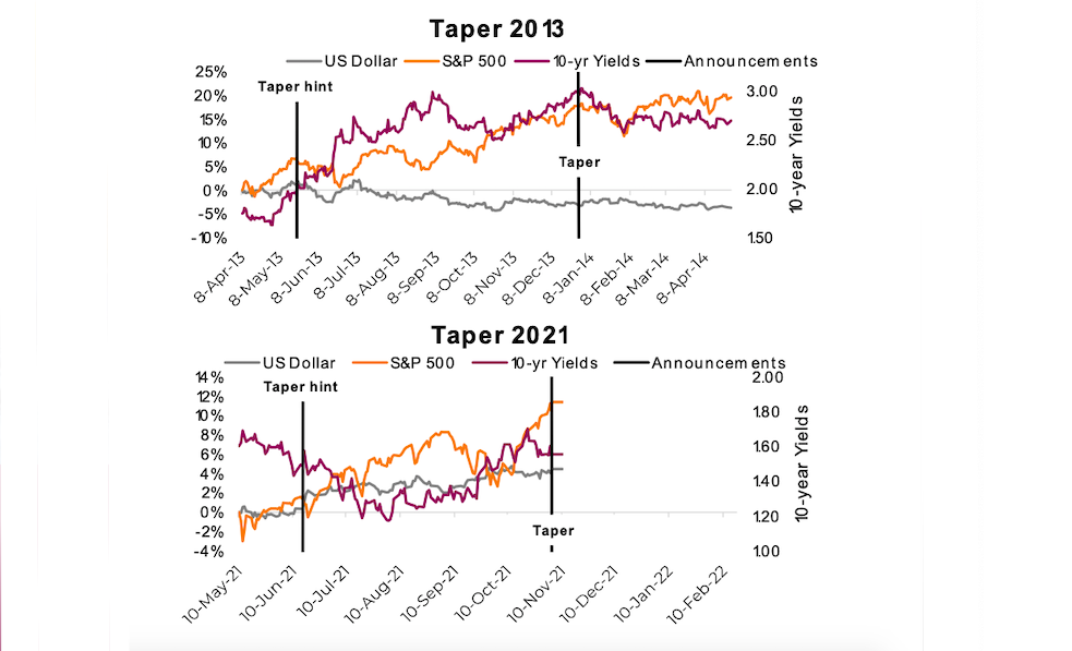
For markets, the Fed matters the most, so let’s focus on them. Of course, this pending taper is bringing back memories of the ‘taper tantrum’ of 2013. Fed Chairman Bernanke began talking about tapering in May with the actual tapering of QE commencing in December. During the taper talk period, the U.S. 10-year yield rose quickly from 1.8% to 3.0%, the U.S. dollar declined and the S&P 500 rose. After the taper started, yields fell back down, the dollar went flat, and of course the S&P 500 rose (is it just me or does that index always just go up?). Remember, back then the ‘taper tantrum’ was used largely to describe the action in the bond markets. The May to September period was tough for bond investors.
That was a fun trip down memory lane, now forget about it. We all like simple stories, neatly wrapped up with a bow. Fed does this, market reacts like that, simple. Unfortunately, looking at ONE tapering episode and drawing conclusions is not that simple. If n=1, good luck trying to reject the null hypothesis, for those statistical-oriented readers. Or if you prefer, it’s like comparing apples and oranges.
The markets are certainly in a different place today compared with 2013. Bond yields aside, the S&P 500 was trading at 14x forward earnings in 2013 compared with 21x today. In 2013, the S&P 500 had just recovered to its previous high from 2007, which took about 5 1⁄2 years. Today, the S&P 500 is 38% higher than its pre-Covid 2020 high (took six months). The U.S. economy was growing at an average of 2.5% in 2013, way lower than the trailing Q4 average of 4.9%. The trade-weighted U.S. dollar was low, by historical standards, around 82 compared with today’s 94.
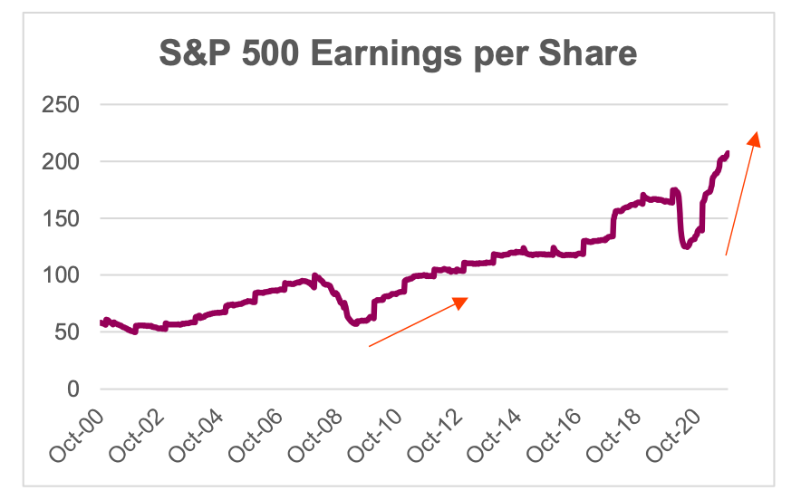
The biggest difference between these two tapers is where the money went and where it is going. The QE following the great financial crisis ended up more within bank balance sheets. Indirectly of course, but given banks reduced lending activities to repair balance sheets devastated from the 2008-09 recession, the QE did not have a material economic impact. Economic growth remained muted. Bank deleveraging was a natural counterbalance to QE. This time, QE has been funding government fiscal spending and support programs to help offset the impact of the pandemic. This QE had a central line right into the economy. You can see this is the earnings per share of the S&P 500. In 2013 there was a gradual runup coming out of the great recession, whereas 2020 has snapped back, recovering far more than it lost through the pandemic.
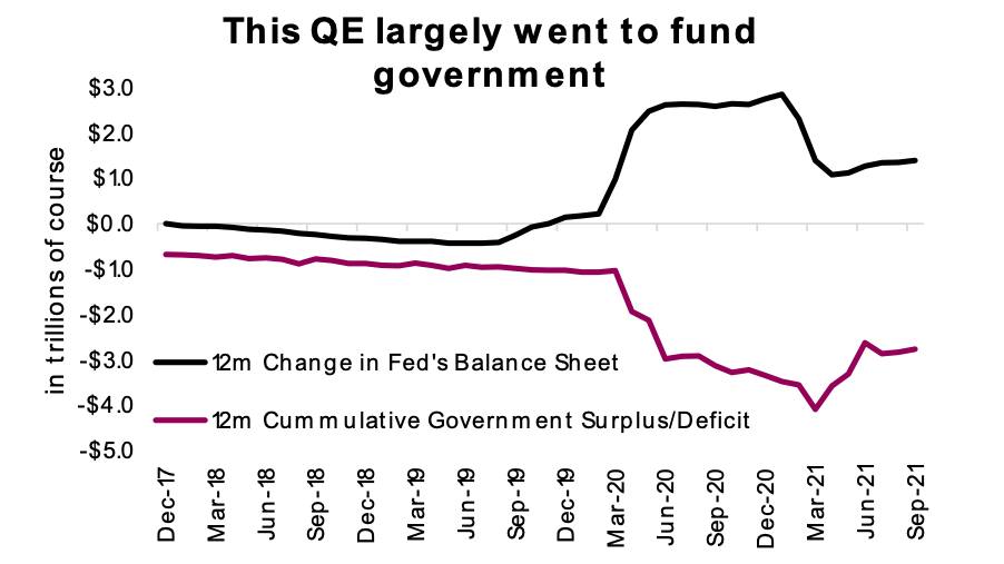
It is clear to see that as the government deficits come back down to earth, thanks to rising tax receipts as the economy recovers and emergency spending programs dwindling, there is less need for QE to fund the government. Demand (i.e., QE) is tapering at the same time supply (i.e., deficits) are falling. The good news is we are less likely to see bond yields rise because of this taper. The bad news is the Fed can taper because since fiscal spending is falling, there is a fiscal cliff on the spending side. Hopefully the economy has enough of its own momentum to get safely over this cliff.
Investment Implications
The taper tantrum of 2013 does not provide a useful playbook for taper 2021. The market is in a very different place, and the bond-buying programs ended up having vastly different impacts on the economy and markets. This makes it difficult to draw any hard conclusions from the last go ‘round.
The bigger stories for portfolios are that inflation continues to prove not so ‘transitory,’ short yields have risen, and the timing of rate hikes is approaching. In other words, the tightening cycle is upon us. Best to fill your cup from the punchbowl now.
Source: Charts are sourced to Bloomberg L.P., Purpose Investments Inc., and Richardson Wealth unless otherwise noted.
Twitter: @ConnectedWealth
Any opinions expressed herein are solely those of the authors, and do not in any way represent the views or opinions of any other person or entity.
: Creating Bullish Divergence?")

 and Semiconductors (SMH): Concerning Price Pattern?")
 and Semiconductors (SMH): Concerning Price Pattern?")


