Key Takeaway: Monthly changes in employment data are mostly noise and do not deserve the attention they get. Longer-term trends show continued (or even increased) strength in the labor market.
Both employers and employees are showing increased confidence in the economic recovery.
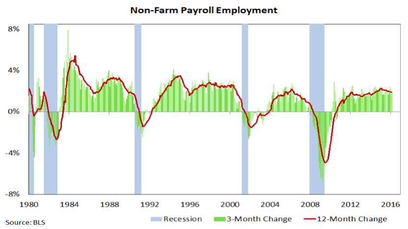
Despite the attention it gets, there is really too much noise in the month-to-month changes in payroll data to provide a sound basis for evaluating the health of the economy. Not only is the data subject to sometimes substantial revisions for several months after its initial release, but the confidence interval for monthly changes in the establishment survey is 100,000 jobs. The reported increase of 242,000 jobs in February might better be represented as a likely increase of between 142,000 and 342,000 jobs.
Nonetheless, financial markets act, react, and overreact when the data misses or beats expectations by even just a few thousand jobs. Even when cloaked in “fundamentals” short-term market moves can often just be evidence of fear and greed. Rather than pay too much attention to monthly changes or data points quoted without context, a better approach would be to focus on the longer-term trends in the labor market.
The current economic expansion has been unique in many respects. Much of the commentary on this topic focuses on the disappointingly slow rebound in the 12-month change in payrolls. On the positive side, missing from this recovery has been a meaningful slowdown in job growth. Rather, the pace of hiring has continued to drift higher as the recovery has progressed.
Another complaint about the recovery in the labor market is that it has come without any wage growth. While this was true for the first several years of the recovery, median wage growth, as calculated by the Federal Reserve Bank of Atlanta (more details here) has accelerated, rising at a 3% clip for the past year.
![]()
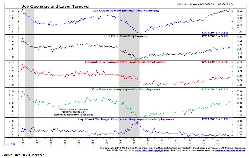
One of the reasons that employers might raise wages is because they want to fill open positions and are having trouble doing so. The continued rise in the Job Openings Rate (top panel in the chart below) suggests this may be the case and reflects confidence on the part of employers. The Quit Rate (the fourth panel in the chart) shows confidence on the part of employees, as they are increasingly willing to voluntarily leave their current position, usually in search of greener pastures.
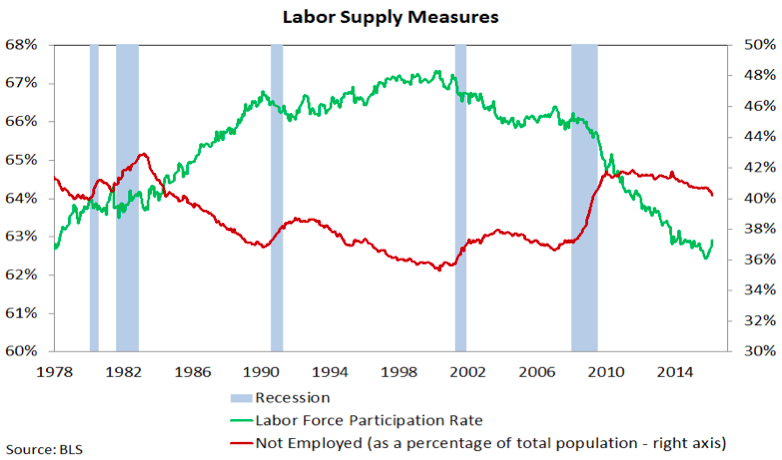
The uptick we are seeing now in the quit rate does not reflect workers dropping out of the labor force. In fact the opposite is being seen as the labor force participation rate has increased in recent months and “not employed” percentage of the population has declined. This uptick in participation comes as powerful demographic trends have pushed participation lower over the past decade-plus (the participation rate for prime-age workers has been more stable, but is also now rebounding).
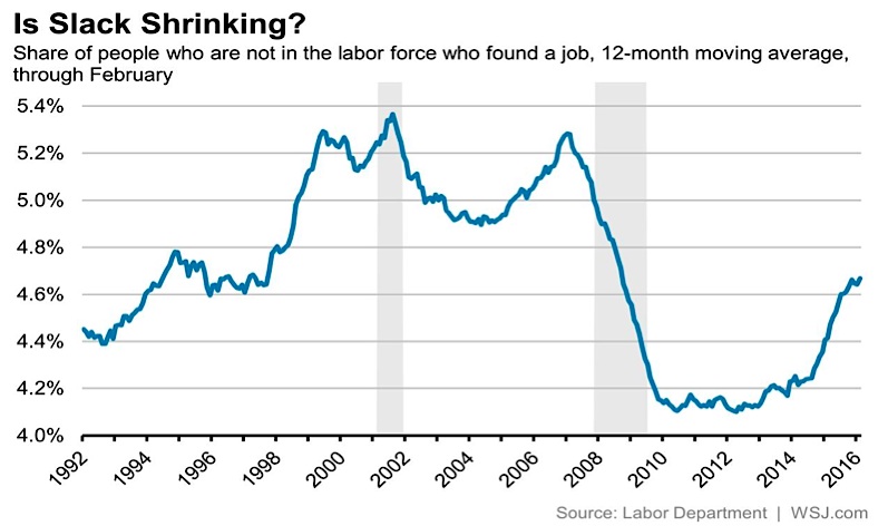
As the bottom chart shows, more new hires are coming from the pool of people that were not even looking for a job (not in the labor force) to begin with. Altogether these trends show continued firmness in the labor market and speak to a sustained economic recovery.
Thanks for reading.
Further reading from Willie: “Weekly Stock Market Outlook: Putting The Rally In Context“
Twitter: @WillieDelwiche
Any opinions expressed herein are solely those of the author, and do not in any way represent the views or opinions of any other person or entity.


