BONDS WERE EXTENDED AT THE END OF MAY
A June 4 post outlined an extremely rare and extended condition in the bond market that had only occurred ten times in the past thirty-three years.
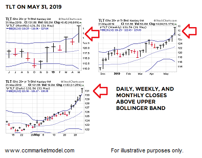
The historical cases told us to be open to a period marked by bond underperformance relative to the stock market. Thus, it might be helpful to revisit the stock vs. bond topic as we near the end of July. Treasury Bonds NASDAQ: TLT and S&P 500 ETF NYSEARCA: SPY discussed here and below.
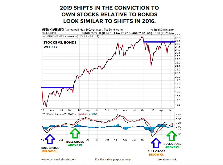
STOCK VS. BOND MOMENTUM
The weekly chart below shows the performance of the S&P 500 (VFINX) relative to the total bond market (VBMFX) between 2016 and 2019. In Q1 2016, as the S&P 500 was forming an important low, weekly MACD printed a bullish cross that occurred below the MACD centerline, telling us the bulls still had some work to do from a primary trend perspective. In Q3 2016, another bullish MACD cross occurred, but this time it took place above the MACD centerline, which aligns more odds-wise with the end of a countertrend move within the context of an established bullish trend.
After the second MACD cross, stocks significantly outperformed bonds. A similar look was nailed down three weeks ago when the second MACD cross occurred above the MACD centerline.
The longer the MACD cross remains in place, the more relevant it becomes. Conversely,a sharp reversal in the stock/bond ratio, followed by a bearish MACD cross would add to the concerning side of the bull/bear ledger.
RARE WEEKLY STOCK MARKET SETUP
The S&P 500 recently spent 18 weeks below the 23-week moving average and then printed 15 consecutive weekly closes above the 23-week, which indicates a significant and sustained shift in the market’s perception of future economic outcomes.
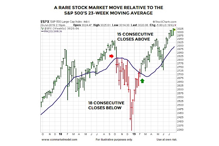
HOW MANY TIMES HAS SOMETHING SIMILAR OCCURRED AND WHAT HAPPENED NEXT?
To answer the questions above, we looked for cases dating back to 1950 that featured at least a 15-week drop below the S&P 500’s 23-week moving average followed by at least 8 consecutive weekly closes above the 23-week. Like numerous “this just happened in 2019; what happened next historically?” studies covered in recent months, average S&P 500 performance was satisfying after the initial weekly close back above the 23-week (see table below).

COMPARING 2019 TO 2000, 2007, 2015, and 2018
This week’s stock market video makes numerous fact-based comparisons between 2019 and painful periods in the stock market, allowing you to draw your own conclusions.
EMPLOYMENT AND CONSUMER SPENDING REMAIN STRONG
The probability of really painful long-term outcomes in the stock market tends to increase when the U.S. economy slips into a recession. Thus, it can be helpful to monitor two key components of the recession equation: consumer spending and employment. From Tim Duy’s Fed Watch Blog:
“While the 4.3% pace of consumption spending is not likely sustainable, the underlying strength likely is sustainable. I have said this before, but I think it is worth repeating: Do not bet against the American consumer in the absence of widespread job losses. With that in mind, note that initial unemployment claims continue to move sideways at very low levels. We have yet to see the upturn in claims consistent with even sharply slowing job growth let alone steep declines in the number of jobs.”

Twitter: @CiovaccoCapital
The author or his clients may hold positions in mentioned securities at the time of publication. Any opinions expressed herein are solely those of the author, and do not in any way represent the views or opinions of any other person or entity.

: Cup (and Maybe Handle) Watch")
 Trading Near Top Of Price Range")

