We typically don’t put much weight on how one stock market period compares to another, especially when looking at price graphs.
The market composition, the environment and the participants change too much over the years for us to give much weight to simple chart comparisons between S&P 500, TSX, and other global market indexes.
However, similarities in the market environments can make these comparisons more useful.
We considered the similarities between today’s market environment and that of 1998, and found a number of strong commonalities.
Both 1998 and 2018 are roughly the ninth years of historically long bull market runs. That means both are clearly in the late bull phase of the market cycle. Both cycles had the U.S. equity market as the clear leader compared to other developed equity markets and emerging markets. The U.S. dollar was also one of the stronger performing currencies, similar to today.
In 1998, a currency crisis started in Russia and spread to a number of Asian emerging economies, which triggered the correction, causing global growth to slow. Notably less for the U.S. and more for other economies such as Europe and Asia. This cycle we have had crises in Argentina and Turkey, and now slowing economic growth in China weighs on global growth. Again, more for non-U.S. economies.
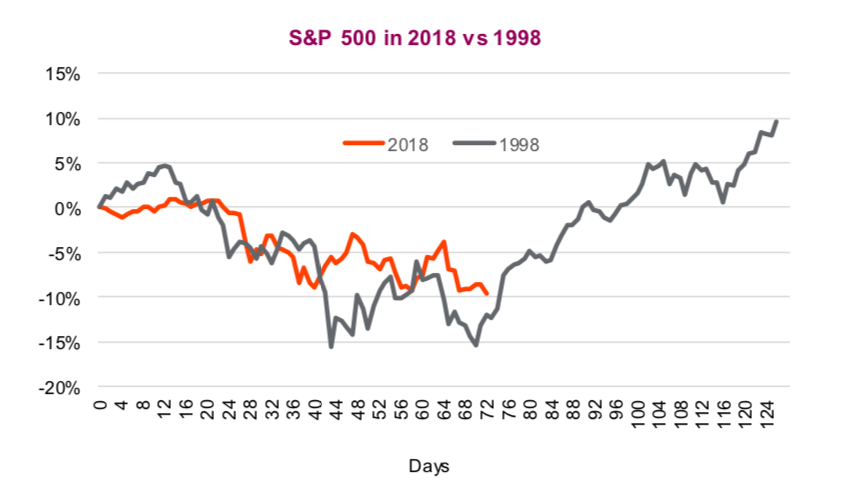
Currently the S&P 500 is down 11% from its late September high. In 1998, the S&P bottomed at closer to -20%. One could argue markets were a bit more inflated in the late 1990s, making the drop more painful. The P/E ratio for the S&P 500 dropped 4 points from 22x to 18x in 1998, compared to a drop of 3 points from 18x to 15x so far in 2018. The TSX, which started falling earlier than the S&P 500, is now down 12% from its high. The bad news is that in 1998 the TSX ended up dropping almost 30%.
The drop in global growth expectations was much more severe in 1998 relative to the current state, especially in the emerging markets [note we said ‘current state’ as things can change]. This certainly weighed more on the TSX given its resource tilt. In 1998, the BRIC (Brazil, Russia, India and China) nations GDP dropped from 2% growth into negative territory for two quarters. Europe was slowing and the U.S. remained pretty resilient to the global slowdown (top chart below).
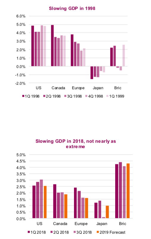
Fast forward to today and we have the U.S. remaining on a healthy growth path, Europe losing steam and the BRIC nations showing some signs of slowing. Clearly, the current situation is not nearly as dire as 1998 at this point. And if you believe current 2019 consensus forecasts (yellow bars in the second chart above), there does not appear to be a sudden deceleration in the cards.
Long correction
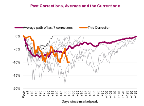
The current spell of market weakness seems like it just keeps dragging along. It sure feels that way to us. The S&P 500 peaked on September 21 which means this 3.5% correction has lasted 84 days. Given the current level is only a few points above the December 10 low, it’s hard to say if that was truly the trough or there is another leg down. If it was today, 84 days would be the longest peak-to-trough among the last ten corrections. This isn’t one of the most severe yet, but relative to other corrections during the cycle, it is a big one. The average number of days from peak-to-trough has been 35, with an average decline of 10%.
The third chart is all the past corrections for the S&P 500 during the current bull market and how they played out. The purple line is the average and the yellow line is the current market. The only two that were near these depressed levels after this amount of time was in late 2010 and 2011, during the European financial crisis.
Some encouraging signs
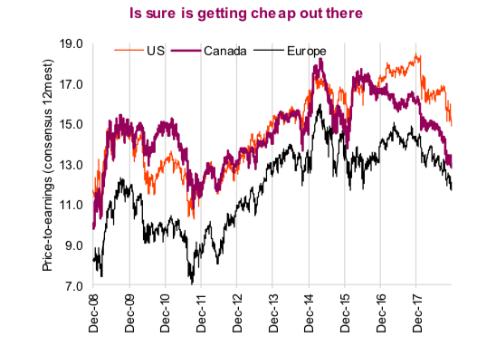
Not be all down on the markets, as there are some positive developments, even as we watch the markets close the week near session lows. Today the S&P 500 is trading below 15x, the TSX is below 13x and Europe is below 12x. That is cheap. Sentiment has turned very bearish, which has historically been bullish. The American Association of Individual Investors survey this week found only 21% felt bullish and 49% bearish about the stock market over the next six months. That is the highest percentage of bears since 2013.
Also, emerging markets are outperforming developed markets. Emerging markets started weakening quarters ago. Clearly, we all should have paid more attention to this canary in the coal mine. Emerging markets tend to be more sensitive to changes in sentiment and global growth, given the higher reliance on trade, less developed financial sectors and at times, a jittery shareholder base. The fact that emerging markets have been outperforming the developing markets in the past few weeks may be a sign the end of the corrective phase is near.
If none of those are right, Santa is coming soon…
Charts are sourced to Bloomberg unless noted otherwise.
Twitter: @ConnectedWealth
Any opinions expressed herein are solely those of the authors, and do not in any way represent the views or opinions of any other person or entity.


