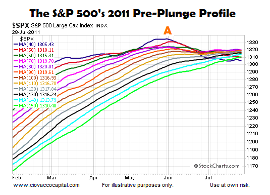
The chart below shows various daily moving averages for the S&P 500 on July 28, 2011; the moving averages range from the 40-day (dark blue) to the 150-day (lime green).
Notice how the 40-day moving average peaked two months before the waterfall decline (point A). The fastest moving average had also moved from the top of the cluster to the bottom of the cluster, which spoke to the magnitude of the deterioration in bullish conviction relative to bearish conviction. Also notice how tight the cluster of moving averages were on July 28, and how the slopes had moved from positive to neutral or negative.
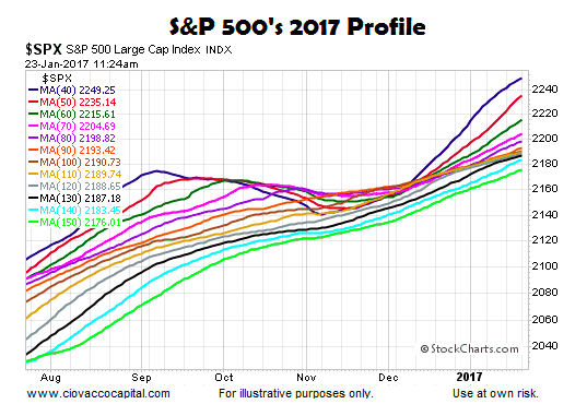
The 2017 chart below allows us to compare and contrast the exact same moving averages as of January 23. Instead of making a new high months earlier, the dark blue 40-day moving average is still making new highs. Unlike the tepid slopes in 2011, the slopes of all the moving averages in 2017 look much healthier from a bullish conviction relative to bearish conviction perspective. In 2011, the 40-day had migrated to the bottom of the moving average cluster; today, the 40-day remains firmly on the top.
Additional Historical Comparisons To January 2017
This week’s stock market video uses similar “facts in hand” charts to make comparisons to 1982, 1987, 1994, 2000, 2003, 2007 and 2009. The video helps us better understand the long-term bullish case relative to the long-term bearish case.
How Can The Charts Help Us?
Charts cannot predict the future. Charts help us monitor the probability of good things happening relative to the probability of bad things happening. The probability of bad things happening was higher on July 28, 2011 than it is today. Regardless, the probability of bad things happening is never zero, something that remains true in 2017.
The charts above do not tell us much about the next few hours or next few days. However, given the information we have in hand today, which reflects relatively strong bullish conviction vs. bearish conviction on numerous timeframes, any pullback in stocks has a better than average chance of eventually being followed by new highs.
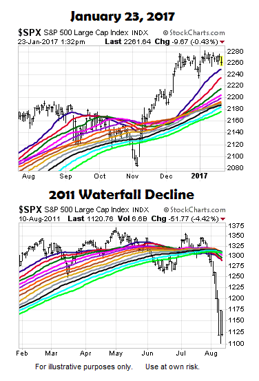
This analysis is based on the look of the charts as of January 23. If the charts deteriorate in the coming days and weeks, a new assessment would include a bump higher on the “probability of bad things happening” side of the bull-bear ledger. Only time will tell.
Thanks for reading.
Read more from Chris over on CCM.
Twitter: @CiovaccoCapital
The author or his clients may hold positions in mentioned securities at the time of publication. Any opinions expressed herein are solely those of the author, and do not in any way represent the views or opinions of any other person or entity.


