WILL IT HAPPEN AGAIN?
Human beings tend to remember emotional events, especially painful events.
December 2018 falls into the painful category, given the S&P 500 lost 14.92% between the end of November and Christmas Eve. Thus, it was unnerving for investors to see red screens in early December 2019.
THAT WAS THEN
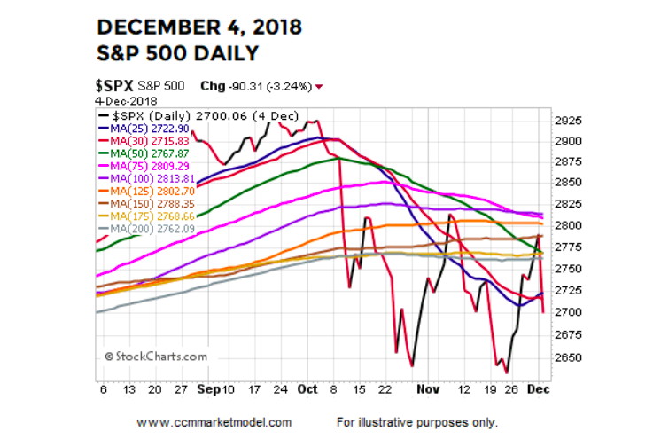
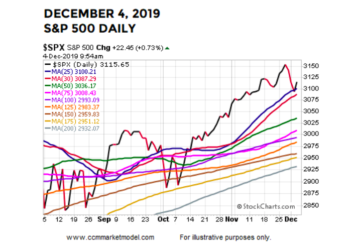
From a “what are the odds it happens again” perspective, it might be helpful to compare December 4, 2018 to December 4, 2019.
In the 2018 case, the S&P 500 closed below the 25, 39, 50, 75, 100, 125, 150, 175, and 200-day moving averages, which told us large institutions were very concerned about future market and economic outcomes.
THIS IS NOW
In the 2019 case, the S&P 500 is trading above the 25, 39, 50, 75, 100, 125, 150, 175, and 200-day moving averages, which tells us large institutions are optimistic about future market and economic outcomes. If we were taking a technical analysis test and were asked is the chart below an uptrend or downtrend, we’d think that’s easy, choose uptrend, and move to the next question. In real time, it is a bit more difficult because of the news cycle and our personal biases; regardless, the answer is still easy and it is still uptrend.
HOW ABOUT WEEKLY TRENDS AND MOMENTUM?
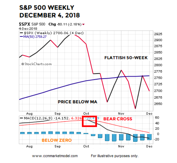
In the 2018 case, the S&P 500 was below a 50-week moving average that had a “we are concerned” look. Weekly MACD was in a “bearish cross” state and below zero, which told us the intermediate-term trend was at a higher risk of flipping to a sustained bearish trend.
WEEKLY LOOKS MUCH BETTER TODAY
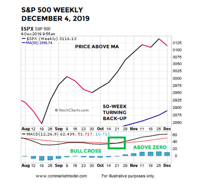
The concept of a mirror image comes to mind when comparing the 2018 chart above to the 2019 chart below. In the 2019 case, the S&P 500 is above the 50-week moving average that has a “we have been getting more confident” look. Weekly MACD is currently in a “bullish cross” state. Weekly MACD is above zero, which tells us the intermediate-term trend is up and recent pullbacks have been countertrend moves.
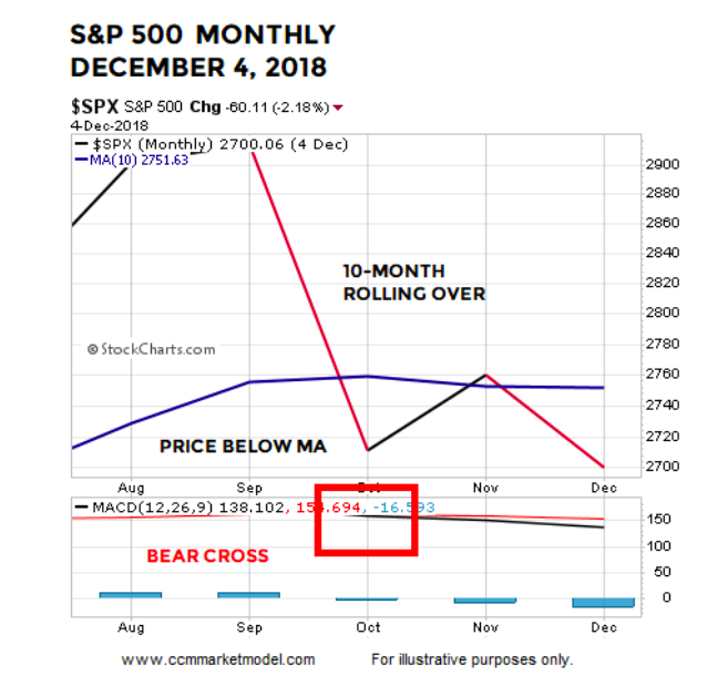
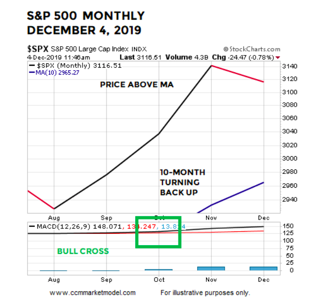
MONTHLY TRENDS AND MOMENTUM
On December 4, 2018, the S&P 500 was below a “flattish to in jeopardy of rolling over” 10-month moving average. The market had recently experienced a bearish monthly MACD cross, telling us a bearish countertrend move was taking place.
2019 LOOKS MUCH BETTER
Once again, the evidence we have in hand today is a polar opposite to what we had a year ago. Instead of being below the 10-month, price is above. Instead of an indecisive/rollover look, the 10-month has a bullish/turning-up look. Instead of a recent monthly MACD bearish cross, the S&P 500 recently printed a bullish monthly MACD cross.
ODDS TODAY VS. A YEAR AGO
It is extremely important to note, the look of all the 2018 charts shown above was BEFORE the S&P 500 lost an additional 12.64%, telling us the odds of really bad things happening was significantly higher a year ago relative to the present day.
THESE CONCEPTS WERE HELPFUL IN JANUARY 2019
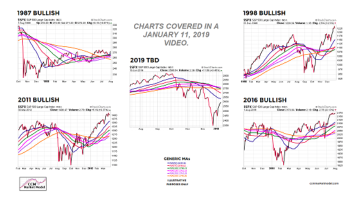
Charts cannot predict the future; they simply help us assess the probability of good things happening relative to the probability of bad things happening. December 2018 was the worst December since 1931 and the plunge in Q4 was rare from a magnitude perspective. It would have been easy to remain in cash for the first few months of 2019, given the weak data on December 31, 2018 and the severity of the Q4 2018 decline. Charts like the charts shown above were helpful in terms of helping us get back in line with the market. For example, the charts below were covered in a January 11, 2019 video and presented as part of a bull/bear road map that proved to be valuable throughout 2019.
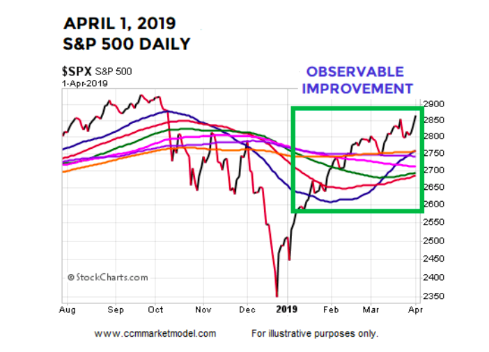
The chart in the middle of the image above is dated January 10, 2019. If we looked at the same chart on April 1, 2019 (below), we can see how the evidence gradually improved between January 10, 2019 and April 1, 2019. The chart below said the odds of a sustainable uptrend were quite a bit better on April 1 relative to early January. Thus far, the uptrend has remained in place, meaning the April 1 chart was helpful.
Is it possible all the 2019 charts shown above begin to morph into more concerning looks similar to the concerning looks on December 4, 2018? Yes, it may happen and it may happen soon, but it has not happened yet.
OTHER FORMS OF HELPFUL EVIDENCE IN 2019
While it is never easy navigating near a major low (December 2018), the market has provided numerous “this does not look like a bear market” and “this does not look like a recession is underway” clues since January 11, 2019.
This Never Happened In The 1974, 2001, And 2008 Bear Markets
Rare Bullish Shift In P&F Buy Signals
Learning From The 1998, 2002, 2009, 2011, And 2016 Stock Market Lows
An Extremely Rare Move In Bonds, How Have Stocks And Bonds Performed In The Past?
What Typically Happens When These Charts Flip?
Are Institutions Selling Into This Rally?
Monthly Breadth: Dark Clouds Or A Ray Of Hope?
History Says Stocks Could Rocket Higher Over The Next Two Years
Do The Facts Support Gloom And Doom Or Higher Highs In Stocks?
2019 Market Action Points To Positive Long-Term Outcomes
The Bullish Message From The Stock/Bond Ratio
Are National Financial Conditions Saying The Stock Market Is In Big Trouble?
History Says Stocks Can Perform Very Well After Big Oil Shocks
Bulls Have Setups In Place For Monster Breakout
The Road Ahead May Be Brighter Than Expectations
Trade, Impeachment, And The Conviction Of Buyers And Sellers
Similar Drops In ISM Manufacturing Data
The Six Most Powerful Charts On Wall Street
Demographic Sweet Spot Says Bull Market Could Last Until 2035
Bulls Still Have Support For Upside Breakout
History Says Stocks Could Still Soar To Unimaginable Heights
VOLATILITY IS A NORMAL PART OF ALL TRENDS
As outlined in the posts above dated between January 21 and November 4, the market and economy have provided numerous reasons to keep an open mind about better than expected outcomes. Now that stocks are near an all-time high, it can be easy to forget all the volatility that took place between those two dates. The moral of the story is even IF really good things happen in the weeks, months, and years ahead, we can expect a ton of volatility and scary headlines along the way. We will continue to take it day by day with an open mind about all outcomes, from wildly bullish to wildly bearish.
Twitter: @CiovaccoCapital
The author or his clients may hold positions in mentioned securities at the time of publication. Any opinions expressed herein are solely those of the author, and do not in any way represent the views or opinions of any other person or entity.

: Showing Some Signs of Emerging Strength")

