INSTITUTIONS DRIVE MARKETS
Institutions typically lead in the stock market and retail investors follow, which is why equity-based mutual funds and ETFs have seen record outflows in 2019, but the stock market has still gone up.
Institutions have been supporting the markets since the December 2018 low.
THESE PERIODS ARE SIGNIFICANTLY DIFFERENT
Long-term trends can help us (a) monitor what institutions are doing and (b) assess the market’s risk-reward profile.
The first chart below shows the S&P 500 before and after the major stock market peak in October 2007 and before and after the major stock market low in March 2009. The second chart shows the evolution of the S&P 500’s trend via the 11-month and 13-month moving averages.
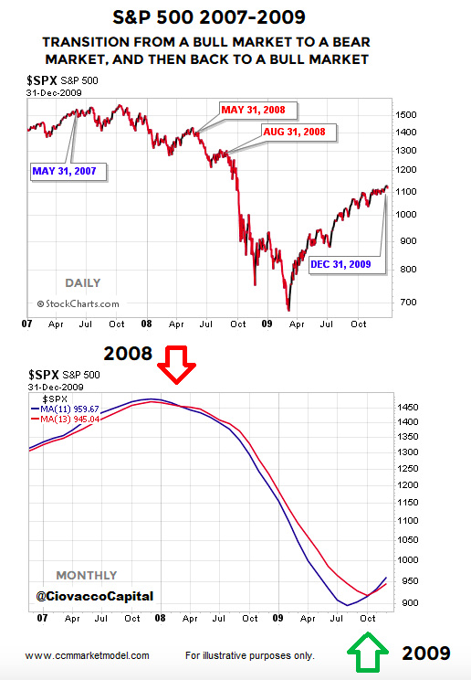
The first monthly close with the S&P 500’s 11-month moving average (blue in chart above) below the 13-month moving average (red) came on April 30, 2008. Was the bearish signal helpful or too late? Helpful, given the S&P 500 closed at 1385 on April 30; it did not find a bottom until making an intraday low of 666 on March 6, 2009.
Thus, after the 11/13 month bearish cross, the S&P 500 lost an additional 51.93%.
A POWERFUL VISUAL THAT CAN ASSIST IN 2019
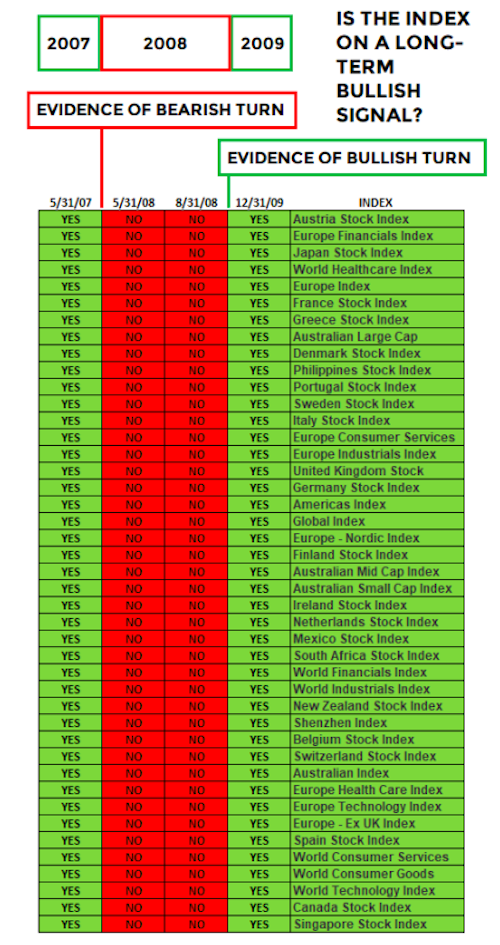
We selected a broad set of global stock indexes to illustrate what institutional shifts look like and how it can correlate to future stock market performance.
The table below shows global stock indexes that were in a bullish longer-term state using the 11-month and 13-month moving averages. Notice how the hard evidence looks significantly different before (May 31, 2007), during (May 31 2008 and August 31, 2008), and after (December 31, 2009) the financial crisis bear market.
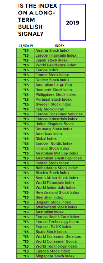
HOW DOES THE SAME TABLE LOOK TODAY?
Does 2019 look more like the concerning data on May 31, 2008 or more like the constructive data in late 2009? The answer is more like the constructive and bullish-leaning data in late 2009 (and it is not even close). The table below speaks to the longer-term outlook for stocks and tells us very little about the next few days or next few weeks.
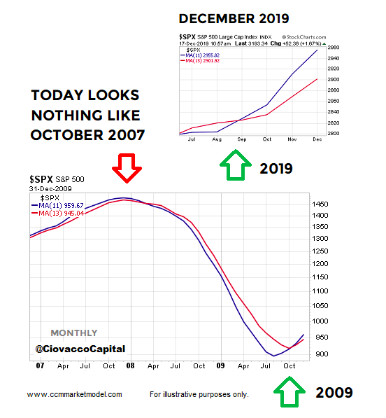
YOU SHOULD HAVE COMPARED TODAY TO OCTOBER 2007
In October 2007, the blue moving average is rolling over toward the red moving average, which is evidence of a waning trend. Today, we have seen just the opposite. The blue moving average recently turned back up and crossed the red moving average, which is evidence of a strengthening bullish trend. If large institutions thought the long-term outlook for the global economy was highly negative, the chart below would not look like it does today.
Another common rebuttal is “you should have compared today to October 2018”; we have done that on numerous occasions including in a December 6 video clip.
THESE SIGNALS SERVE TO CONFIRM EARLIER SIGNALS
Data telling us to be open to a major stock market low started to show up on January 4, 2019 when Jerome Powell said, “We are always prepared to shift the stance of policy and to shift it significantly”.
Powell’s 180-degree turn from his December 2018 comments were followed by a bullish breadth thrust, another signal that provides insight into what large institutions are doing and seeing in terms of the longer-term global economic outlook. This week’s stock market video provides additional data backing up the “be open to more upside in stocks” thesis.
Twitter: @CiovaccoCapital
The author or his clients may hold positions in mentioned securities at the time of publication. Any opinions expressed herein are solely those of the author, and do not in any way represent the views or opinions of any other person or entity.

: Showing Some Signs of Emerging Strength")
