Let’s do a quick stock market recap. At the beginning of October, 10-year Treasury yields rose above 3.2% while the S&P 500 (NYSEARCA: SPY) was trading at just over 2,900. By the end of October this index slipped down to 2,650 (-9%).
Then the S&P 500 rallied off the bottom to just over 2,800 and now back down to 2,730. As well, 10-year yields are now down again to 3.09%.
In other words, it has been one wild ride.
As happened during the bout of volatility back last February, many investors are again contemplating whether this is just another correction in an aging bull market or the precursor of something more dire.
The narrative can be compelling on either side. The bulls point to a global economy, which has slowed a little but continues to grow at a decent pace. Earnings season has been stellar; one of the best quarters in the past decade based on both earnings and sales growth. The pullback caused valuations to become the most compelling in years.
And if the start of the holiday season is any indication, consumers appear confident and spendy. Bull markets don’t die of old age; it’s the Fed that kills them. We wouldn’t disagree and given rates are still pretty low, with a lack of apparent bubbles, the bull appears relatively healthy.
On the other side, bears have a ton of ammo too. Global growth has slowed, and there is a degree of fragility in the emerging markets. We may have already seen peak earnings growth last quarter. The yield curve is flattening and more central banks are tightening. Oil and copper prices, two commodities that are sensitive to changes in global demand, have been falling pretty fast. Then there are the trade war, shenanigans in Europe and China dragging on the economy.
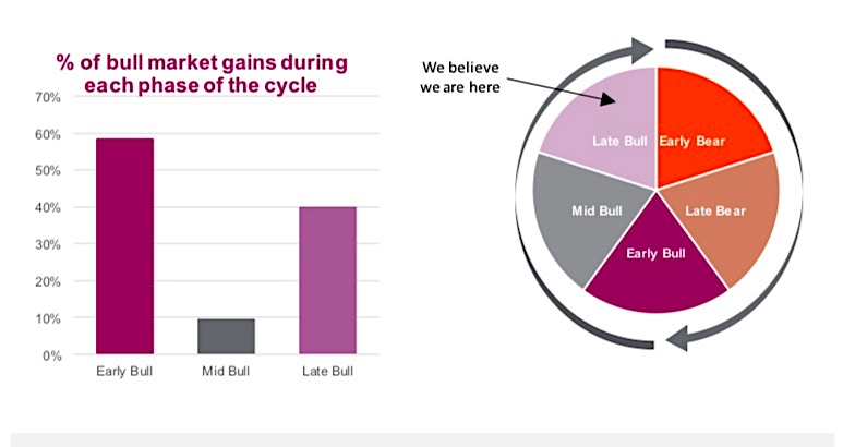
This tug-o-war typically occurs late in the market cycle as the bulls and bears battle it out. While this may reduce our collective comfort level, running to the sidelines may prove ill-advised. The late bull phase, which we are in, tends to enjoy strong returns. We took the last 11 bull markets, dating back to the 1930s, and measured the performance during the first third, second third and final third. Depending on the length of the bull market, each third experienced gains of different magnitudes and durations.
Of particular interest is that the first third, or early bull, enjoyed the largest share of returns on average. The mid-bull saw rather tepid returns and the late bull experienced strong gains, albeit not as strong as the early bull. During 10 of the 11 bulls, the late bull outperformed the mid-bull, usually by a pretty material margin.
This raises the obvious question, does the late bull phase have more room to run?
Investing in the late bull phase
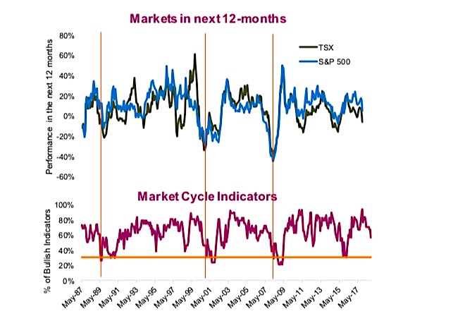
Our regular readers are likely familiar with the Market Cycle framework we use to gauge the health of the current market environment. This approach uses about 30 indicators that have historically enjoyed some degree of predictive power for forecasting big market moves. Currently, 19 indicators are bullish, about 60% of the total. Our analysis found that when the bullish signals drop below 30%, this tends to be the line in the sand that historically precedes a bear market and recession combo. The chart below (bottom panel) has the percentage of bullish indicators going back to the late 1980s with a vertical line drawn when this dips below 30%. The top panel in the chart below is the price performance of the TSX and S&P 500 over the subsequent 12 months.
While 19 indicators are in positive territory (good), they have been trending lower. The distribution has not changed much lately. Rates are bearish as are global economic indicators. On the positive side, the U.S. economy remains stellar as do company fundamentals, including earnings growth and valuations.
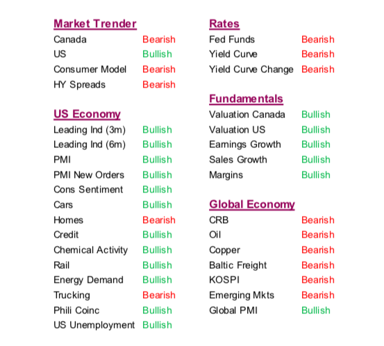
As we have highlighted before, there are three indicators we are more focused on.
Firstly, the yield curve has flattened but remains positively sloped (bullish). Secondly,
credit spreads are a concern due to the level of corporate debt accumulated over the
past decade. Spreads have risen over the past month from 60 to 75bps on investment grade (neutral at this point).
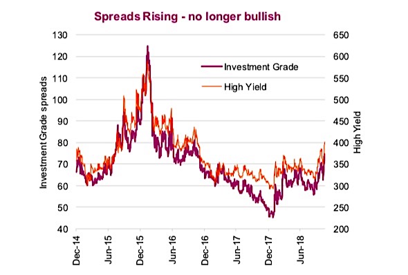
If these rise much further, we will become more concerned (chart below the table). Lastly, company margins hung in during the latest earnings season, where more companies saw their Q3 profit margins rise than fall, above the 50% line (bullish).
Add the above to the Market Cycle indicators remaining well above the 30% threshold, and we continue to believe the bull will beat the bear in this current tussle. The data can change but for now we continue to buy the dip.
Charts are sourced to Bloomberg unless otherwise noted.
Twitter: @ConnectedWealth
Any opinions expressed herein are solely those of the authors, and do not in any way represent the views or opinions of any other person or entity.

: Creating Bullish Divergence?")

: Creating Bullish Divergence?")


