Nasdaq 100 to S&P 500 Ratio “Monthly” Price Chart
The tech bubble didn’t end well. BUT it did tell us that the world was shifting into the technology age…
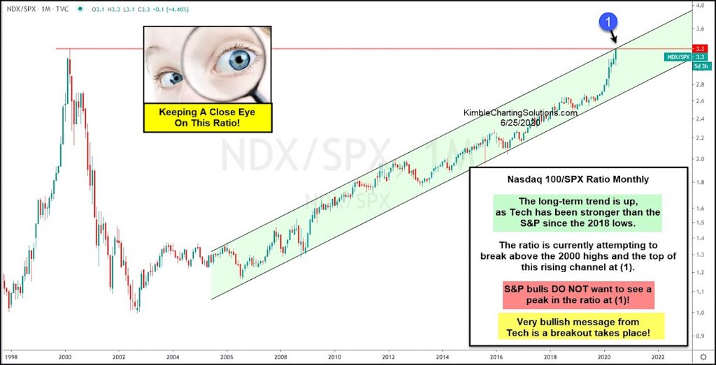
Since the Nasdaq 100 bottomed in 2002, the broader markets have turned over leadership to the technology sector.
This can be seen in today’s chart, highlighting the ratio of Nasdaq 100 to S&P 500 performance (on a “monthly” basis).
As you can see, the bars are in a rising bullish channel and have turned sharply higher since the 2018 stock market lows. This highlights the strength of the Nasdaq 100 and large cap tech stocks.
The ratio is currently attempting to break above its 2000 highs and the top of the rising trend channel at (1).
A peak would send a neutral to bearish message to the market, while a breakout would send a very bullish message to tech bulls. Stay tuned!
Note that KimbleCharting is offering a 2 week Free trial to See It Market readers. Just send me an email to services@kimblechartingsolutions.com for details to get set up.
Twitter: @KimbleCharting
Any opinions expressed herein are solely those of the author, and do not in any way represent the views or opinions of any other person or entity.


: Showing Some Signs of Emerging Strength")
