As a technician/chartist, I always want to grab today’s price action and look/find matches to past price action. Fortunately, we know that most chart patterns are repeatable, year after year, decade after decade, so we don’t have to look back to find similarities.
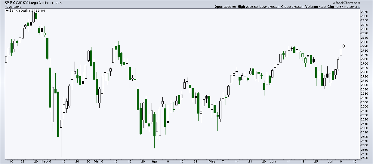
So when you have a highly irregular price pattern, like the one since the peak in January, you would think it would take some looking to find something similar.
Well, we only have to go back to the S&P 500 (INDEXCBOE:.INX) peak in 2000 to find a decent match.
The current period looks “somewhat” similar to the March to August price action from 2000. Both are about 6 month periods and both are pullbacks after hitting all time highs on the S&P 500 and both occurred after strong periods of outperformance. However…
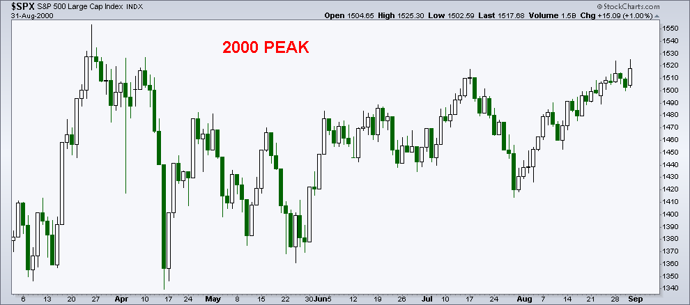
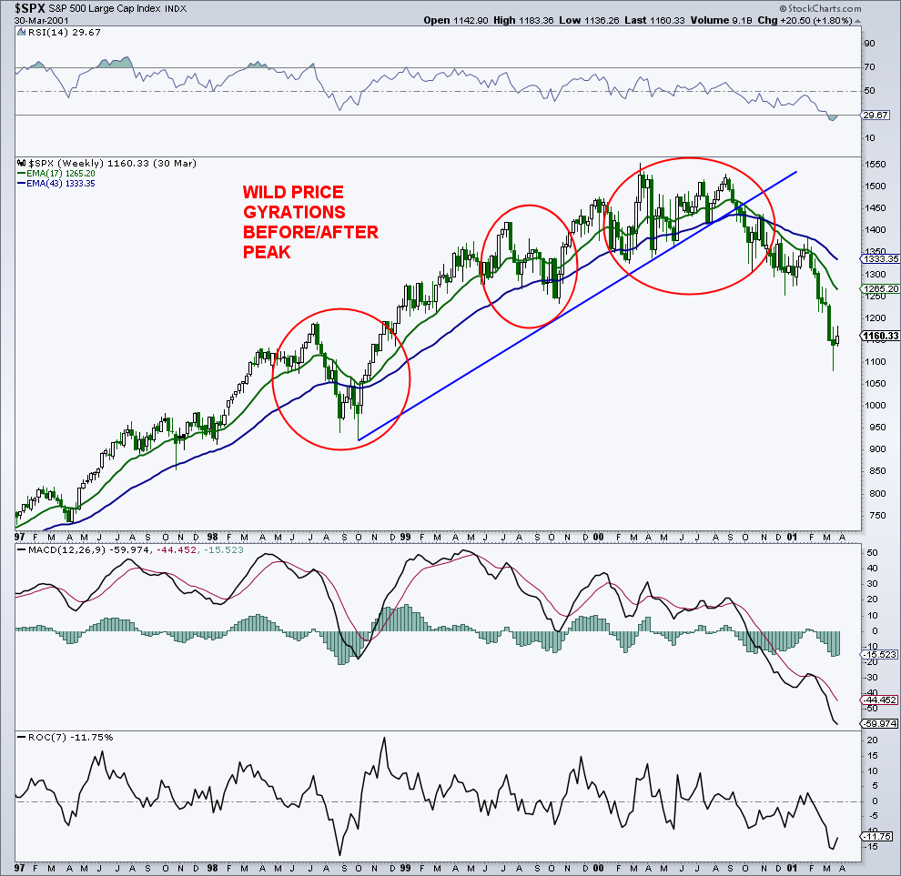
The “500” started ripping in 1995, and had some major, mostly short-term, price volatility in 1997, 1998, and 1999 before the peak in 2000.
Therein lies the first distinct difference between the two periods: Volatility jolts versus the absence of volatility jolts. We have said many times that there are usually quick and fast market declines before the ultimate price top. We certainly saw those in the late 90’s. Currently, the market ran from the latter part of 2016 to the January 2018 peak without even a hiccup.
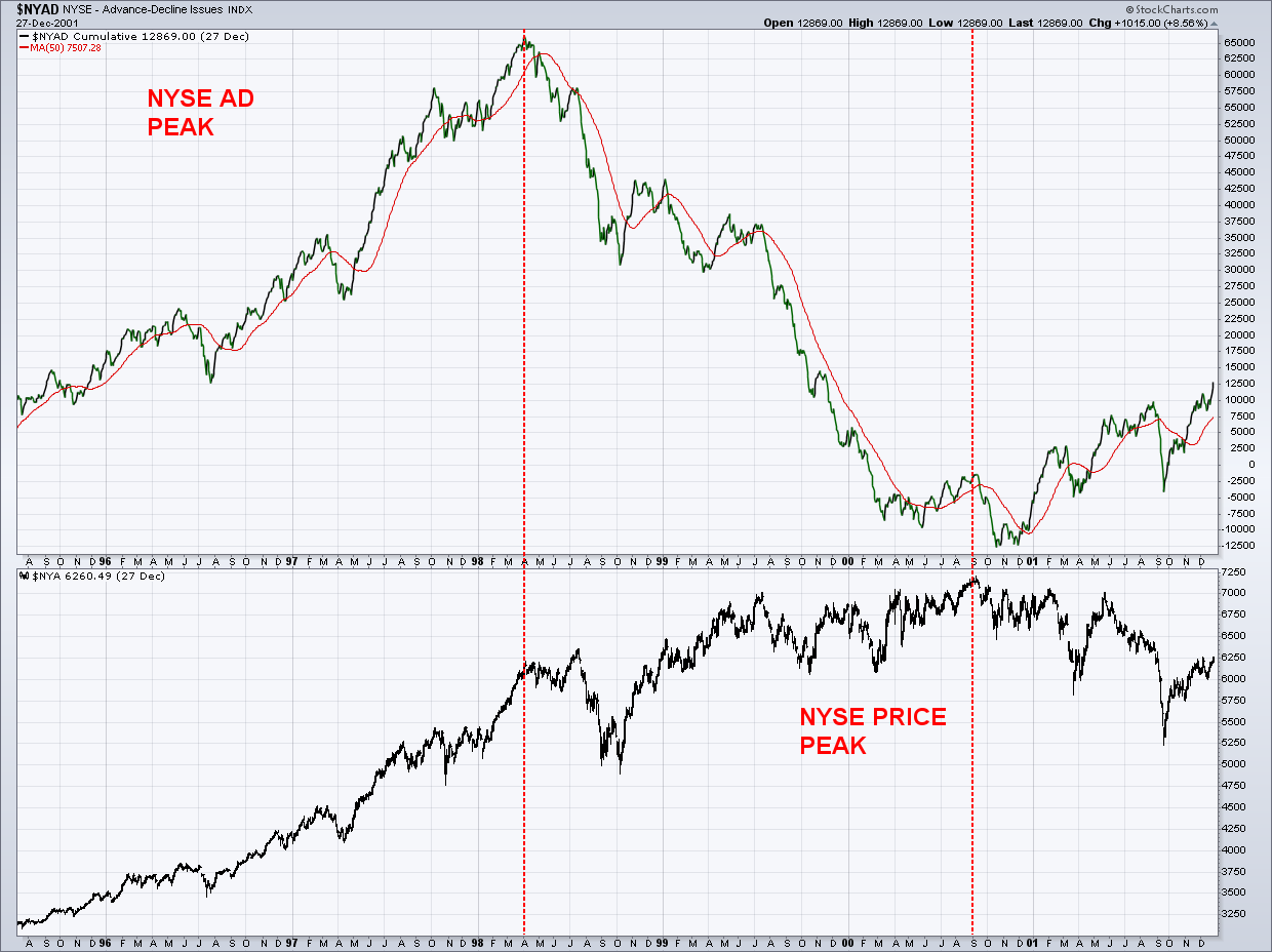
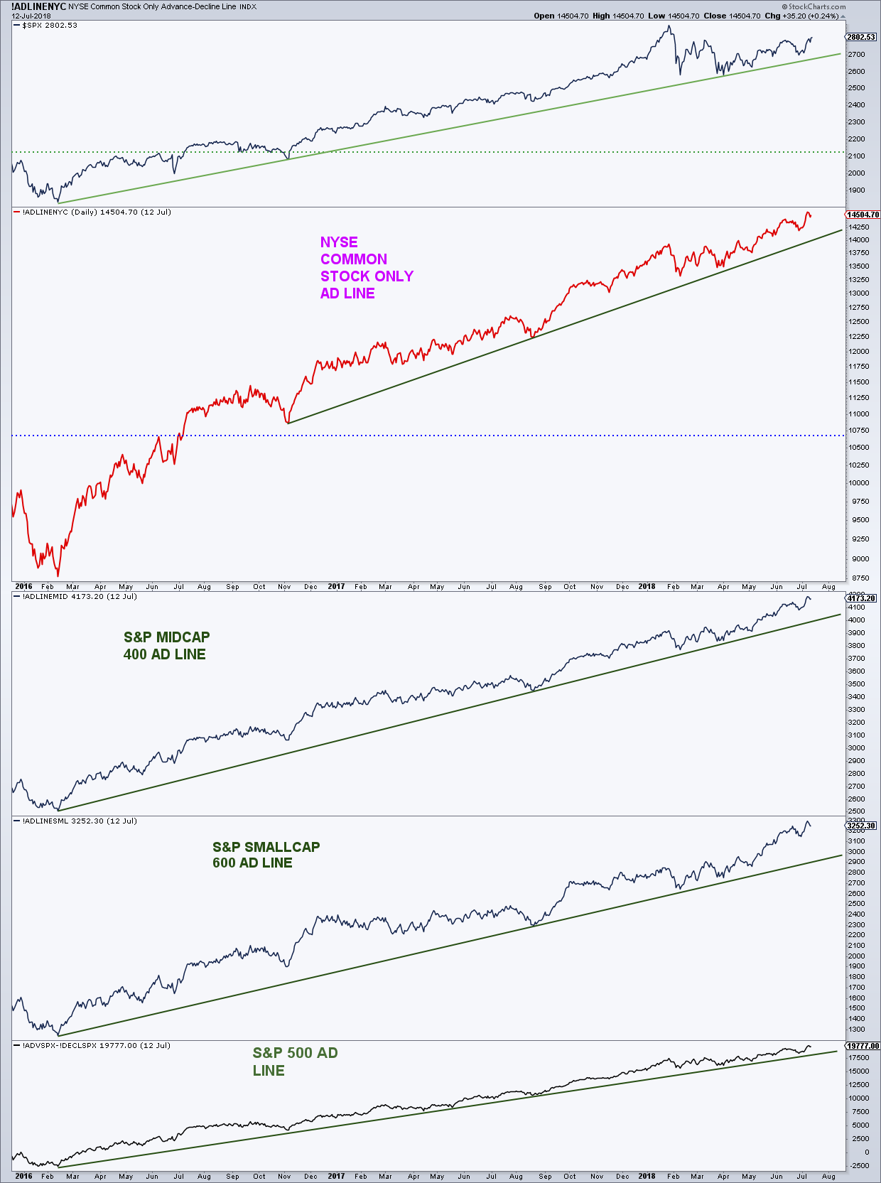
The second major difference, as my friend Ari Wald of Oppenheimer pointed out, it’s kind of like looking at two individuals that are the same height and assuming they are the same health. The NYSE advance/decline (AD) line peaked in April 1998, about two years before the March 2000 price peak. Looking back, this is very hard to believe. Today, we see new highs in the AD lines for the NYSE as well as the other major indices.
Today:
Next we’ll take a look at the NYSE AD volume as well as price divergences across the two periods.
continue reading on the next page…

: Showing Some Signs of Emerging Strength")
