After a huge five year rally,what should we make of things? Are the markets historically overbought? Here are some charts that I have been using for a long time that tell a very interesting story.
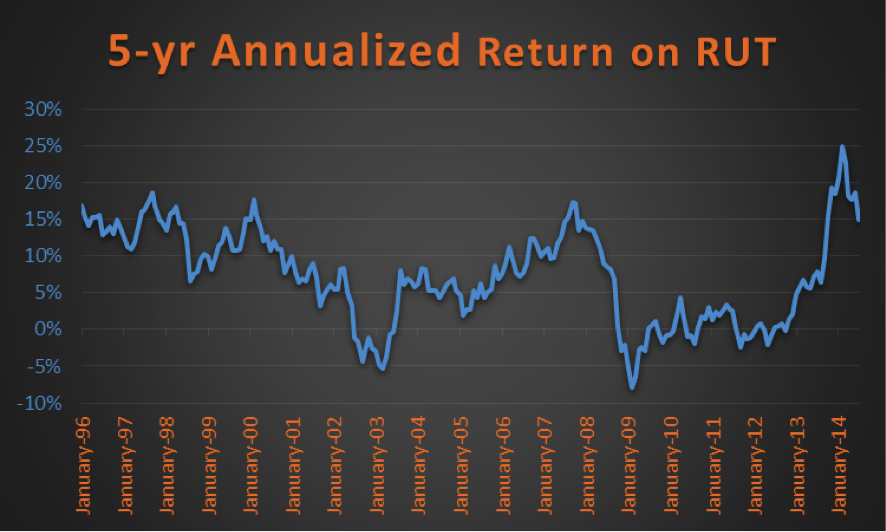
First up, the Russell 2000 (RUT) has seen a historic move lately. In fact, small caps lead large caps for nearly 13 years until this past Spring. I’m of the camp things got so extended for small caps back then that that was it, the small cap bubble burst. In other words, large caps will finally start to lead – probably for years.
Over the past five months that looks to be the case, as small caps have lagged significantly. Here’s the one chart I used that said things had gotten overbought to an extreme. On a 5-year annualized basis the RUT moved to an all-time high of nearly 25%, before the recent trip back to earth. Now the amazing thing is this peaked at 17% back in 2007 and after the recent weakness is still just back to 14%. In other words, still historically extremely high.
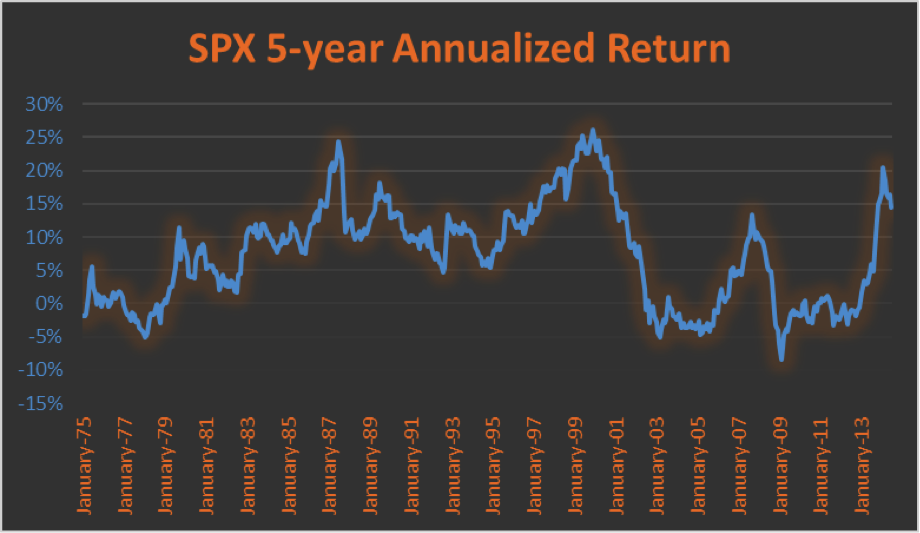
Turning to the S&P 500 (SPX), we see similar action, as it spiked up near 20% before a correction recently. This isn’t as overbought as the RUT, as we have seen moves up to 25% back in the ‘80s and 2000 peak. Still, currently above 2007 makes you think some.
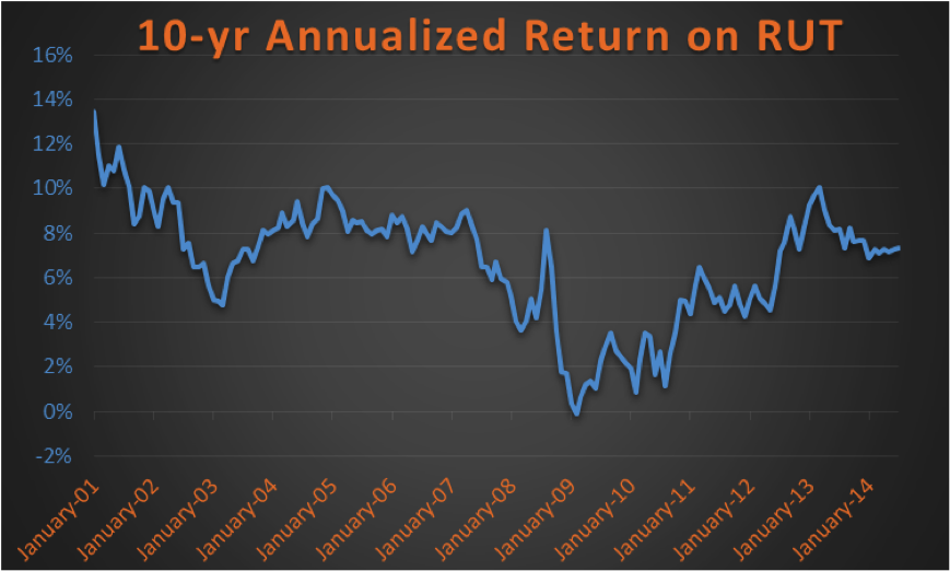
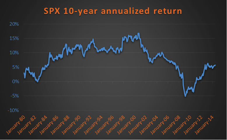
Now here’s where it gets good. Those were 5-year annualized returns. If you go further out and look at 10-year annualized returns we see a much different picture.
Here’s the RUT. Still high, but not nearly as extreme.
The SPX shows a totally different picture. In fact, it has a 10-year annualized return of just over 5%, not very impressive in the whole scheme of things really. So perhaps its short-term overbought, but looks like there’s a lot of room to move higher here longer-term. I think that could be the case.
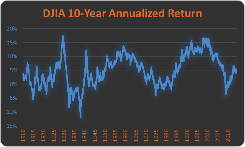
Lastly, here’s the 10-year annualized return on the Dow Jones Industrial Average (DJIA) going back to 1900. The average over this entire time has been around 5%, exactly where it is right now! Again, looking at this chart you could argue there is plenty of room to move higher – potentially for years.
In conclusion, these few charts tell you a lot of info. My take is small caps are still historically stretched and could continue to lag their large cap brothers. Also, near-term the SPX is still overbought and maybe some more choppy and frustrating price action is needed to work off the near-term extremes. But bigger picture we aren’t seeing the major overbought nature we’ve seen at other major market peaks. Thanks for reading.
No position in any of the mentioned securities at the time of publication. Any opinions expressed herein are solely those of the author, and do not in any way represent the views or opinions of any other person or entity.


