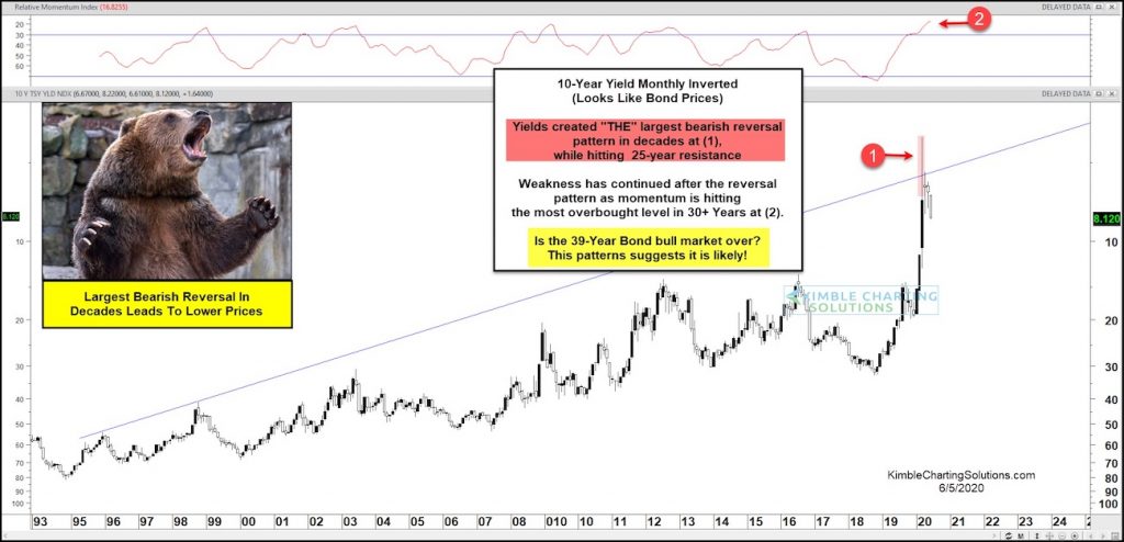
10 Year US Treasury Bond Yield “inverted” Chart
This chart should look familiar, as I’ve shared and updated it a few times to alert clients and readers. Check out this article from early April.
It is the 10 Year US Treasury Yield Chart… inverted.
As you know, bond yields and price move in opposite directions. So this is a way to analyze and think about bonds. And as I’ve pointed out before, inverted charts can also reduce bias.
As you can see, bond yields created the largest reversal pattern in decades. When inverted (as this chart is), yields look like bond prices. So this is action is very bearish for bond price on a long-term historical basis.
Could the 39 year bull market in bonds be over? Sure looks like it. Stay tuned!
Note that KimbleCharting is offering a 2 week Free trial to See It Market readers. Just send me an email to services@kimblechartingsolutions.com for details to get set up.
Twitter: @KimbleCharting
Any opinions expressed herein are solely those of the author, and do not in any way represent the views or opinions of any other person or entity.


: Showing Some Signs of Emerging Strength")
