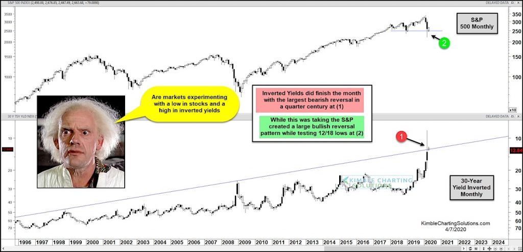
S&P 500 Index versus “Inverted” 30 Year Yield “monthly” Chart
Stocks and treasury bond yields had a wild (and scary) month of March as the financial markets crashed to new lows.
In today’s chart, we highlight this by looking at long-term “monthly” chart of the S&P 500 Index versus an “inverted” 30 Year US Treasury Bond Yield.
Note that inverting charts offers a different perspective and reduces bias. For more on this, read my “Market Masters” article from 2015.
Today’s chart highlights huge reversal patterns for both stocks and bond yields.
The inverted chart of the 30-Year yield shows the largest “monthly” reversal pattern in a quarter century occurred in March at (1). At the same time, the S&P 500 put in a large bullish reversal pattern while testing the December 2019 lows at (2).
Will this “experiment” hold? Stock market bulls sure hope so! Stay tuned.
Note that KimbleCharting is offering a 2 week Free trial to See It Market readers. Just send me an email to services@kimblechartingsolutions.com for details to get set up.
Twitter: @KimbleCharting
Any opinions expressed herein are solely those of the author, and do not in any way represent the views or opinions of any other person or entity.

: Showing Some Signs of Emerging Strength")
