TRYING TO MAKE A RELATIVE TURN
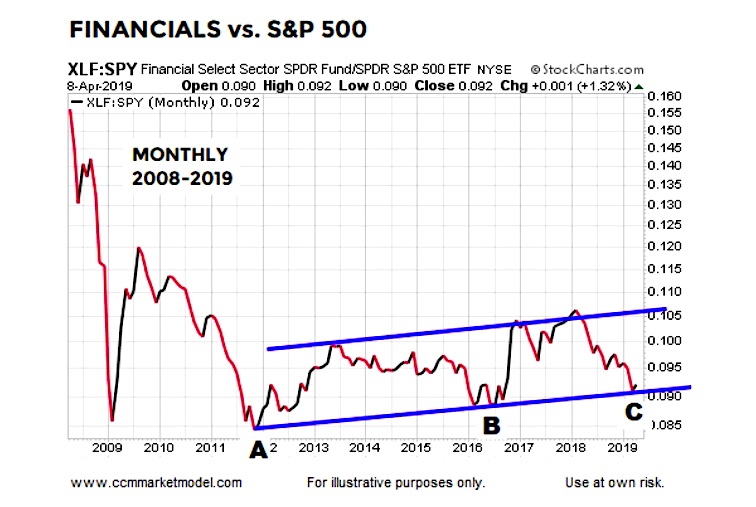
The chart below shows the performance of financial stocks (XLF) relative to the S&P 500 (SPY).
Since making a low in late 2011 (point A), the XLF:SPY ratio has been trading in the slightly upward-sloping blue trend channel.
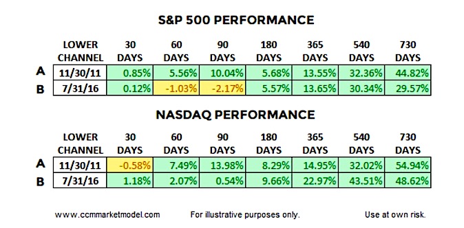
Anecdotally, it is interesting to note point A came on November 30, 2011 and point B on July 31, 2016; both attractive entry points for the general stock market.
The tables below show S&P 500 and NASDAQ performance following point A and point B, telling us to keep an open mind about better than expected outcomes in the stock market over the next two years.
The first 30-90 days reflect normal market volatility, meaning even if good things happen over the next two years, we should expect pullbacks, red days, red weeks, and red months.
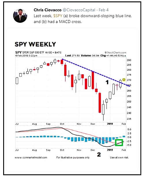
Given the wide fluctuations in the correlation between XLF:SPY and SPY, the XLF:SPY channel above falls into the “that’s interesting” category. However, the concept of shifting bullish momentum, similar to the turns in 2011 and 2016, aligns with a broad array of evidence in 2019. For example, numerous growth-oriented ETFs made 2016-like turns in Q1 2019, as noted in the tweet below dated February 4.
WHAT ABOUT RED DAYS?
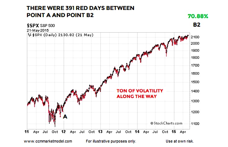
Point A in the XLF:SPY graph is November 30, 2011. The S&P 500 gained over 70% between point A and point B2 (graph below). To capture that gain, an investor had to endure 391 red trading sessions with an average decline of 0.56%. There were 481 green trading days with an average gain of 0.57%.
Therefore, we learn very little about the market’s long-term health by reviewing a red day or cluster of red days in isolation. Red days are normal and to be expected.
OTHER FORMS OF EVIDENCE
This video clip covers numerous forms of “be open to better than expected outcomes” evidence that has accrued in 2019. When new data comes to light, evidence can shift. Thus, nothing says the XLF:SPY ratio can’t experience a bearish breakdown and negate the pattern that has been in place since 2011. For now, the longer-term evidence we have in hand remains constructive. We will continue to take it day by day, while remaining open to all outcomes, from wildly bullish to wildly bearish.
Twitter: @CiovaccoCapital
The author or his clients may hold positions in mentioned securities at the time of publication. Any opinions expressed herein are solely those of the author, and do not in any way represent the views or opinions of any other person or entity.


 Ready To Break Out?")


