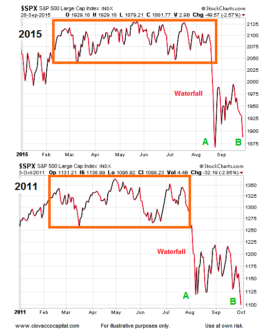
We Can Still Learn From 2011 Analogy
The charts below show some similarities between the stock market topping and bottoming processes in 2011 and 2015.
Both years started with gains that were followed by a long period of consolidation (see orange boxes). In both years, a waterfall plunge occurred when support was broken at the lower end of the range (orange box).
The similarities did not stop there; both years saw a low (point A) followed by a successful retest of the low (point B). In both cases stocks rallied after point B.
All Good Things Must Come To An End
As of March 1, 2016, we are 155 days removed from the retest of the stock market lows at point B that occurred in late September 2015. The second chart below shows the 2011 analogy 155 calendar days after the retest of the 2011 lows near point B.
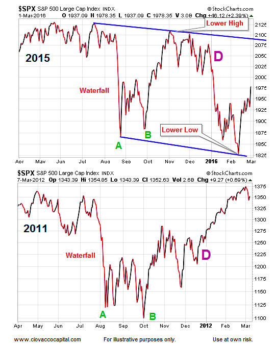
As you can see in the charts above, the analogy between 2011 and 2015 started to break down near point D on each chart. In early 2012, stocks broke sharply higher after point D. Just the opposite occurred in early 2016; stocks kicked off the new year with the worst 10-day start in history.
Comparing The Lows Head-To-Head
Now let’s look at the lows, while comparing stock market trends then vs now.
Since stocks rallied to new highs after the 2011 low, it can also be helpful to compare the October 2011 low directly to the February 11, 2016 low. The two charts below show the S&P 500 19 calendar days after the low in October 2011 and 19 calendar days after the low in February 2016. We have added some common daily moving averages for reference purposes (and to highlight stock market trends during each timeframe).
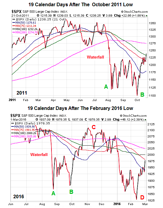
At first blush, the two charts above may appear to be similar. However, there are several subtle, but important, differences that can assist us with the probability of new stock market highs in 2016 vs. the odds of new highs in late 2011/early 2012:
- The biggest difference is the strength of the long-term trend. The 200-day moving average is shown in pink in each chart above. Notice how the 200-day rolled over six months ago on the 2016 chart. Also notice 19 days after the 2016 low, the slope of the 200-day is still negative. In the 2011 version, 19 days after the low, the 200-day had only been weak for less than three months (vs. six in 2016). The differences in the slopes on the 200-day 19 days after the low also speak to a weaker trend in 2016 relative to 2011.
- Another subtle difference is that 19 days after the low in 2011 price was above the 50-day, 75-day, and 100-day moving averages; in 2016, we have only recaptured the 50-day, which is indicative of a weaker trend in 2016.
- The slopes of the 50-day (in blue) 19 days after the low also speak to a weaker trend in 2016. In 2011, 19 days after the low, the 50-day had already turned back up; today continues to have a negative slope.
continue reading on the next page…


