Let us start with this simple example:
We have a 10-person economy, and 7 people earn $2,000 with $5,000 in debt and 3 people earn $3,000 with $6,000 in debt. All debts require a minimum payment of 2%. In aggregate, total income equals $23,000 and total debt service payments equal $1,060. The Debt service ratio equals $1,060 / $23,000 = 4.61%.
5 of the people default on their debts; 3 of the 7, and 2 of the 3. After these defaults, they have no access to credit. In aggregate, total income remains equal to $23,000. However, total debt service payments now equal $520. Debt service ratio equals $520 / $23,000 = 2.26%. Fantastic! The debt service ratio improved by 51%. However, 5 people cannot borrow anything.
If the denominator were reduced by the aggregate income of those people who defaulted, the debt service ratio would equal $520 / $11,000 = 4.73%. Not so fantastic! The debt service ratio worsened by 2.60%.
It is our premise that the debt service ratio is flawed in its construction due to the fact that disposable personal income is not adjusted for those borrowers who default. Is the dramatic improvement in household finances, and the implicit assumption of future spending power, as portrayed by the DSR actually correct?
Now let’s look at some charts to highlight our point here.
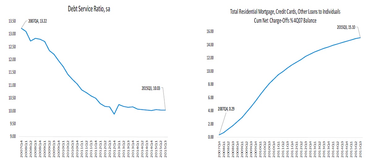
(Left Chart) To create the measure, payments are calculated separately for revolving debt and for each type of closed-end debt, and the sum of these payments is divided by disposable personal income as reported in the NIPA accounts. DPI is not adjusted for those with no access to credit.
(Right Chart) This data is sourced from the FDIC Quarterly Banking Profile.
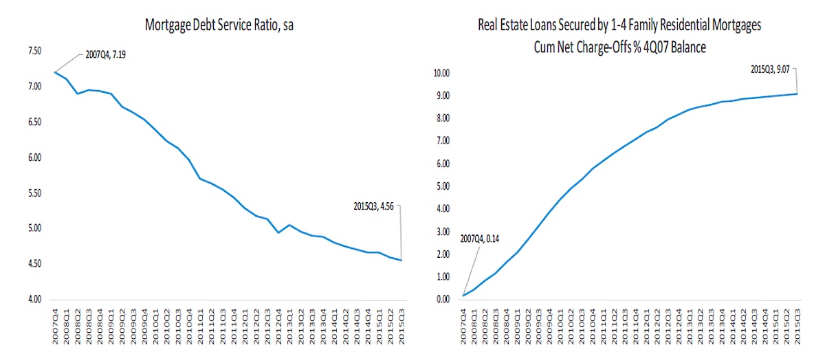
(Left Chart) Estimates of the amount of mortgage debt are taken from the Federal Reserve Board’s Z.1 Financial Accounts of the United States statistical release. DPI is not adjusted for those with no access to credit.
(Right Chart) This data is sourced from the FDIC Quarterly Banking Profile.
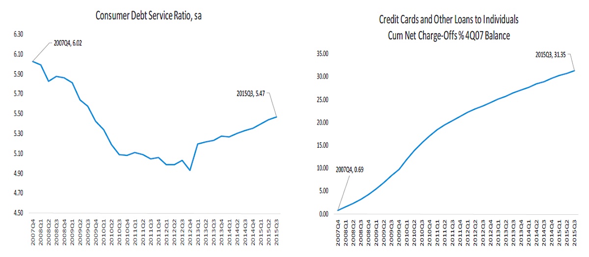
(Left Chart) Estimates of outstanding consumer debt are taken from the Federal Reserve’s G.19 Consumer Credit statistical release. DPI is not adjusted for those with no access to credit.
(Right Chart) This data is sourced from the FDIC Quarterly Banking Profile.
Thanks for reading.
Twitter: @Techs_Global
Any opinions expressed herein are solely those of the author, and do not in any way represent the views or opinions of any other person or entity.


