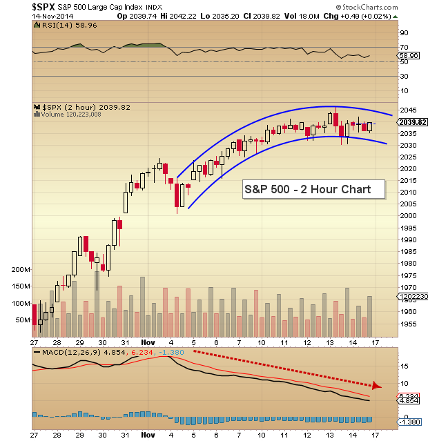
Well, this chart isn’t going to be flashy. And in fact it may be downright boring. Let’s take a look at the S&P 500 chart from the past few weeks, focusing on the past week or so in general.
The S&P 500 has traded in a fairly narrow range for the past 6 days, leaving behind a trail of slowing momentum. Will this underlying weakness lead to a pullback in stocks next week?
Price has created a pattern that looks tired and somewhat complacent to the visual eye. Take today for example: The S&P 500 traded in a range of just 7.02 points. To be fair, what I mean by complacent is that the price action looks robotic… almost as if the algorithms were placed on cruise control.
Typically when price trades in a narrow range, it is a sign that range expansion is nearing. This type of price action should have traders on alert for some volatility to enter the markets over the next week or so.
Also be sure to read fellow SIM contributor Andrew Kassen’s post on the ISEE Put/Call Ratio and what it might be saying about the recent price action.
S&P 500 2 Hour Chart
Trade safe.
Follow Andrew on Twitter: @andrewnyquist
The author holds a net short exposure to the S&P 500 at the time of publication. Any opinions expressed herein are solely those of the author, and do not in any way represent the views or opinions of any other person or entity.


: Important Breakout Retest")


