While the stock market continues its boring path higher within the confines of the narrowest of channels, one needs to look elsewhere for some price volatility.
Well, kind of.
Once again, treasuries sit at the precipice of what could be some ugliness, which are higher yields very quickly. Will the bond market finally get pushed over the edge, and with it, a reexamination of the stock market and its lofty levels? Or will the bond bears, and there are many, be disappointed again.
Bond Market Higher Yields?
In a normal world, that is without the Federal Reserve setting monetary policy (remember the Volcker FED raised the Fed Funds rate to 20% in the early ‘80’s and the Bernanke FED dropped them to 0% in 2008), bond yields would rise during equity bull markets and economic recoveries and fall during weakening economies/recessions and equity bear markets. Believe it or not, this is kind of hard to prove using treasury data back to the early ‘80’s. Why?
Because treasury yields have been in a bull market since 1981 when the 10-year treasury yield reached 16%. Yields bottomed around 1.4% in 2012 and retested that area (1.3%) in 2016. During the economic recovery from late 1982 until mid-1990, the 10-year yield fell a couple hundred basis points (bps). During the economic recovery of 1991 to early 2001, yields fell about 300 bps. During the recovery from late 2001 until late 2007, 10-year yields declined about 100 bps. The latest economic recovery, which started in mid 2009, has seen yields decline about 100 basis points from 3.5% to 2.5%.
To those closet economists who may have picked it up, there was a small (okay moderate) flaw in my analysis above. Bond yields “should” drop before the end of the recovery as the expansion loses momentum before rolling over into a recession. During the late 2001 to late 2007 recovery, yields were about 100 basis points higher 6 months prior to the expansion ending so using this data, the 10-year was basically flat. The same can be seen during the recovery from 1991 until early 2001. Yields peaked about a year prior to the recovery ending, so that recovery actually saw the 10-year fall 130 bps instead of 300.
Before the Volcker FED, economic recoveries that ended in the late 60’s, the mid-70’s, and the late-70’s all saw the 10-year yield rise by 100 to 300 basis points. This, in my opinion, is more normal bond market action. Economic growth accelerates, stock market rises, funds move from bonds to stocks = higher yields. It’s just common sense.
As I have stated many times, treasury yields dance to their own music and lead the FED and its machinations with the FED Funds rate. Yet, at the peaks (1981) and troughs (2012, 2016), there was clear panic in the treasury market, exacerbated by an over aggressive (panicky) Federal Reserve. The 10-year soared 600 basis points in late 1980 to their peak in 1981 (10% to 16%) and crashed about 200 bps from 2011 to 2012 (3.5% to 1.4%).
My major points here: The stock market most likely does not have the tail wind from lower rates that we have had since 1981. Future economic expansions/bull markets are likely to see more normal bond yield increases.
Before I take a look at the current technical condition of the treasury market, I will repeat a couple conclusions from months ago. First, the peaks in the stock market in 1987, 1990, 2000, and 2007 occurred when the 10-year yield was at 9.6%, 9%, 6.8%, and 5.3% respectively.
With the current yield on the 10-year at 2.56%, we most likely have a far amount of leeway on the upside before any stock market or economic issues develop. Second, and this comes from a lot of historical data, the stock market’s highest valuations have occurred with the 10-year yield between 4% and 6%. This also supports that near term bond market worries for stocks is most likely very overblown.
Monthly Chart – 10-Year Treasury Bond Yield $TNX
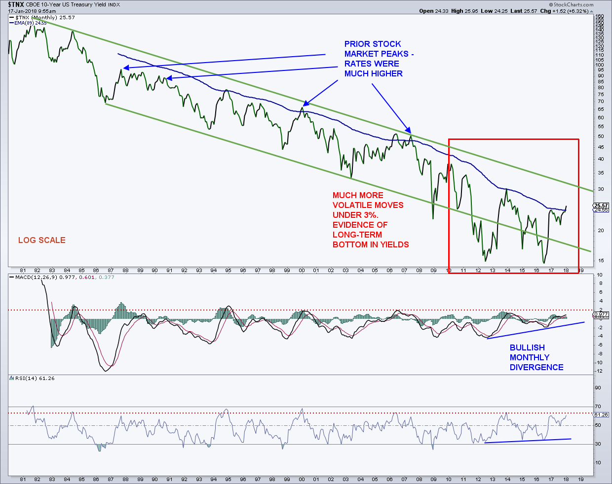
The monthly 10-year yield ($TNX) chart shows that yields are just above the middle of a downward sloping channel that goes back to the early ‘80’s when using a log scale. I have been saying for years that the 10-year yield is in a bottoming process that would take many years. A 30+-year bull market does not turn on a dime. We have seen a large pickup in volatility since 2011, and this is strong evidence that a trend change is taking place.
Yields are currently flirting with their 89-month exponential moving average, which has basically kept a lid on yields going back to the 80’s. To break the long-term (L.T.) channel, put in a higher high, and confirm that rates have finally bottomed, the 10-year needs to break above the 3% – 3.36% region.
That would complete a very large double bottom and target the 4.5%+ area in the next couple of years. The monthly MACD traced out a bullish divergence at the yield low in 2016 and is back in positive territory. The 14-month RSI is above 50 and not far from breaking to its highest level since 2000. These two L.T. momentum indicators are suggestive of higher yields in the year(s) ahead.
Weekly Charts – 10-Year Treasury Bond Yield $TNX (wide & zoom)
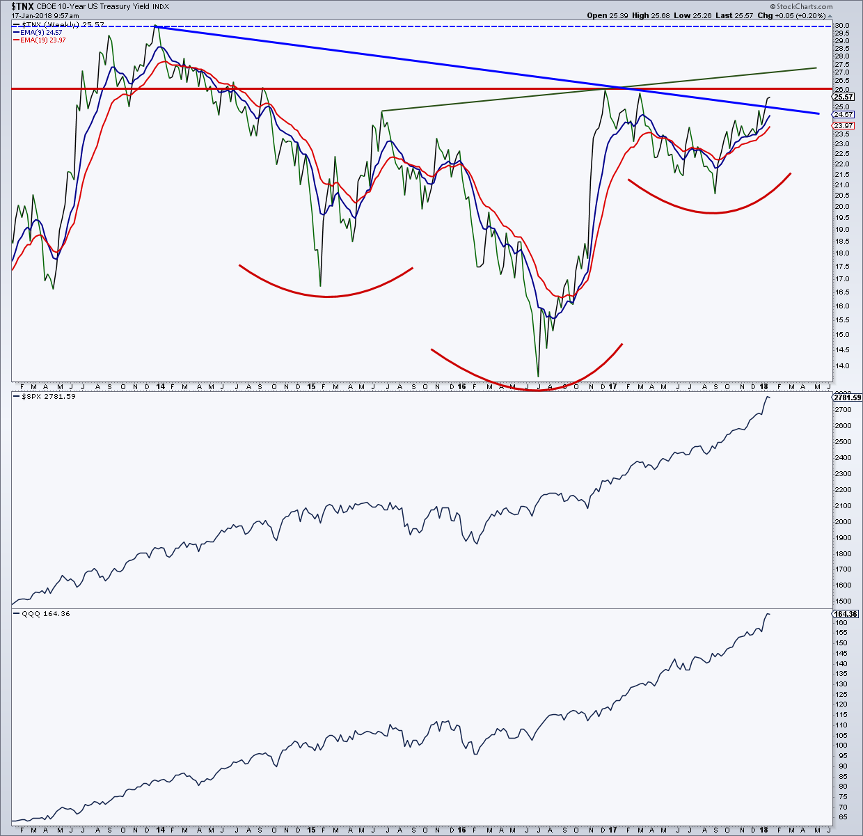
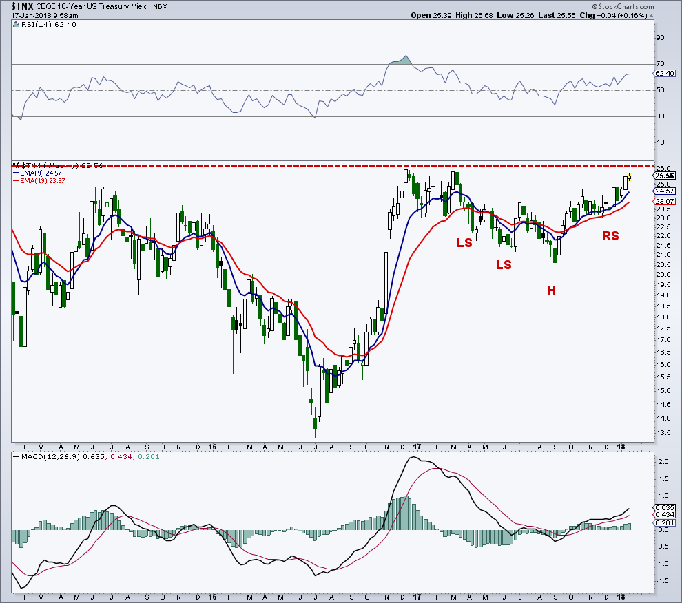
On the weekly $TNX chart, things really get interesting from a technical perspective. There is a potentially large inverse head-and-shoulders (H&S) bottom that is almost complete, with this pattern going all the way back to late 2014. To complete this formation, yields need to break the prior high of the pattern at 2.62%. That would open the door for a measured move up to the 3.8% region. Looing at the chart since late 2016, there is another potential complex inverse H&S developing, which also needs to clear the 2.62% level to complete. This H&S is the right shoulder of the larger H&S I just talked about.
Looking behind the scenes, the Commitment of Traders (COT) data for the 10-year is mixed, but bearish for the 30-year. Sentiment is neutral for the 10-year and excessively optimistic for the 30-year. Hedge funds are underexposed to bonds, however, this has had very mixed results for bonds.
Treasury rates are poised to break higher in 2018. Be cognizant about interest sensitive, or so-called safe/defensive areas of the market.
My stock market conclusion remains the same: While some evidence from sentiment and market breadth exhibit an overheated and divergent market, and a pullback could emerge at any time, I still do not see the longer-term deterioration under the surface that is normally seen as major tops are traced out. Additionally, we most likely need to see a very large pickup in volatility for a major top or a blow off top, neither of which is from being seen.
Feel free to reach out to me at arbetermark@gmail.com for inquiries about my newsletter “On The Mark”. Thanks for reading.
Twitter: @MarkArbeter
The author does not have a position in mentioned securities at the time of publication. Any opinions expressed herein are solely those of the author, and do not in any way represent the views or opinions of any other person or entity.


")

 Ready To Break Out?")

