“Inflation is as violent as a mugger, as frightening as an armed robber, and as deadly as a hit man.” – President Regan
I am delighted to announce that our firm is now, Alexander & Swartz, Capital Research. Our new name reflects the evolution and transformation of our business. It’s not the first time in history a company has decided to change their name. Remember, Backrub? They are now, Google. How about, Brad’s Drink? Pepsi. My personal favorite is, Computing Tabulating Recording Corporation. That is IBM.
For a primer, please click here to read Part I of “The Party Is Over”.
Today I will be sharing some charts that I think are very well worth your time to have a look at.
The insight from charts and what they can reveal has been extremely valuable to me and my clients over the years; but first, I’d like to preface this by telling you that if I spent my life listening to every person that told me, I couldn’t do “that”, or the “that’s impossible” guy and the “who do you think you are trying to do that” crowd, I wouldn’t be typing this right now!
It’s a fault of human nature to look at what everybody else does so you do not stand out; but the impact of conforming to thinking and doing like everybody else, only results in getting what everyone else gets. There is a long history of us running against the grain, doing what is supposed to be impossible because our gut/spirit knows better.
The reason for mentioning this is after spending many years with a variety of Advisors, Fund Managers, Wholesalers, Ma’ and Paw’ Kettle, Joe CEO there is one very moot mantra being repeated that should not fall from anyone’s lips… “You can’t time the Market!”
Sounds painfully like the saying, “Well, you know what they say…”
Who is “they” anyway?
Let’s hold a mirror up to the “can’t time the market” mantra and reflect it back onto the purveyor who is living in the land of can’t and won’t.
The word “Cannot” is not in our repertoire. Saying you can’t, means you never will; but get one thing clear…
We can, and we will, keep on timing the market!
Here is the secret: Investors do not have to know how to time the market if you just listen to what the market is telling you. The key is to interpret the language properly. The Capital markets love to speak the universal language of mathematics.
With that said, if you do not believe the square root of 9 is 3, that flowers have 3, 5, 8, 13, 21, or 34 petals on them (Fibonacci sequence), or that music vibrates at certain frequencies, then you probably won’t believe the chart below.
Let’s have a look. First concept here is Price is equal to Time and Time is equal to price. The second, is that markets tend to make turns at numbers; that when squared, are whole numbers 4, 9, 16, 25, 36, 49…and so on.
It has now been ~ 3,683 days since the 2007 Top or HIGH and this equates to 121 months. The square root of 121 is 11. Markets often turn and burn the other way on square out dates (see chart below)!
ANALYSIS OF THE DOW ($DJIA)
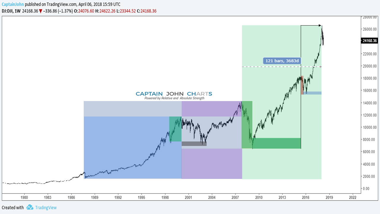
- If you take the 1987 Crash LOW and measure Price to the 2000 HIGH in the Dow Jones Industrial Average and add the distance, it forecasts the 2007 top; years before it happened!
- The price from the 1987 LOW to the 2007 HIGH when added to the 2007 HIGH yields a target that has been recently reached.
- The HIGH in 2007 to the low in 2009 forecasted (6 years earlier) the 2015 summer Top (Green Right Angle).
- The 2015 HIGH to the 2016 LOW is suggesting the time for the Top Is Now.
We can also see these relationships in various other major stock market indices.
The Dow Jones Industrial $DJI Monthly Chart (below)) shows the zeroing out of the market from the start of the crisis in 2007 at 100% Fibonacci extension and the move in 2009 down to 0%.
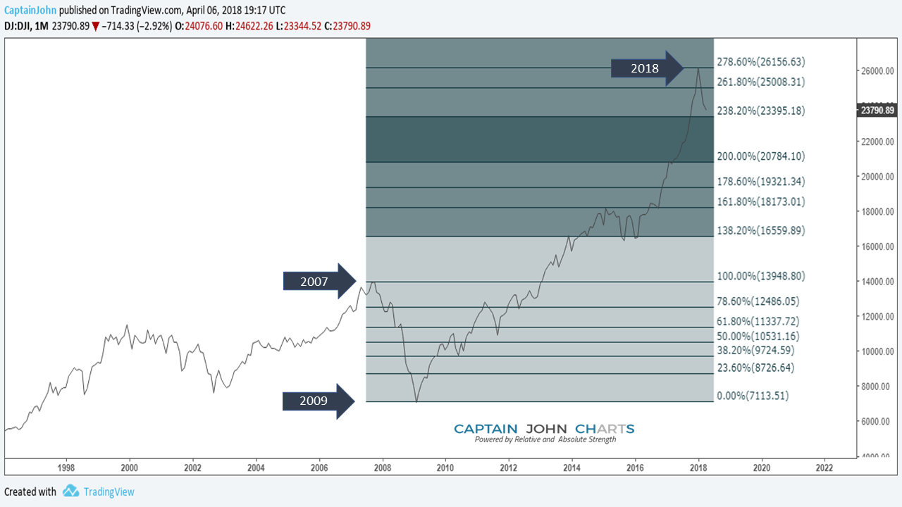
Since the 2009 low at 0%, the Dow Jones Industrial extended to the 278.60% Fibonacci extension, then turned immediately down. Price tends to turn at key Fibonacci extension numbers such as 278.60% or 261.80%
There is not a test of any Fibonacci level in price between 278.60% till you look all the way back down to the 138.20% test of this level at 3 different times from 2014-2016.
Retracement ratio 78.6% is a derived primary ratio calculated as a square root of the primary level 61.8% which is perfect harmony, and as such has mathematical justification.
Here’s the real significance; at these extension levels, you can be reasonably assured the top is in. The last run from 261.8% was sellers selling to those late comers whose timing is often mysteriously opposite and often extraordinarily late to the party.
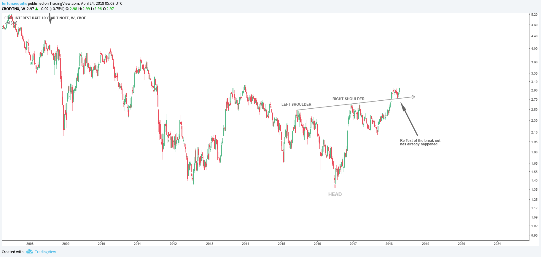
TEN YEAR TREASURY AND RATES
Below is the Weekly chart of the 10 Year Treasury Note Interest Rate of the US Government Bond ($TNX). Notice how a massive head and shoulder bottom is in progress and the test of the neckline is already complete?
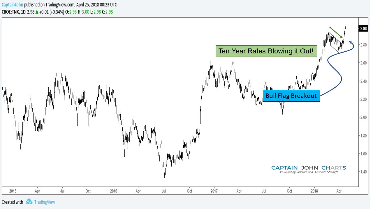
The Daily Ten Year is equally bullish…
In the Monthly (long-term) chart below, Interest rates on the 10 year note already made a clearly defined double bottom and a break of the long-term downtrend while showing great relative strength.
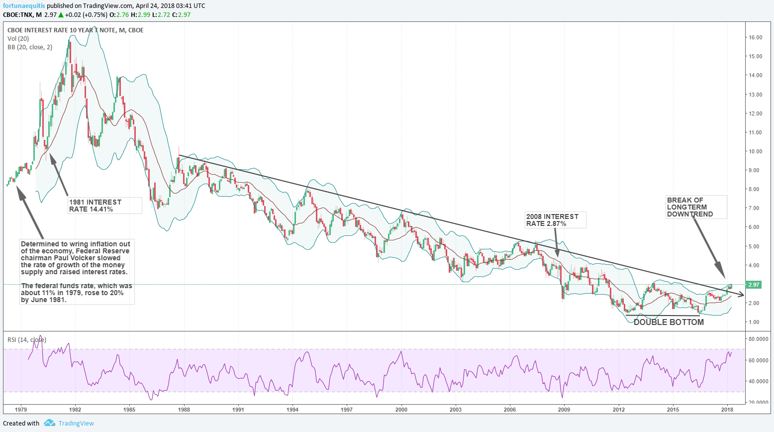
We think that interest rates should continue to gradually go up, further pressuring the stock market.
We have been bullish on rates and short the S&P 500 on a relative strength basis; or in a spread/pair trade.
Another troubling factor weighs heavy for the US REIT’s if the Twenty-Year Bonds continue to outperform.
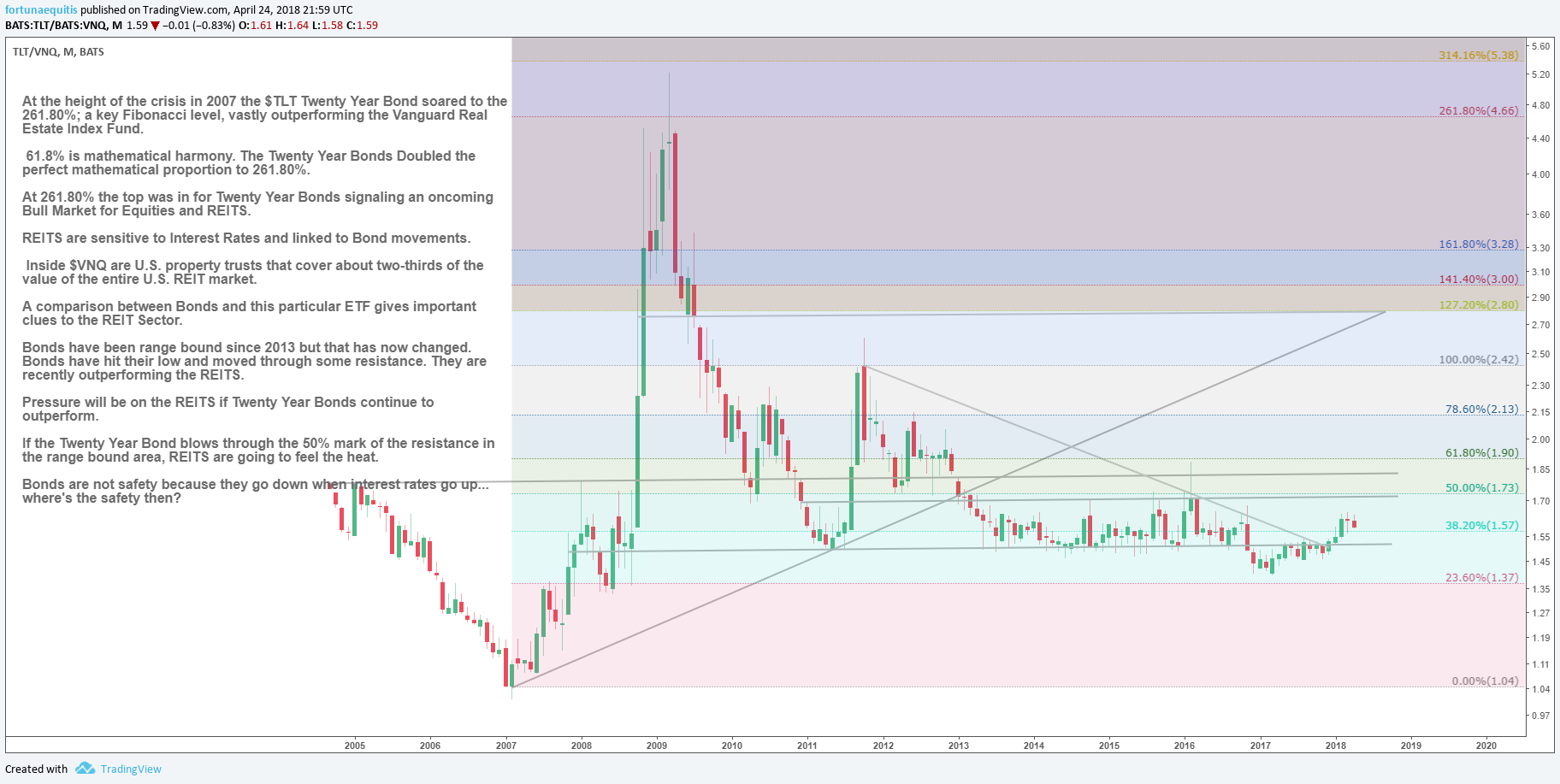
Bond’s are no longer considered a safety when interest rates go up (i.e. bond go down). So, where’s the safety then?
Is it in the largest Nasdaq and Biotech companies ETF; known as $QQQ?
The Daily Chart $QQQ
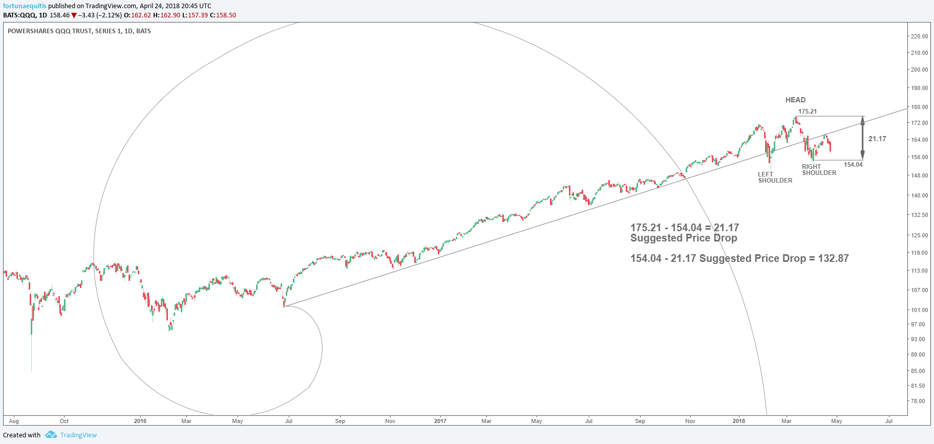
- A bearish Head and Shoulders pattern has formed along the trend line extending from the center of the Fibonacci spiral.
- Based upon calculations a suggested price drop of $21.17 derives a bearish price target of $132.87.
- The Daily chart isn’t enough of a view to see what’s really coming.
The Monthly Chart $QQQ
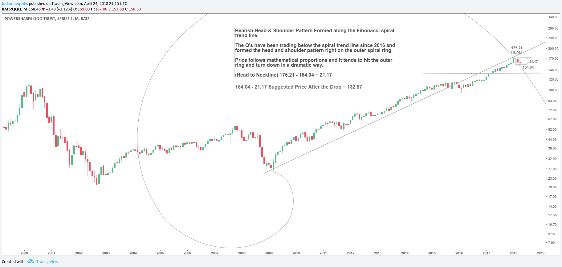
Notice now where the Head and Shoulders pattern formed in the longer-term chart?
- It is significant that it formed right on the outer spiral.
- When price hit the long-term trend line, it formed a head in the pattern then turned down to form the right shoulder; forming precisely right where the Fib trend line and outer ring intersect!
- Price follows mathematical proportions. Once price hits the outer ring; it will signal a top, then turn and burn down in a dramatic way.
- Current selling in the Q’s shows that the candles are tracking along the arc of the Fibonacci spiral. Perhaps they are leading to the $132.87 bearish target that completes the Head and Shoulder Top pattern? With that being said…
I don’t believe there is any safety there either.
Please note that Captain John Charts is now Alexander and Swartz Capital Research. Our research is all about maximizing ones assets and growth; even in the worst of environments.
Twitter: @CptJohnCharts & @FortunaEquitis
The author may have a position in mentioned securities at the time of publication. Any opinions expressed herein are solely those of the author, and do not in any way represent the views or opinions of any other person or entity.


