“What The Fed did, and I was part of it, was front-loaded an enormous market rally in order to create a wealth effect… and an uncomfortable digestive period is likely now.” – Former Dallas Federal Reserve Governor Richard Fisher – January 5, 2016.
Do Not Say You Were Not Warned – Again
Throughout 2015 we discussed various measures of evaluating equity prices. All of our analysis continues to point to current equity valuations being near an extreme and that poor future returns should be expected. As a result, we have not been shy in our belief that it is prudent for investors to take a more conservative tack with equities. Indeed, equity market price deterioration in just the first three weeks of 2016 has wiped out nearly two years of gains. While we are uncertain if the recent downturn is the beginning of the anticipated bearish period we expect to materialize, we believe it is important for investors to better understand the poor risk/reward dynamic of holding equities in the current environment.
On the heels of the frank comments from Mr. Fisher, we thought it would be helpful to share yet another type of equity analysis to help visualize the effect the “enormous rally” has had on equity valuations.
Soaring Price to Earnings Multiples
The scatter plot below shows the strong correlation (r-squared = .75) between long-term earnings growth estimates and the price to forward earnings estimates ratio. This ratio is similar to traditional P/E measures but uses 1-year forward earnings estimates instead of historical earnings data. When long term growth estimates are high, investors tend to be optimistic and likely to pay a higher premium or a greater multiple for earnings (this pushes equity valuations higher). The opposite holds true for lower growth expectations.
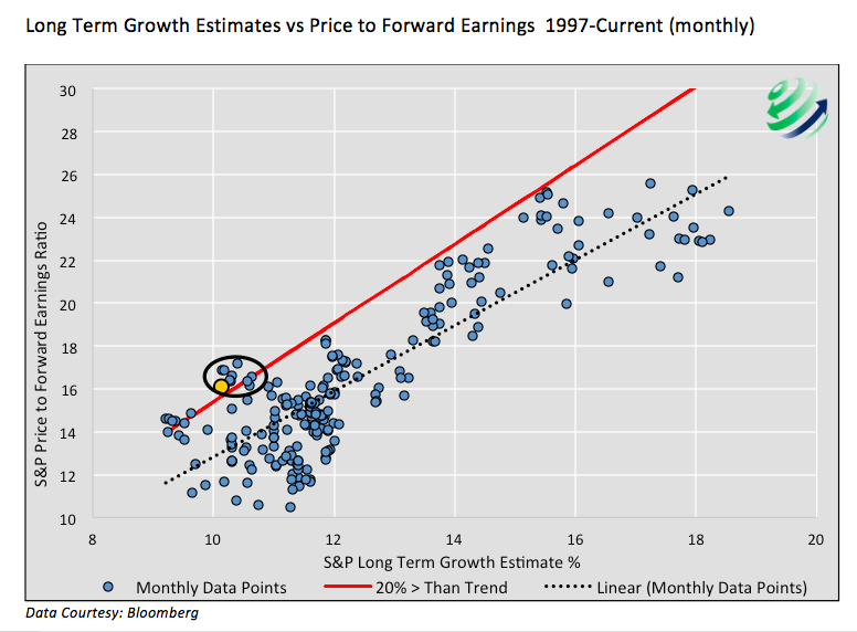
Deeply concerning to us, and apparently now to Mr. Fisher, is the degree of excessive optimism embedded in current prices and equity valuations. The red line delineates combinations of earnings ratios and long term growth estimates that are 20% greater than the dotted black regression line. The yellow dot, representing the most current data, lies slightly above the red line and at levels rarely seen in the last 20 years. The circled cluster of data points nearest the yellow one are all from the prior 9 months.
**Keep in mind as you view the charts- the data only covers the last 18 years, a time period which we would argue contains three of the largest equity bubbles since the Great Depression. Accordingly, observations that stand out as extreme within this data-set are even more extreme when analyzed over longer time periods.
Where will the dot go over time?
The inevitable question is, “Where and how will the yellow dot shift?” In the following chart we add arrows to the scatter plot to help visualize how the location of the dot might change. In reality there are an infinite number of possibilities but we offer four base cases (A-D) in an effort to asses which shifts might be of higher or lower probability.
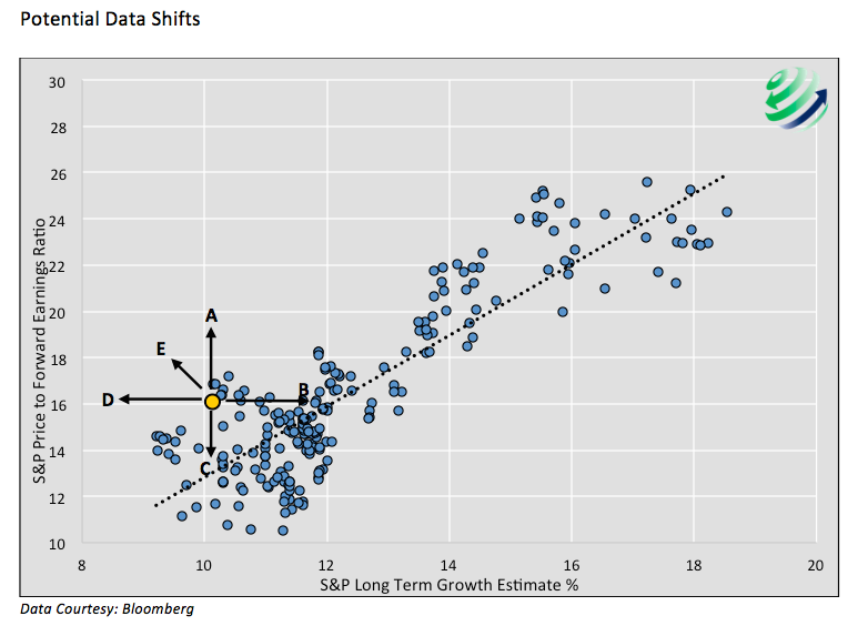
1. This scenario infers prices increase at a faster rate than expected forward earnings, or decline at a slower rate than forward earnings decline. Also conditional is that long term growth estimates remain the same. This scenario leads to further multiple expansion beyond the current levels, which as noted earlier are already historically extreme.
2. This arrow represents a path towards normalization back to the trend line. In this case long term growth estimates rise and investors do not pay a higher forward earnings multiple as they traditionally have. An increase of long term growth rate estimates of 3% currently, absent a change in the price to forward earnings ratio, would bring the market to a fair valuation and a multiple consistent with the last 18 years of data.
3. This arrow presents another path to normalization. Long term growth rates remain stable like arrow A, however unlike arrow A, multiples decline back to trend. In this case a price drop in the S&P 500 of 20% with no change in expectations for one-year forward earnings, would be required to normalize equity valuations.
4. In this scenario, price to forward earnings multiples remain unchanged despite a shrinking long term earnings growth rate. This would defy historical precedent as reduced long term earnings estimates have usually been met with lower price multiples. The fact that current equity valuations are already at extremes seems to make this scenario unlikely.
5. This arrow highlights the general direction the data points have traveled over the last 5 years. This is more accurately shown in the scatter plot below which uses yearly color codes to map out the last 5 years of data.
continue reading on the next page…


 Nears Important Pivot Point")

 Nears Important Pivot Point")

