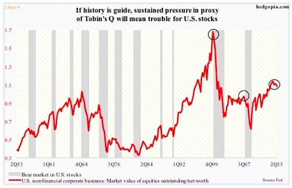
The red line in the next chart (see chart 4 below) is a proxy of Tobin’s Q.
Tobin’s Q is the ratio of a company’s market value to the replacement value of its assets. For our purposes here, the market value of equities outstanding of U.S. non-financial companies and their net worth is used (in 2Q, they were $22.1 trillion and $21.4 trillion, respectively).
The ratio has been north of one the past eight quarters, and in the current cycle peaked in 2Q14 at 1.09 – the highest since 1.64 in 1Q00.
Two things are worth noticing. First, it has hooked down (2Q was 1.03), and second, it is doing so from a relatively high level.
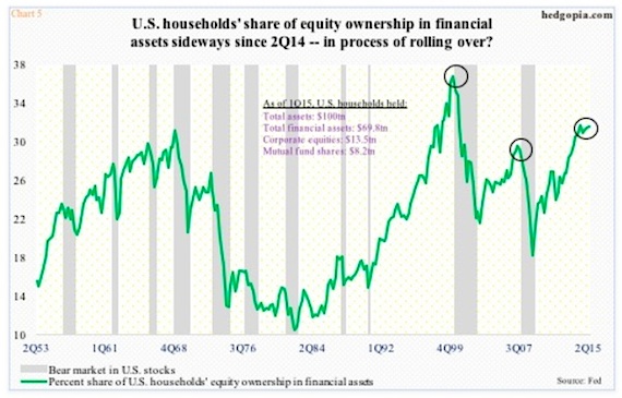
Probably also in the process of peaking is the green line in Chart 5 below – It shows U.S. households’ equity ownership in financial assets. Despite all the talk we hear about bear market-burned retail investors yet to go all in, households in 2Q held 31.2 percent of their financial assets in equities – slightly below 31.3 percent in 2Q14. The cycle high a year ago is second only to 36.4 percent in 1Q00.
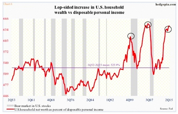
Staying with households, if we just focus on their net worth, the picture could not be brighter. In 2Q, net worth was $85.7 trillion. But then again what looks good on an absolute level may not do so on a relative basis. When we compare net worth with disposable personal income – $13.3 trillion in 2Q – we see how lopsided the increase has been in the former. In 2Q, net worth was 6.45 times disposable personal income – second only to 6.51 times in 4Q06 (chart 6 below). Stocks do not like once a process of unwinding begins.
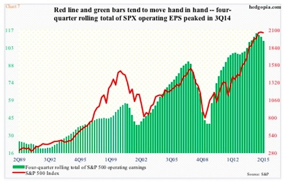
This is even more so when it comes to earnings growth – or a lack thereof. In our final chart (chart 7 below), the S&P 500 is pitted against the four-quarter rolling total of operating earnings for its constituent companies. The green bars peaked in 3Q14 at $114.51 and by 2Q15 were $6.20 lower. Primarily due to energy, estimates for this year have collapsed to $111.08 from as high as $137.52 at the end of 2Q last year. Ironically, 2016 estimates in February this year were $137.46 and have since dropped to $129.45 – still expected to jump 16.5 percent over 2015! If next year’s estimates look high – and in all probability they are – watch the red line. The correlation coefficient between the two variables is .9. They move in tandem. And worth a close watch.
How Charts 2 and 3 evolve can have repercussions for Charts 4, 5, 6 and 7, and hence for stocks.
Thanks for reading!
Twitter: @hedgopia
Read more from Paban on his blog.
No position in any of the mentioned securities at the time of publication. Any opinions expressed herein are solely those of the author, and do not in any way represent the views or opinions of any other person or entity.

: Showing Some Signs of Emerging Strength")

