Last month I wrote a short article about why I thought stock market returns are going to be muted over the next 10 years. A prediction of low returns is not a crash prediction nor is it a prediction of a top in the stock market. Typically an intermediate top is preceded by signs of market divergence – warning signs of cracks under the surface exposed by market new highs that are not corroborated by new highs in related indicators. One important non-confirmation is the Dow Industrials vs. Dow Transports which is discussed here in a recent post by Andy Nyquist. Let’s talk about a few other significant market divergence measures.
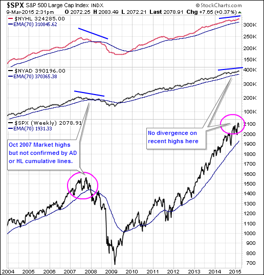
NYSE High-Low and Advance-Decline Index
To illustrate an example of market divergence, look below at this chart with the NYSE High-Low index and Advance-Decline index. The S&P 500 Index made new highs in Oct 2007, but there was no follow through in the cumulative HL or AD indexes. That was an important signal and should have raised many red flags for long term investors. Note that there is no divergence yet with today’s market. That is very positive.
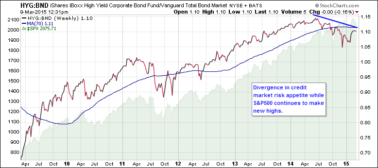
Credit Market Risk Appetite is waning
Often at market inflection points, the credit markets will portend a shift in risk appetite before the stock market. We can get a proxy of risk in the bond markets by watching the ratio of high yield bonds compared to short term bonds. This ratio peaked last summer. If there is no resumption of junk bond buying with the next attempt at market highs, investors should be wary. When risk-on becomes risk-off and there is a rush for the exits, it is difficult for small investors to avoid getting trampled.
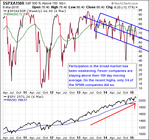
Participation by fewer stocks
Another indicator that I watch for market divergence is participation. In particular, I’m interested in how many companies are participating in the new market highs. Below is a chart showing the percentage of stocks above their 150 day moving average. There seem to be fewer companies meeting this measure of strength as the market advances. That means the heavy lifting of the weighted indexes is being done by fewer companies. That is a market divergence measure that active investors should continue to monitor.
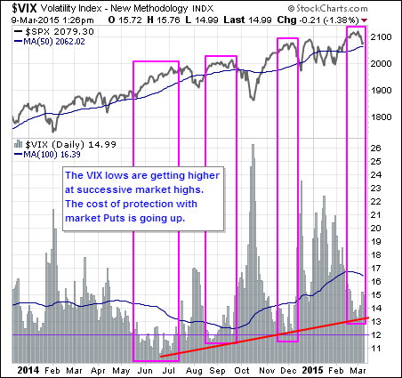
Volatility Index as Fear Gauge
Lastly, another interesting indicator to watch at market inflections is the CBOE Volatility Index. It is a measure of the market’s expectation of 30 day volatility and is integral in the pricing of options. The lower the VIX is, the lower the cost of protecting your portfolio with puts. As you can see with the following chart, the VIX lows are getting higher at each of the market new highs. Option market makers seem to be less likely to sell cheap protection. This may just be a short term situation, but I’ll be keeping an eye on this situation during the next bounce.
In all, there are some signs of divergence, but not so significant to run for cover just yet. However, the next run higher in the markets will tell us a great deal. Will we get to new price highs? Will there be corroboration in these other indicators? Have some patience to see how these will play out. In the meantime, I’ll suggest appropriate caution.
Follow Brad on Twitter: @BBTompkins
Any opinions expressed herein are solely those of the author, and do not in any way represent the views or opinions of any other person or entity.


