Imagine a world with two investment options, apples and oranges. Investors are best served to reduce their holdings of apples and to replace them with oranges when demand for apples drives the price too high.
The simple logic in this example is applicable across the full spectrum of economics, and it holds every bit as true in today’s complex world of investing and the ongoing debate between owning stocks vs bonds.
The question every investor should have is: “When does the price of “apples” make “oranges” the preferred holding”? Most of the time, answering that question is not easy. Occasionally however, the evidence becomes too obvious to ignore.
Replace apples and oranges with stocks and bonds and you have defined the majority of investors’ asset allocation schematic. Unlike our fruit example, the allocation decision between stocks and bonds, is based on many factors other than the price of those two assets relative to each other.
Among them, recent performance and momentum tend to be a big influence in both raging bull markets and gut-wrenching bear markets. In both extremes, valuations tend to take a back seat despite historical data providing ample evidence that equity valuations alone should drive allocation decision.
Current equity valuations and nearly 150 years of data lead me to believe that I should ignore yesterday’s stock market momentum and gains and should shift to bonds. Below I’ll explain my thoughts.
Stock Market Valuations
How often do you hear someone touting a stock because its share price is low, or advising you to sell because the price is too high? This nonsense does not come from just Uber drivers and novice investors; it is the primary programming line-up of the main-stream business media. The share price on its own is meaningless. However, the stock price times the number of shares outstanding provides the market capitalization (market cap) or the dollar value of the company. Inexplicably, market cap is a number you rarely hear from those giving stock tips.
Market cap allows investors to take the aforementioned corporate worth and compare it to earnings, cash flow, revenues and a host of other fundamental data to provide a logical valuation platform for comparison to other investment options.
While investors use a slew of different valuation techniques, I tend to prefer the Cyclically-Adjusted Price-to-Earnings (CAPE) Ratio as devised by Nobel Prize winning economist and Yale professor Robert Shiller. The ratio adjusts for inflation and as importantly, uses ten years of earnings data to derive a price to earnings ratio that encompasses business cycles. Shiller’s approach eliminates short-term noise that tends to make the more popular one-year trailing price-to-earnings ratio erratic and potentially misleading.
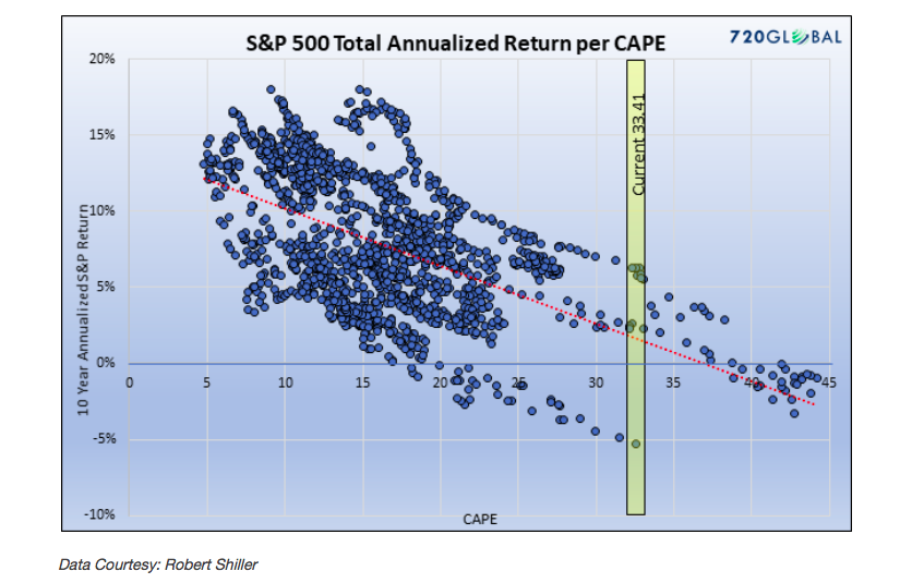
Currently, the CAPE on the S&P 500 is 33.41. Looking back as far as 1871, today’s valuation has only been exceeded by a brief period in the late 1990’s. To help link return expectations and CAPE valuations we plot below every historical monthly instance of CAPE to the respective forward ten-year returns. Each of the 1,525 dots represents the intersection of CAPE and the ten year total return that followed since 1871.
Apples or Oranges
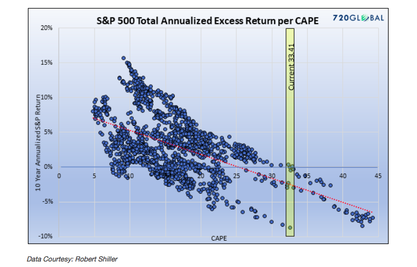
While the analysis is telling, investors should compare the returns versus those from a ten-year U.S. Treasury note to determine whether the returns on stocks adequately compensated investors for the additional risk.
The graph below shows the returns above minus the prevailing ten-year U.S. Treasury note. Essentially, the graph shows the excess or shortfall of the returns provided by stocks versus those of ten-year Treasury Notes in the ten years following each monthly CAPE instance. Negative returns indicate the 10-year Treasury yield exceeded the 10-year total return on stocks.
To better highlight the data and put a finer point on current prospects, consider the bar chart below.
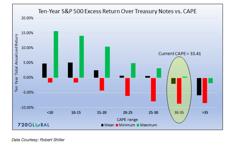
The chart above aggregates the data from the prior chart into ranges of CAPE as shown on the x-axis. It also displays the mean, maximum and minimum of the excess ten year returns of stocks at the various CAPE ranges. This information can be used to create expectations for future performance given a stated CAPE.
With the current CAPE at 33.41 as circled, investors should expect an annualized excess return for ten years of -2.04%. Based on historical data which includes 32 full business cycles dating back to 1871, the best excess return experienced for all instances of CAPE over 30 is 0.39%. Over this 147 year period, there have been 57 monthly instances in which the CAPE was above 30. Only four of these instances provided an excess return over Treasuries and the average was a paltry twenty basis points or 0.20%.
Call me cynical, but the prospect of equity market excess returns for the next ten years measuring in the fractions of a percent is not nearly enough compensation for the distinct possibility of underperforming a risk-free asset for ten years.
Summary
History, analytical rigor and logic all argue in favor of shifting one’s allocations away from stocks. Investors have no doubt become accustomed to the easy gains provided by equity markets over the past ten years, and old habits are hard to break but we know valuations to be mean-reverting. Given current extremes, this comparison offers compelling evidence that compounding wealth most effectively depends on breaking that habit.
Twitter: @michaellebowitz
Any opinions expressed herein are solely those of the author, and do not in any way represent the views or opinions of any other person or entity.

: Showing Some Signs of Emerging Strength")

