Today, thanks to Quantitative Easing (QE) by the Federal Reserve, the yield curve couldn’t be any further from an inversion – the hint that alerted keen observers to a nearing equity peak in the previous recession. But with rates being held artificially low for so long, it seems only a matter of time before other, later intermarket indicators come to fore to signal an end to the party in equities (See my April 2014 research post “Wave of Mutilation” for some additional context).
Treasuries, Equities, Crude Oil, 2007-2008: Correlated Into Crisis (click image to zoom)
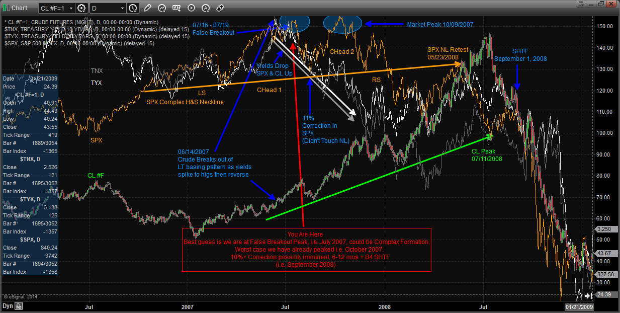
In the chart above, the grey & white arrows point to falling yields while the orange & green arrows identify rising prices in equities and crude oil, respectively. In a normal market environment, long bond yields should be correlated (rising) when equities and crude oil are rising together. The major red flag didn’t occur until equities continued to rally between August-October 2007, even as yields continued lower. This is known as a “Flight to Safety” scenario, in which smart money (institutions, hedge funds, sovereign wealth funds) reallocate to safer harbors before the onslaught of a storm. Despite this intermarket divergence, 2007 ended the year with a positive return in the S&P 500.
Interestingly, when yields began to recouple in December 2007, the damage had already been done with the S&P 500’s Complex (two-headed, as denoted by the blue circles) triggered shortly thereafter. Although choppy, equities, bond yields, and Crude Oil all staged a convincing rally before failing to reclaim the rising neckline (orange) of this Head & Shoulders pattern in May 2008. Bonds rose (yields dropped), stocks dropped, and crude continued to rally until July. August saw a “relief rally” as crude cracked culminating with rumors that Lehman Brothers was insolvent in early September, 2008. Then, onSeptember 15th these rumors became truth and the rest is history. (If this brings back too many memories for you, you’re not alone.)
Cut forward to today and what we see is eerily similar to the interaction between these asset classes in mid-2007: (click image to zoom)
Yields, Stocks, and Crude: About to Reprise the 2007 Theme?
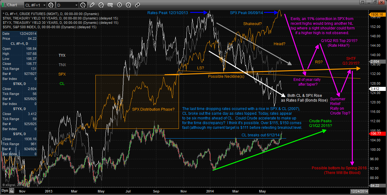
Treasury yields peaked on December 31st, 2013 and have since worked lower aggressively. On the same day crude oil made a lower low before reversing into a defined uptrend. Last Thursday, June 12th, crude broke out of a long basing pattern targeting $111/$112 in coming days. Look back to 2007, Crude broke out on June 14th — nearly the same seasonal price action, both years experiencing a breakout. Today the “fluke” is attributed to an Iraqi insurgency most of us knew nothing about a day beforehand, whereas in 2007 (and every 2nd or 3rd Thursday in June — depending on the year) it was attributed to the important oil inventories report after refiners make the switch to Light Sweet Crude from WTI (thanks to Marc Eckelberry for bringing the report’s timing to my attention). Equities continue to rally onward but it’s possible they may have peaked this past week based on a number of studies in the realm of Gann & DeMark.
This time around there are a few key differences: First, in 2007 Crude established a defined uptrend for several months before rates peaked, while in today’s context crude bottomed and rates topped simultaneously. Second, rates topped four months prior to equities in the 2007 observation, while 2014 has seen this relationship diverge for almost six months. Is this bond selloff ahead of schedule thanks to the Fed’s Taper? Also possible. One of these relationships will make a statement at some point soon that helps point the way forward, though the similarities between this potential top and the last has been reduced with these variables. One leading scenario of how this plays out: yields continue to go lower, with a possible inversion in the 10/30-year US Treasury yield curve as Crude accelerates higher at a faster pace than in 2007. Back then, Crude was operating off a much lower level than today. If it were to get past $115per barrel there wouldn’t be much stopping it from taking out >$145 in short order as there’s little resistance overhead.
Is this the top? I have no idea, but based on this research it may be a lot closer than I previously thought. The “Falling Treasury Yields/Rising Equities & Crude” observation likely means if the yield curve were currently capable of inverting, it would have done so 6 to 18 months ago. My original hypothesis for another wave higher after a correction on the monthly S&P 500 chart could be fulfilled with a double top similar to July/October 2007. However, there’s the distinct possibility that my count is incorrect and this is not a monthly Elliot Wave 3, but an ending Wave 5. Either way, what I believe these studies best show is that there are probably 6-12 months or more before the major problems emerge (SHTF). Even if we have already topped; it’s not time to panic… yet.
Twitter: @MinyanDP
Author holds long position in Long Term Bonds/Futures and Crude Oil Related Equities/Futures at the time of publication. Any opinions expressed herein are solely those of the author, and do not in any way represent the views or opinions of any other person or entity.


")

 Rolling Over At Key Fibonacci Level?")

