For the past several months, active investors have been trained to buy the dip. Or as many have said and written on Twitter, “just BTFD” with emphasis. Well, instead of the typical 3 or 4 percent pullback, this time the market had troubling intentions. But, when you think about it, this correction was long overdue.
Market breadth indicators have been deteriorating since spring. And like many divergences, it can take time to finally translate to price. In late July, I wrote a piece on market breadth and how equities have been resilient… but unable to break out. Here’s an excerpt:
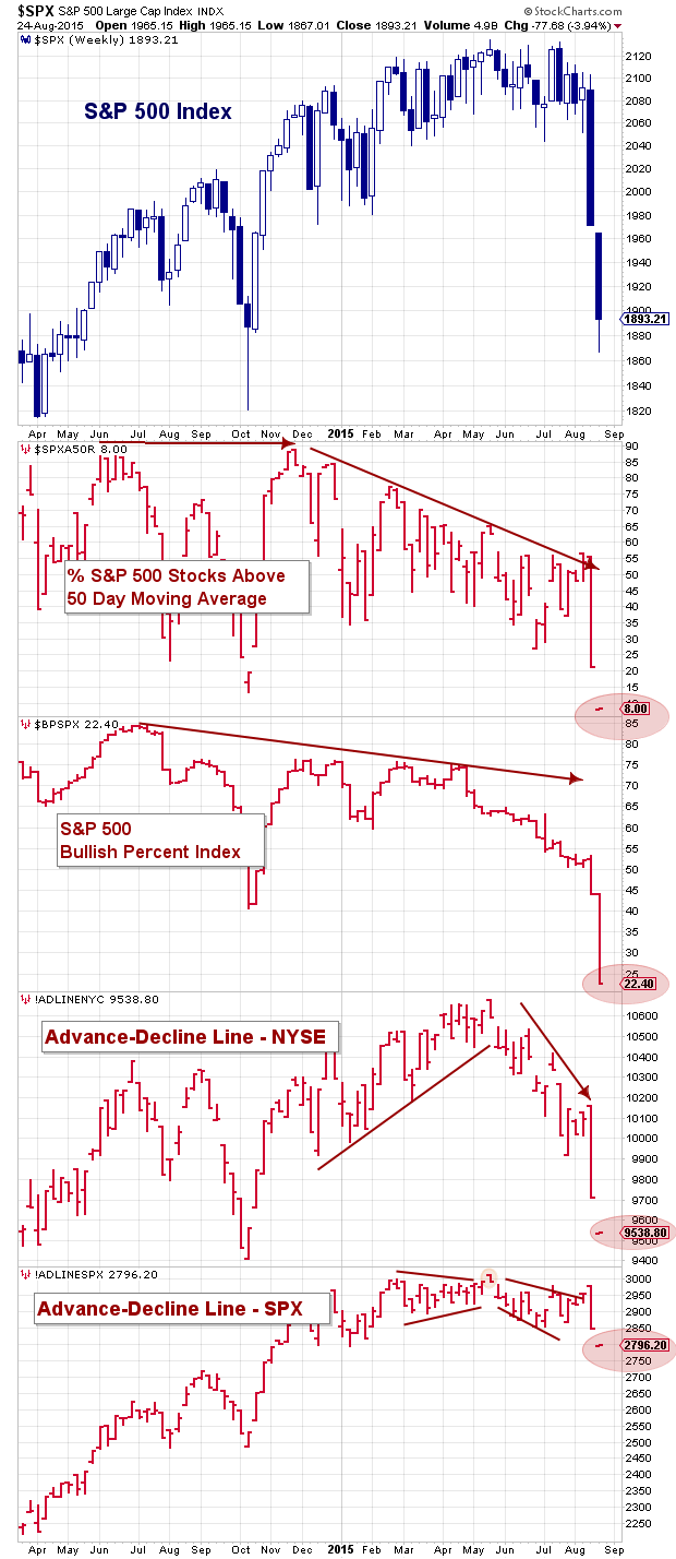
The S&P 500 and NYSE Advance-Decline Lines have turned lower. This broad-based market breadth indicator is still above the January lows, but needs to bear watching. Any further rollover would warn that the summer doldrums will be anything but. It’s also worth noting that the Bullish Percent Index (stocks with a Point And Figure buy signal) has slipped below the January lows.
Before I look at the market decline and current technical setup, let’s look at a chart with a few market breadth indicators (through today’s close). As you can see, breadth has been falling apart. And just look at today’s readings (in red). Wow.
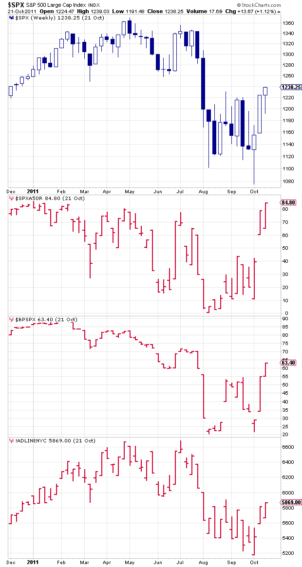
Now look at July/August 2011. The market usually doesn’t repeat, but it often rhymes. Market breadth wasn’t quite as ill, but the patterning (and timing) sure looks similar.
Escalator up, elevator down. If you’ve been around, you’ve been through this many times before. But the tricky part here is that we are 6 years into a bull market and there’s a growing concern of a new prolonged bear market.
So what do I make of this and what am I doing now? Well Friday sure felt like a good day to buy equities with the VIX up big (fear) and the Dow Jones, Russell 2000, and Nasdaq Composite reaching correction territory. I bought some exposure to the Dow Jones and a couple stocks before the close. But I knew it wouldn’t be that easy (hence playing small ball). I’m a big fan of averaging in and building bigger focused swing positions over time. So when I saw futures plummeting over night on Sunday/Monday, I knew I’d be buying in larger size today. And if we test the lows or make new lows tomorrow or over the next couple of weeks, I’ll be ready again.
This all sounds bullish, but keep in mind that we have already seen the Dow Jones decline 16.6 percent from the highs (intraday) and I’d like to add to my positions near those intraday lows or lower, if possible.
And if we see a big bounce, I’ll likely trade around the positions. “Trading around” is a strategy of trimming some size off of positions (on rallies) and adding back (on declines).
To be fair, though, many investors are likely underwater… perhaps deeply underwater. This makes it hard to see and think clearly and implement this strategy (i.e. trimming on rallies if it means taking a loss).
At the same time, when investors get trapped it creates overhead supply. What that means is that many investors are wanting out of positions and waiting for a rally to do. This sets the stage for rallies to get sold. And this is another reason why it takes time to heal the damage.
So there’s likely not going to be a “V” bottom here. But I do think that we’ll see some heavy volatility and back and forth as then market feels its way through this mess (similar to fall of 2011). Will we see lower lows? Perhaps. Will we see a few sharp, quick, rallies. Sure.
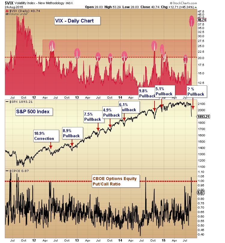
The next chart looks at the stock market corrections since the 2011 sharp decline. It highlights the VIX and Equity Put-Call Ratio. As you can see, the VIX has rocketed since last week. As well, the put-call ratio reached up over 1 before slipping today. Now that’s some fear.
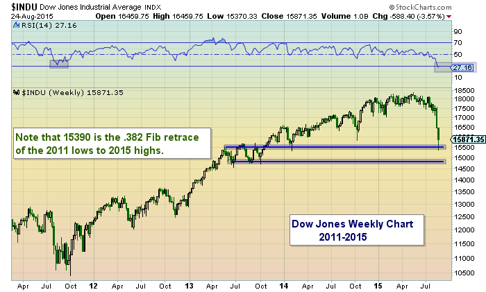
Lastly, let’s finish up by looking at the charts of the S&P 500 and the Dow Jones Industrial Average charts.
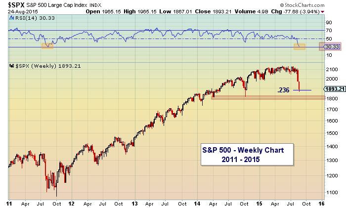
First of all, both are weekly charts and the Relative Strength Index (RSI) on both is as low or lower than the 2011 swoon. As well, the S&P 500 is near its .236 Fibonacci retrace level (1880) and the Dow Jones is near its .382 Fibonacci retracement level (15,390). It will be important to see if these technical support levels hold. If they fail to hold, then 1800-1820 on the S&P 500 and 14700-15,000 would be next.
S&P 500 Weekly Chart
Dow Jones Industrial Average Weekly Chart
Thanks for reading and trade safe.
Twitter: @andrewnyquist
The author has long exposure to the Dow Jones Industrial Average at the time of publication. Any opinions expressed herein are solely those of the author, and do not in any way represent the views or opinions of any other person or entity.


 Rolling Over At Key Fibonacci Level?")


