“Man, I wish I’d gotten out of that trade when price dropped under that support level.” Does this sound familiar? Have you ever let a trade get away from you? Of course you have and so has yours truly. If you’ve ever traded the stock market, there is a 100% chance you’ve mismanaged a trade and paid dearly for it. Looking back over the last 15 years, I know I’ve made some trading decisions that were not only poorly managed but outright stupid!
No one likes to lose. It’s simply human nature. From badminton to baseball, everyone wants to be the winner. The major problem is, “it ain’t gonna happen every time.” And if you’re trading the stock market, chances are the winners are going to be hard fought battles between emotions, machines and a pinch of luck. So what is one to do? Well, as the title of this article suggests, it’s OK to be wrong but it’s not OK to stay wrong. In other words, cut your losses and reevaluate, as I like to say.
Traders have an uncanny ability to convince themselves that a losing trade is just before changing direction and going in their favor. They stay in the trade, scour every article they can find in hopes of finding a piece of good news to reinforce their own beliefs with no regard to what a chart is clearly showing them.
The one thing I want you to take from this article is learn to listen to the charts! Forget financial TV shows, analysts’ ratings, “top picks of the week/day,” economic data, etc.. Look at the chart in front of you. Using whatever method works for you, when the chart says price has broken a level of support or resistance, close the position. Bail, get out, run, whatever you wanna call it, but DO NOT stay in a losing trade! And if that trade that you were in love with turns around there is nothing stopping you from getting right back in. And it’s this discipline that separates successful traders from unsuccessful ones.
To sum up all of the above, “you never know where price is going.” Think about that for a minute. There are literally hundreds of indicators you can use to analyze price action, but do you really ever know for sure what’s going to happen? No.
So now lets look at two actual stocks and how real situations affected their price.
We’ll start with Exxon Mobil Corporation (XOM).
Picture this, if you will. Exxon, (as it was known at the time), was trading in a $1.50 range between $10.00 and 11.50. And the unthinkable occurs. The infamous Exxon Valdez oil spill. Without going into a ton of details, let me just give you the highlights.
- An oil tanker, the Exxon Valdez, while crossing the Prince William Sound off the southern coast of Alaska ran aground by hitting a reef.
- Of the 53 million barrels of crude oil being transported, nearly 11 million gallons were spilled.
- It is still considered by many to be the worst environmental disaster ever caused by man.
- Millions upon millions of dollars were lost in tourism and commercial fishing revenue. (1989 dollars)
- Recreational fishing alone suffered over 30 million dollars in lost revenue in only 2 years post-spill.
- Hundreds upon hundreds of thousands of birds, fish, and marine life were killed, including seals and otters.
- The ecological impact is still being felt 25 years later.
I couldn’t fabricate a more disastrous event, and this one is true.
So, what’s your first inclination? A company whose stock trades around $10.00 – 11.5 has just forever altered a part of the globe. Would you buy, sell or watch? Personally, I wouldn’t touch the stock and if I did own it already, I would sell. If you knew nothing of the stock market, your common sense would tell you the stock was going to take a huge hit.
So let’s look at a chart of XOM during the year of the spill. Looking at this chart, can you tell me when you think the oil spill occurred?
22 Month Chart of XOM late 1988 – late 1990
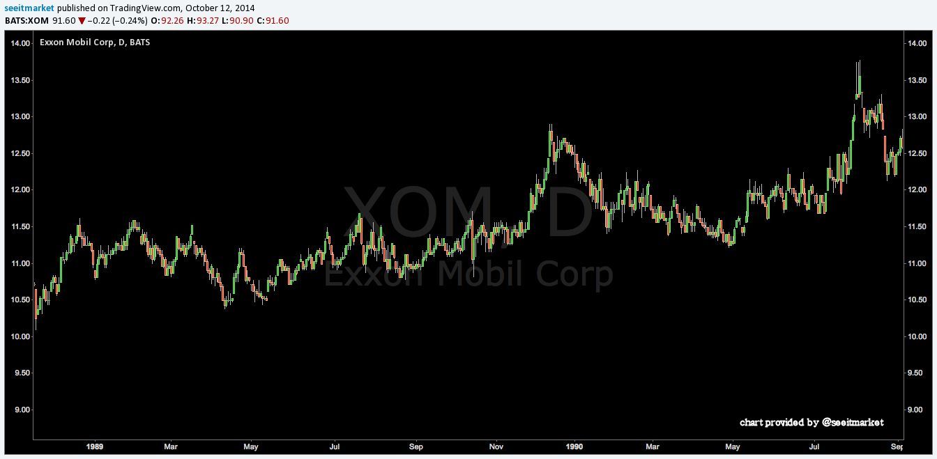
You thought it would be easy to spot, didn’t you? Surely the stock would fall 50% or more! Or even go into bankruptcy.
The Valdez hit the reef in the early morning hours of March 24th, 1989. On April 11th, 1989, price bottomed out at 10.38, a pullback of a mere 7.73%. Not exactly the kind of reaction one would expect to see from investors considering the astronomical cost of the clean-up, environmental damage, lawsuits, etc..
Now let’s pick up next where the previous chart left off to see if any damage to the price of the stock starts to appear after the catastrophic impact of the spill becomes more evident.
5 Year, Monthly Chart of XOM. September 1990 – December 1995
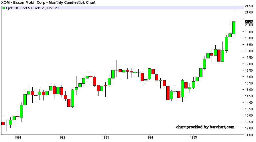
Now wait a minute. Why is the value of this stock going up ? Doesn’t make common sense, does it ? It doesn’t to me, and my common sense is pretty dang accurate.
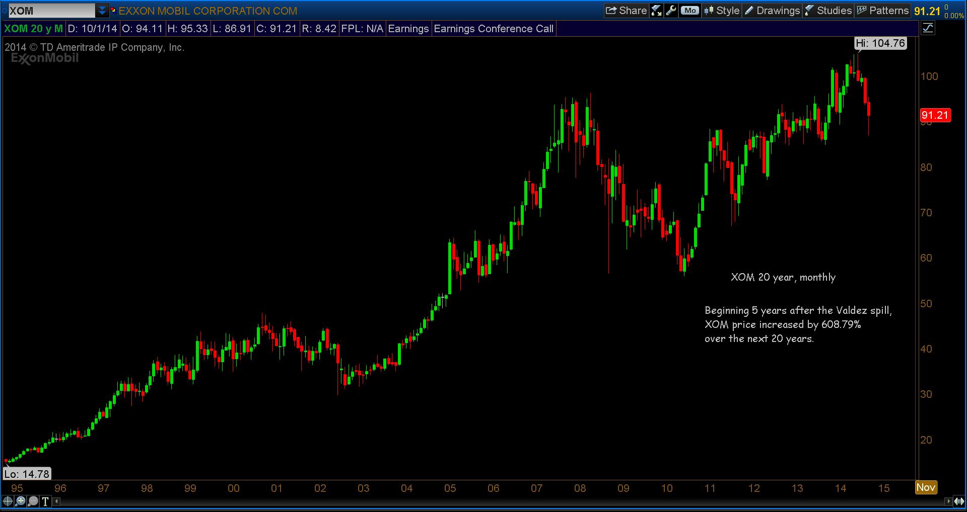
Now let’s look at the big picture and measure the moves.
Looking at a 20 year chart, beginning roughly 5 years after the Valdez spill, you’ll see price increased an astronomical 608.79% at its high of 104.76. As noted earlier, the spill occurred in the early morning hours of March 24th, 1989. After that date, price never dropped below 10.38.
In essence, the stock did the exact opposite of what myself and a lot of other people thought it would do.
20 Year, Monthly Chart of XOM. November 1994 – October 2014
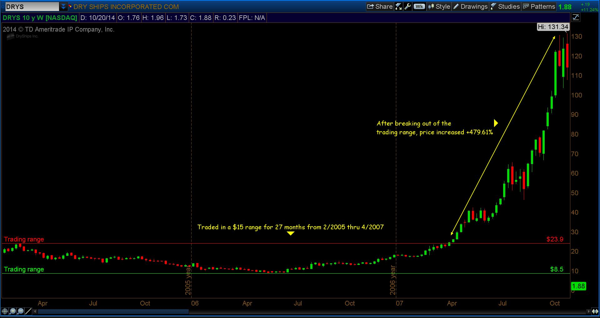
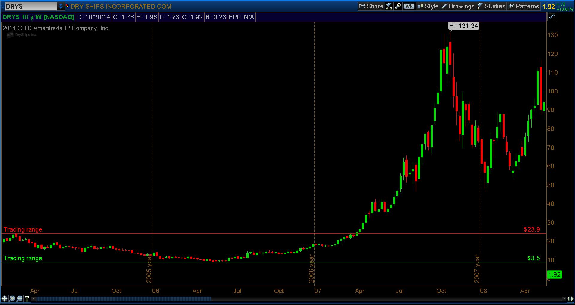
Now let’s look at a chart that I’m sure a lot of people, including yours truly, are very familiar with, DryShips Inc. (DRYS). Just the name brings back some terrible memories! And I feel confident I’m not the only person to have traded this one precisely wrong!
Starting in early 2005, we see DRYS traded in a $15 range up to 1Q’07 before breaking out and making a very impressive move of +479.61%, or a 5+ bagger. In trading, that’s a big one. After such a substantial move up in price, one would think some pullback would be perfectly normal and expected. Also, one would think after a little profit taking, price should continue its march upward considering past performance.
33 Month Chart of DRYS. February 2005 – October 2007
In the following chart you can see DRYS went through a phase of more than just a little profit taking. It actually pulled back -63.29% before putting in a bottom, but at the same time, the S&P 500 gave up -57% in the “Great Recession” so it was explainable. You could rationalize the drop, so to speak.
It eventually made its way back up to $116.43 so one would be safe to assume “all is well now” and the march back up continues, right? Well, let’s have a look and see what happened in the chart below. Keep in mind we were still in a technical recession and the market was anything but clear.
DRYS Weekly Chart through May 2008
So, what does one do? It looks like a big “W” pattern just before launching upward, why not get back in? I mean after all, it is DryShips and you can’t go wrong buying Dryships. I can still hear that in my head, somewhere. So, would you follow the chart or your heart?
10 Year Weekly Chart of DRYS. January 2005 – October 2014
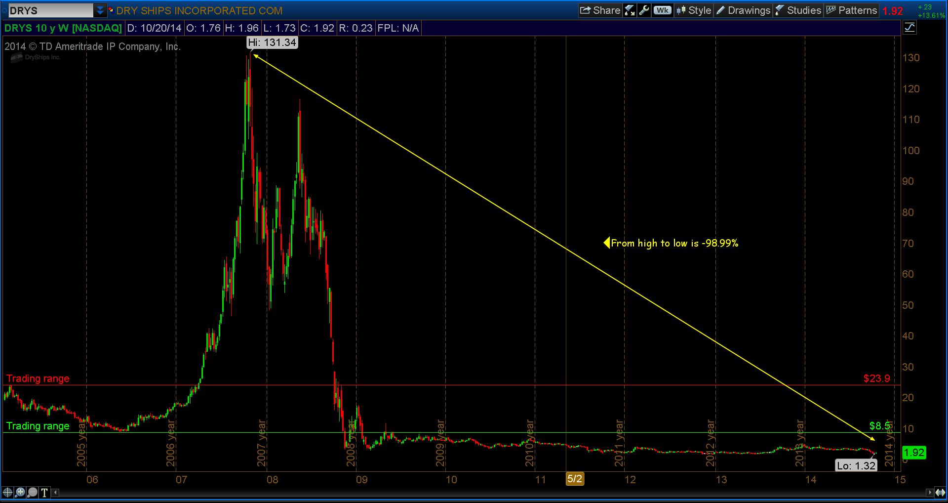
WHOA! What happened? It doesn’t matter what happened or what caused this stock to, for all intents and purposes, go to zero. What matters is that it gave very clear signals that it was in trouble. Whatever your preferred method is, whether it be Fibonacci, Gann, previous highs or lows, even basic trend lines, the chart told you over and over and over that support levels were being broken in quick order.
In summary, don’t EVER think you know what the price of an equity/future/option is going to do. Follow the chart and if tells you the trade isn’t working, GET OUT!
Trade the chart, not your heart!
Follow Dave on Twitter: @TheFibDoctor
No position in any of the mentioned securities at the time of publication. Any opinions expressed herein are solely those of the author, and do not in any way represent the views or opinions of any other person or entity.


