Most of you will have heard the idea of a “golden cross” before (where the 50 day moving average goes above the 200 day moving average), and probably also it’s evil cousin the “death cross” which is the opposite.
Today’s chart comes from the latest edition of the Tuesday Macro Technicals report and provides a special view on global equities.
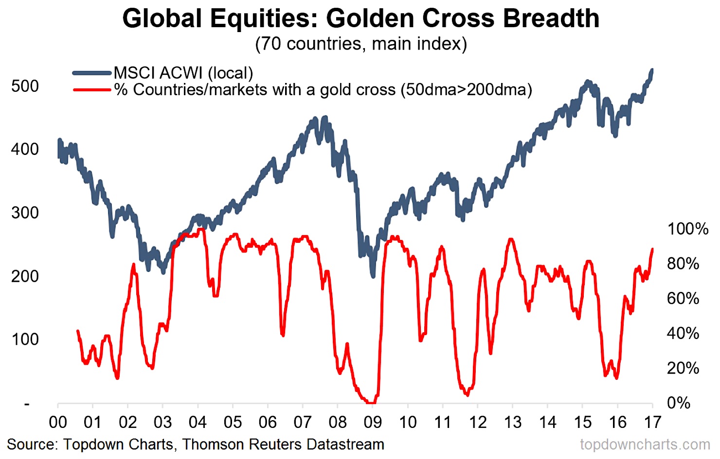
Global Equities Golden Crosses Surge
The chart in question (above) shows global equity breadth by country (in this case we’re tracking the major benchmark of 70 different countries). The red line is the % of those 70 countries that have seen a golden cross i.e. their 50 dma is higher than their 200 dma – the relevant market of course is the MSCI All Countries World Index ( NASDAQ: ACWI) – shown in local currency terms to avoid currency distortions effects.
There’s a couple of important signals to note.
First, notice how high the indicator is – it shows that at the time of writing 89% of the 70 countries we track are in gold cross mode. It shows there is strong breadth across global markets. And this is something that tends to support a global rally.
The second point is that sometimes when the indicator gets this high it can mean bad news. But this signal is only activated when the indicator goes very high and then rolls over e.g. 2010, 2011, 2015.
So for now the message on global equities based solely on this indicator is that breadth is strong and until the indicator rolls over this is a bullish confirmation signal and will help reinforce the global equity bull market.
If you want to learn more about the Tuesday Macro Technicals report, click here.
Twitter: @Callum_Thomas
Any opinions expressed herein are solely those of the author, and do not in any way represent the views or opinions of any other person or entity.


