The ups and downs of Crude Oil prices can provide a pretty good barometer of what to expect from the general market. Last August, I drew our attention to the oil paradox:
The Oil Paradox is simply when demand confirms recovery early in a bull market cycle and prices continue rising until outsized input costs later precipitate a price fall.
The tight band that Crude Oil prices travel depicts the consumer’s vulnerability in a steadily recovering, but still fragile, economy. So let’s take a closer look at Crude Oil to see what it may be telling us about the economy and the stock market.
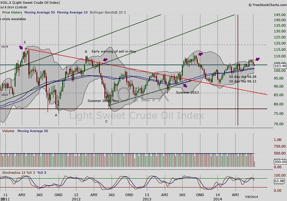
Below is a weekly chart of Crude Oil since its peak in 2011. Compare these peaks to the peaks of the S&P 500 (SPX) and note the lead-lag relationship of oil and equities. Notice as well that oil has turned down recently, and is once again approaching its 10/50 week moving average.
Crude Oil Weekly Chart
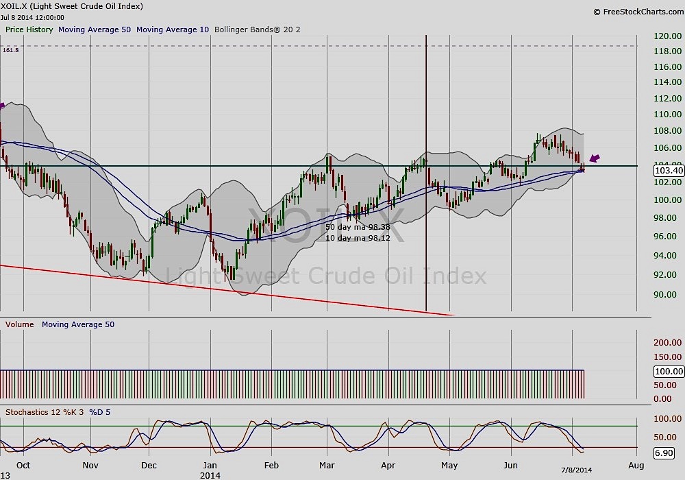
A similar technical juncture shows up on the daily chart of Crude Oil, with prices sitting near the always pivotal 10/50 day moving average. In early June, oil was able to bounce off this floor.
Crude Oil Daily Chart
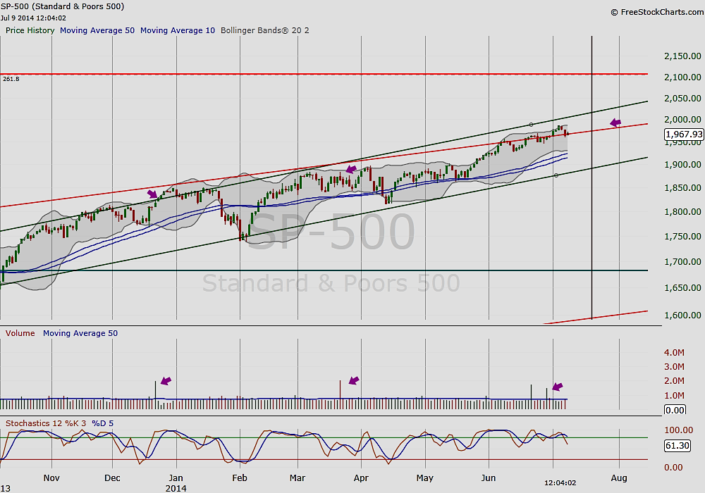
Turning to the daily chart of the S&P 500, you’ll notice the volume spikes over the last couple of weeks. These serve as exhaustion warnings and indicate that the market may be on its last fuel.
S&P 500 Daily Chart
The Takeaway: Watch Crude Oil and how it reacts at the 10/50 week moving average. If it does break through its support, it will be a signal that equities may soon follow.
No position in any of the mentioned securities at the time of publication. Any opinions expressed herein are solely those of the author, and do not in any way represent the views or opinions of any other person or entity.

: Showing Some Signs of Emerging Strength")
