 Understanding where weakness and strength are coming from is often a critical component in analyzing the stock market. Right now it looks like Small Caps are one of the ugliest pigs in the pin. On its face value, the Russell 2000 iShares ETF (IWM), looks fine: It’s near its all-time high, in a clear up trend and above its major moving averages. It’s when we look under the hood of the car that we can see what’s going on with the Small Caps.
The chart I’ll be talking about today is a weekly chart IWM going back to 2007.
I’m going this far back to show past examples and compare them to today of when Small Caps have come under fire. Looking at the peak in 2007 we can see that IWM created a double top at $77.50, very similar to what happened in 2011 and the current price action.
Russell 2000 iShares – Weekly Chart
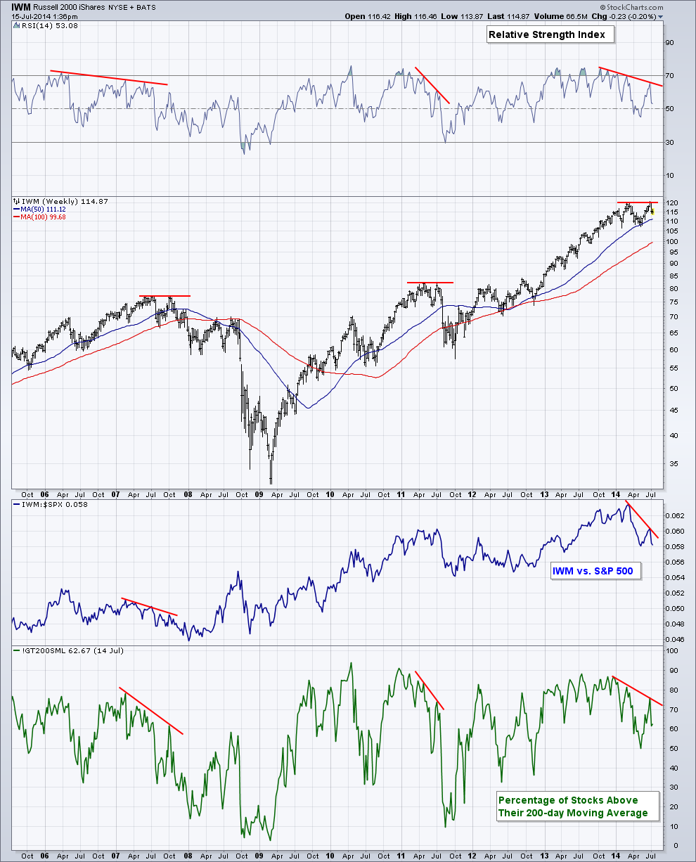
While a double top was created in ’07 and ’11, momentum via the Relative Strength Index (RSI) created a negative divergence. As price action hit its previous high, momentum was making a lower high. This can often act as a warning sign that the current trend may be about to change. We are also currently seeing a divergence in momentum as the RSI indicator has been unable to regain the ‘overbought’ 70 level.
Next we have the blue line on the chart which shows the ratio between IWM and the S&P 500, essentially comparing Small Caps vs. Large Caps. When the blue line is rising we know that on a relative basis, IWM is outperforming the S&P 500. This wasn’t the case going into the double tops in 2007, 2011, or during the first six months of 2014. During these past examples, investors showed a stronger preference for large caps stocks, which are often viewed as a less-volatile alternative to their more risky Small cap brethren. When small caps begin to underperform the overall market (as represented by the large cap S&P 500) another warning flare is shot off.
Finally we have the breadth of the Small Cap Index as measured by the Percentage of Stocks Above Their 200-day Moving Average. Prior to turning points in an index we often see an increasingly larger number of stocks begin to make a trend change. This is often the case in up trends as down trends are mostly ended by a ‘climax’ and V-like pattern. As the chart shows, we began seeing a smaller percentage of stocks above their long-term 200-day Moving Average even though the Index as a whole was making a run at a new high. This tells us that breadth is weakening and participating is waning for the index. With fewer stocks advancing and holding above their 200-day MA, it makes it extremely difficult for the index itself to keep its current trend intact.
During the selling that took place earlier this year we saw IWM test its 50-week Moving Average before bouncing and testing its prior high. I’ll be watching to see if this Moving Average as well as the May low can hold as support if price continues to weaken. If we do see price break through this potential level of support then we could see a test of the 100-Week Moving Average. We’ll see where price takes us.
The information contained in this article should not be construed as investment advice, research, or an offer to buy or sell securities. Everything written here is meant for educational and entertainment purposes only. I or my affiliates may hold positions in securities mentioned.
Any opinions expressed herein are solely those of the author, and do not in any way represent the views or opinions of any other person or entity.
: Creating Bullish Divergence?")


 and Semiconductors (SMH): Concerning Price Pattern?")


