My broad stock market analytical approach is comprised of three main steps: Price, Market Breadth and Investor Sentiment.
First off is price. If you ask me what chart I would look at to get a read on the S&P 500 Index INDEXSP:.INX, my answer would be a chart of the price of the S&P 500 Index! Price is king.
Second to that is market breadth, which answers the question of what is happening with the hundreds of stocks that actually make up this index. Are the individual names mirroring the action of the benchmark, or are certain names diverging from the broader trend?
Today’s chart shows the S&P 500 for the last five years along with two key market breadth indicators based on moving averages.
The first panel below the price shows the percent of stocks in the S&P 500 trading above their 200-day moving average, and the bottom panel represents the percent of S&P members trading above their 50-day moving average.
If you look back at historical bull market phases, for example most of 2019 or 2017, you’ll see that over half of the S&P 500 tends to remain above their 200-day moving average. Especially during pullbacks in price, this indicator tends to remain above the 50% level.
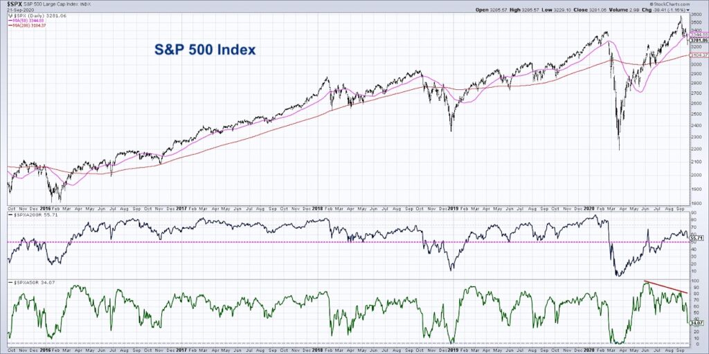
This makes sense, as when the market is in a strong bull market phase, most stocks would understandably be above the 200-day moving average. When the 50% level was broken in October 2018 or February 2020, this suggested increased risk of further downside as most names had broken down through this key level of support.
With the selloff in stocks over the last two weeks, we’ve seen this value decrease from around 68% in early September to just above 55%. As long as we remain above 50% here, the likelihood of a much deeper corrective move is much lower.
Now the bottom panel indicates a bearish divergence with price, similar to the divergences we’ve pointed out in the cumulative advance-decline lines. Price moving higher while market breadth indicators move lower speaks to internal weakness and limited upside for price.
At this point, only 34% of the S&P 500 members remain above their 50-day moving average, and that’s down from almost 100% at the June market high. This means that two thirds of the S&P 500 have already broken down through their 50-day moving average, failing to find support at a point where many investors tend to consider “buying on the dips.”
Perhaps the recent selloff is less of a “dip” and more of an indication of a deeper correction in price and/or time?
One way to be sure is to watch the percent of stocks above their 200-day moving average. If and when this indicator breaks below 50%, it would mean that regardless of the overall market direction, over half of the index members are in confirmed downtrends. This would open the door to lower lows for the S&P 500 and increase the potential for the S&P 500 to break below the “big round number” of 3000.
To see this article in video format, check out my YouTube channel!
Twitter: @DKellerCMT
The author may have a position in mentioned securities at the time of publication. Any opinions expressed herein are solely those of the author, and do not in any way represent the views or opinions of any other person or entity.


: Showing Some Signs of Emerging Strength")
