The US IPO market shows a familiar ebb and flow to the stock market price cycle.
Per my experience, studying the trends in IPO activity can yield interesting sentiment signals and provide extra context on the overall market environment.
This article talks through US IPO trends, and includes some of the insights from a discussion on US IPO market statistics in the latest Weekly Macro Themes report.
The key chart shows US IPO market activity (filings and withdrawals) against the S&P500, and here are a few things worth noting.
US IPO Market Chart
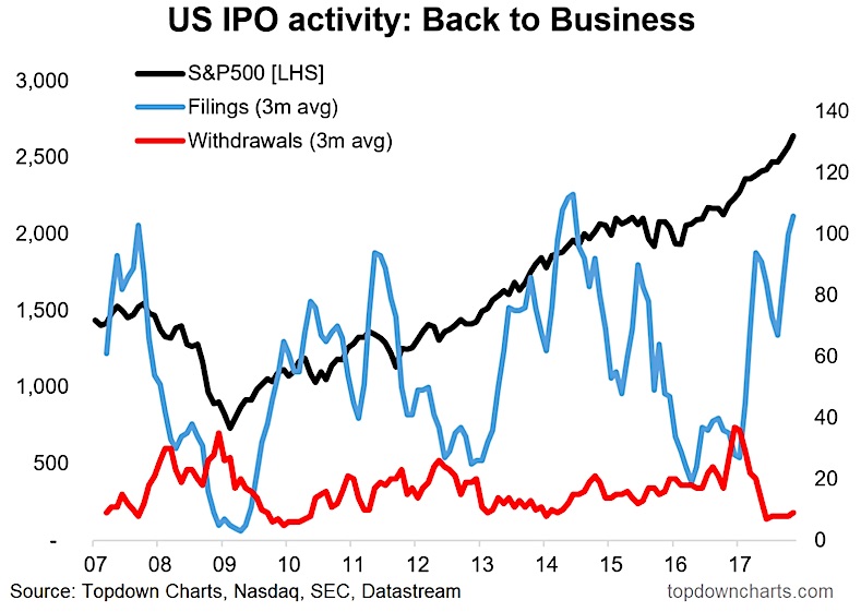
The graph shows 3-month smoothed IPO filings and withdrawals activity vs the S&P500. There is a clear cycle of action on filings, with activity surging around market climaxes and dropping off after periods of turmoil and volatility. Similarly withdrawals tend to spike after a market correction. Overall these patterns or cycles tend to line up fairly well with that of the stock market.
From a practical standpoint both series seem to function as contrarian indicators. That is, withdrawals usually spike around a market bottom, and filings surge during the up-phase of the market; basically a sign of confidence. When filings rollover from booming levels it’s typically a bad sign.
At present withdrawals have dropped off and filings have surged. It’s another sign of the times of a bull market that is steadily maturing, but is yet to show signs of a turn. I’ll be watching IPO filings for any signs of extremes to the upside or a slacking off in activity; likewise I’ll also be keeping an eye on withdrawals for signs of anything stirring…
Twitter: @Callum_Thomas
Any opinions expressed herein are solely those of the author, and do not in any way represent the views or opinions of any other person or entity.
: Cup (and Maybe Handle) Watch")
 Reaches Important Price Support")
