 By Andrew Nyquist
Well, so much for the boring sideways market! Although some may have been caught flat footed on the direction of the move, most should have see a big move coming. For one, many market participants were engaged in political gridlock of sorts (pun intended), spelling out their respective bullish or bearish cases. This can be seen in the coiling low volume, flag-like pattern prior to this week’s break higher. And secondly, the big boys were returning. Here’s an excerpt from last week’s Market Update, “The Return of the Big Boys:”
“Although this narrow sideways action could continue a bit longer, my antennae tell me that the market is gearing up for some range and volume expansion… as well, the Labor Day weekend will soon be behind us, ushering in the start of September trading. On Tuesday, many big players will be back in the saddle, ready to get after it.”
Up, up, and away from here? Well although higher seems likely over the coming weeks, the stock market doesn’t tend to move in a straight line. And further, the market never takes it easy on us. So if it starts to feel “easy,” check yourself by drawing on past experience; in short, active investors need to stay focused on technical indicators and important support and resistance levels. The second we get complacent, we open the door for a costly mistake.
So what contributed to the breakout and what are the charts telling us?
Well, here’s a brief weekly recap of corollary indices and sectors that I’ve covered extensively here: The Volatility Index (VIX) plunged lower, the Financial Sector (XLF) followed through higher, Commodities (CRB) remained firm, and Small Caps (IWM) and Emerging Markets (EEM) played catch up, the high beta way. All bullish, all contributing to the equity breakout to higher ground. But are feeling extended. IWM and XLF are within spitting distance of their Spring highs, and many commodities, namely precious metals, are in need of some consolidation.
So what’s on deck for the S&P 500? Well, this weekend I’m going back to my roots and focusing on the S&P 500 with my charts. Yesterday, I posted a chart showing the recent performance Gold and the S&P 500 versus the US Dollar. And I have further analysis on this, but let’s first look at the daily chart.
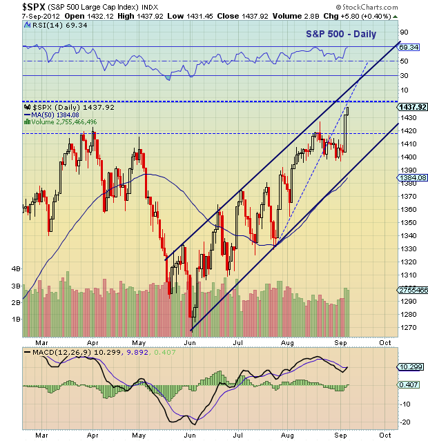
Well, Thursday’s breakout sticks out like a sore thumb. However, it also looks quite similar to previous monster breaks higher this summer on various good news out of Europe and Central Banks. As well, the extention higher is running into the upside of the rising channel which may signal some congestion between 1435-1450. As well, we have the reversal bar from Spring 2008 around 1440 to contest with. Then comes the December 2007 breakdown and gap at 1478. Those two overhead resistance lines may also be serving as upside magnets.
S&P 500 Daily Chart:
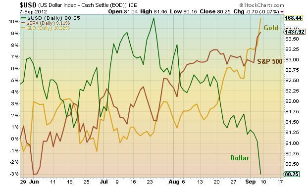
Now let’s return to the gold and equities versus US Dollar study. Below is the chart that I posted yesterday that highlights market expectations and anticipation leading into the Bernanke Draghi two-step. From the article: “What’s interesting to note is the correlation dislocation through late July, indicating investor confusion; both the dollar and the S&P 500 were rising. This was due mainly to the situation in Europe and the weak Euro. However, if recent history is our guide, the Dollar and the S&P 500 don’t typically move together directionally… so something had to give. The breakdown came in late July and bloomed in August, with Gold and the Dollar breaking in opposition and serving as a leading indicator that the Bernanke Draghi two step may pack some punch heading into Labor Day. And just like that we have breakouts in metals and equities.”
Gold and S&P 500 versus US Dollar – 4 month:
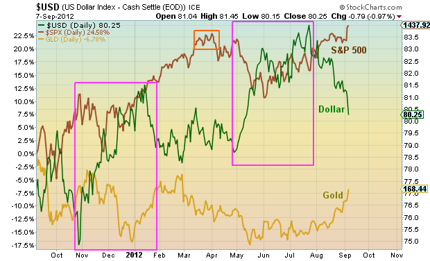
Now let’s take the correlation a bit further back in time to gather insight going forward. Below is a one year chart that offered up a similar instance worth highlighting. Notice the similar run higher in the dollar spanning Nov ’11 to Jan ’12. Then in January, the dollar broke down, similar to the breakdown this past July. From the dollar peak in January to the S&P 500 peak in early April is just over 2 and a half months. If a similar scenario plays out, the S&P 500 would top in October. Markets typically don’t repeat, but often rhyme.
Gold and S&P 500 versus US Dollar – 1 Year:
Thanks for reading. As always, trade safe and trade disciplined. Have a great week.
———————————————————
Twitter: @andrewnyquist and @seeitmarket Facebook: See It Market
No position in any of the securities mentioned at the time of publication.
Any opinions expressed herein are solely those of the author, and do not in any way represent the views or opinions of his employer or any other person or entity.

