 By Andrew Nyquist
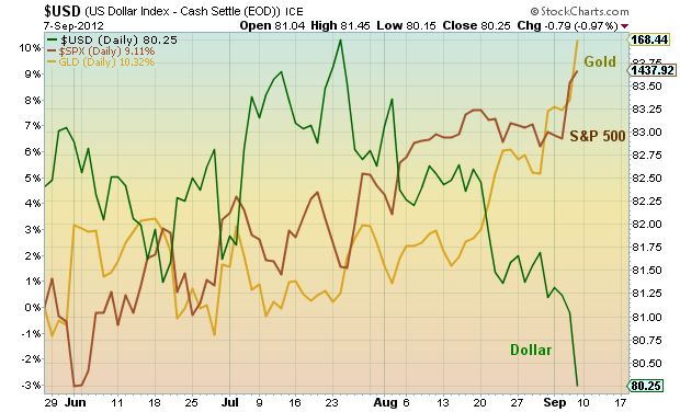
Below is a chart showing the relative outperformance of Gold and the S&P 500 vs the US Dollar since the June bottom in equities.
What’s interesting to note is the correlation dislocation through late July, indicating investor confusion; both the dollar and the S&P 500 were rising. This was due mainly to the situation in Europe and the weak Euro. However, if recent history is our guide, the Dollar and the S&P 500 don’t typically move together directionally… so something had to give.
The breakdown came in late July and bloomed in August, with Gold and the Dollar breaking in opposition and serving as a leading indicator that the Bernanke Draghi two step may pack some punch heading into Labor Day. And just like that we have breakouts in metals and equities.
Further correlation analysis coming in my Weekend Market Update. More charts found here.
A look at the price of Gold and the S&P 500 vs the US Dollar as of September 7, 2012. Currency, commodity, and equity market correlations and indicators since the June equity bottom.
———————————————————
Twitter: @andrewnyquist and @seeitmarket Facebook: See It Market
No position in any of the securities mentioned at the time of publication.
Any opinions expressed herein are solely those of the author, and do not in any way represent the views or opinions of his employer or any other person or entity.


